Deceased Data in Karnataka
This section presents a comprehensive analysis of mortality related to the pandemic within the country. It encompasses various plots and visualizations that shed light on different aspects of fatalities caused by COVID-19.
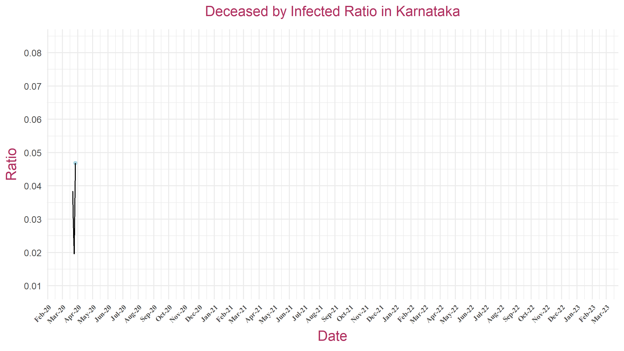
Deceased by Infected Ratio
The plot depicts the ratio of deceased individuals to the total number of infected cases over time. On the x-axis, dates are plotted to show the progression of the COVID-19 pandemic, while the y-axis represents the calculated ratio. This plot offers insights into the severity of the virus's impact by tracking how the mortality rate relative to the infection rate evolves throughout the pandemic.
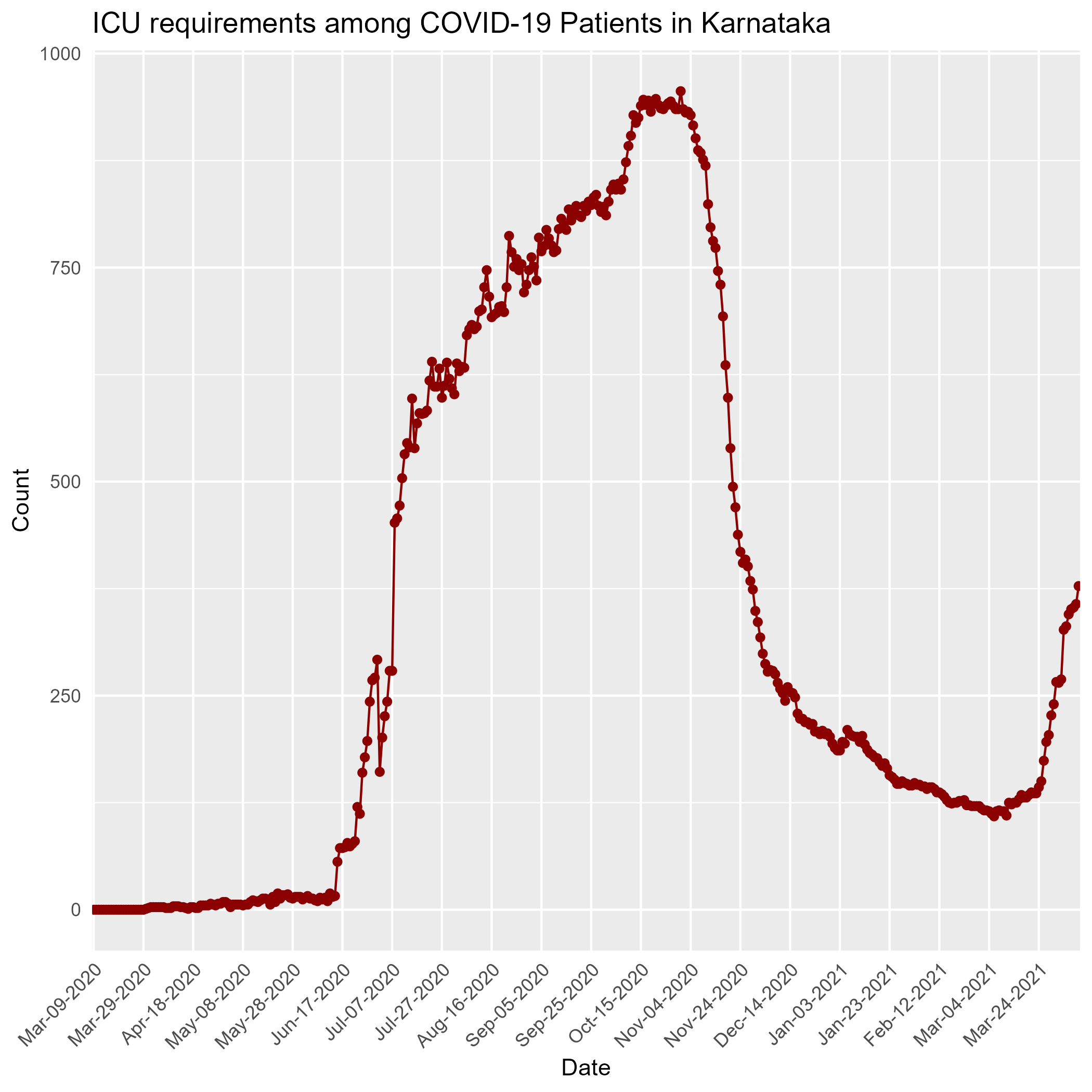
ICU Timeline
In an article published in the New England Journal of Medicine article Fair Allocation of Scarce Medical Resources in the Time of Covid-19 by Ezekiel J. Emanuel Et.all, the authors simulate possible hospitalisation requirements. In the article and otherwise it is widely accepted that the COVID-19 virus has the following distribution among the infected people:
80% of infected will be asymptomatic or have mild symptoms, 6% will require health care but no hospitalization, 8% will require hospitalization and the final 6% will require ICU.
The patients in the ICU include those on Oxygen or on a Ventilator. They include a very small [less than 5%] percentage of the number of currently infected people. On hovering, one can see what percentage of the currently infected people that require an ICU.
In Karnataka, everyone who is infected is being hospitalized regardless of whether they show symptoms or not, as it would ensure isolation. This isn't the case for countries like Netherlands where only those who require hospitalization are hospitalized.
ICU Utilization Timeline for Districts in Karnataka
This plot provides critical insights into the demand for intensive care resources throughout the pandemic, enabling an assessment of healthcare system strain in different districts. By analyzing this data, healthcare authorities and policymakers can identify trends, allocate resources more effectively, and prepare for potential surges in ICU demand. Click here to see the graphs for all districts.
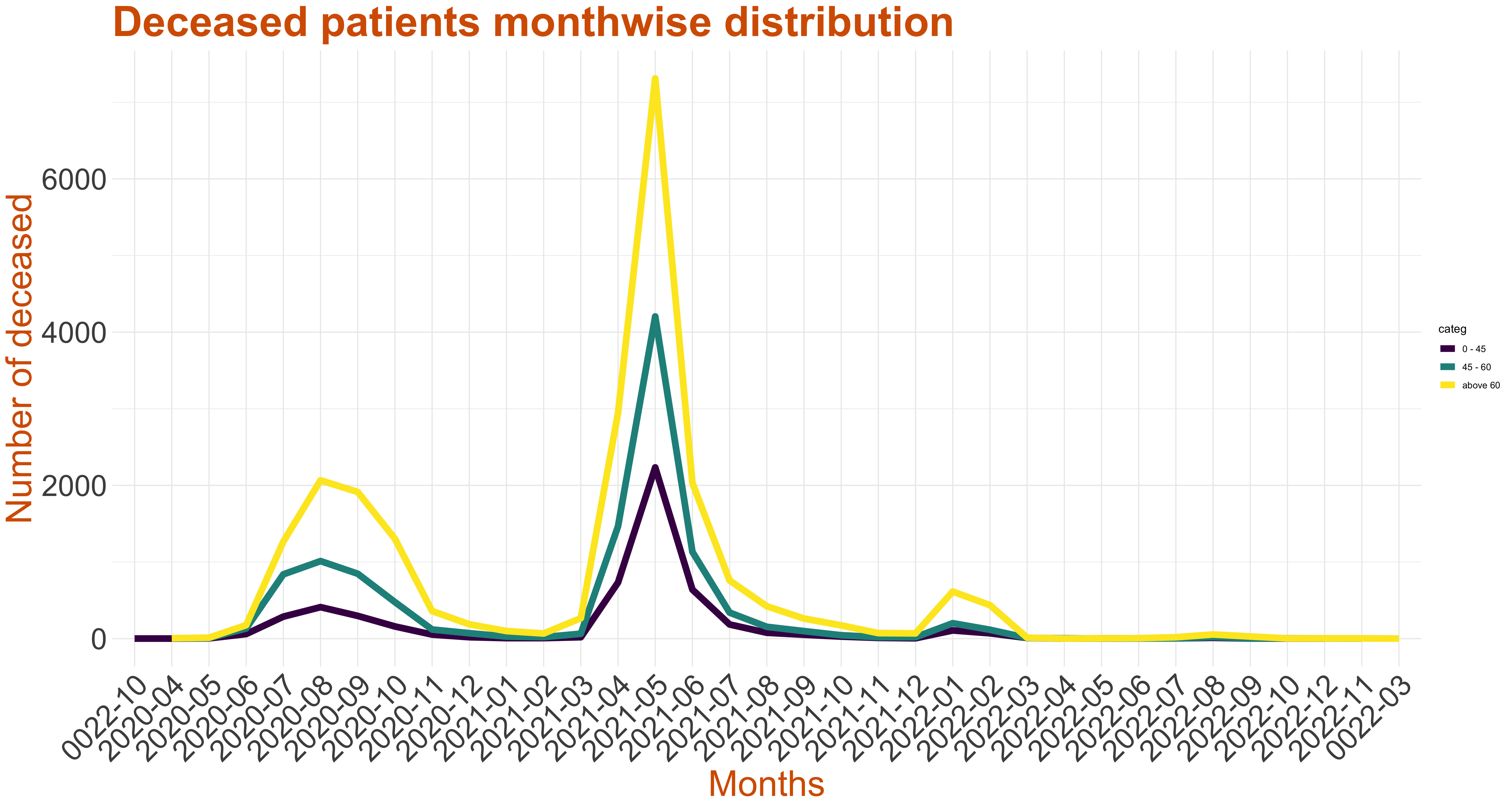
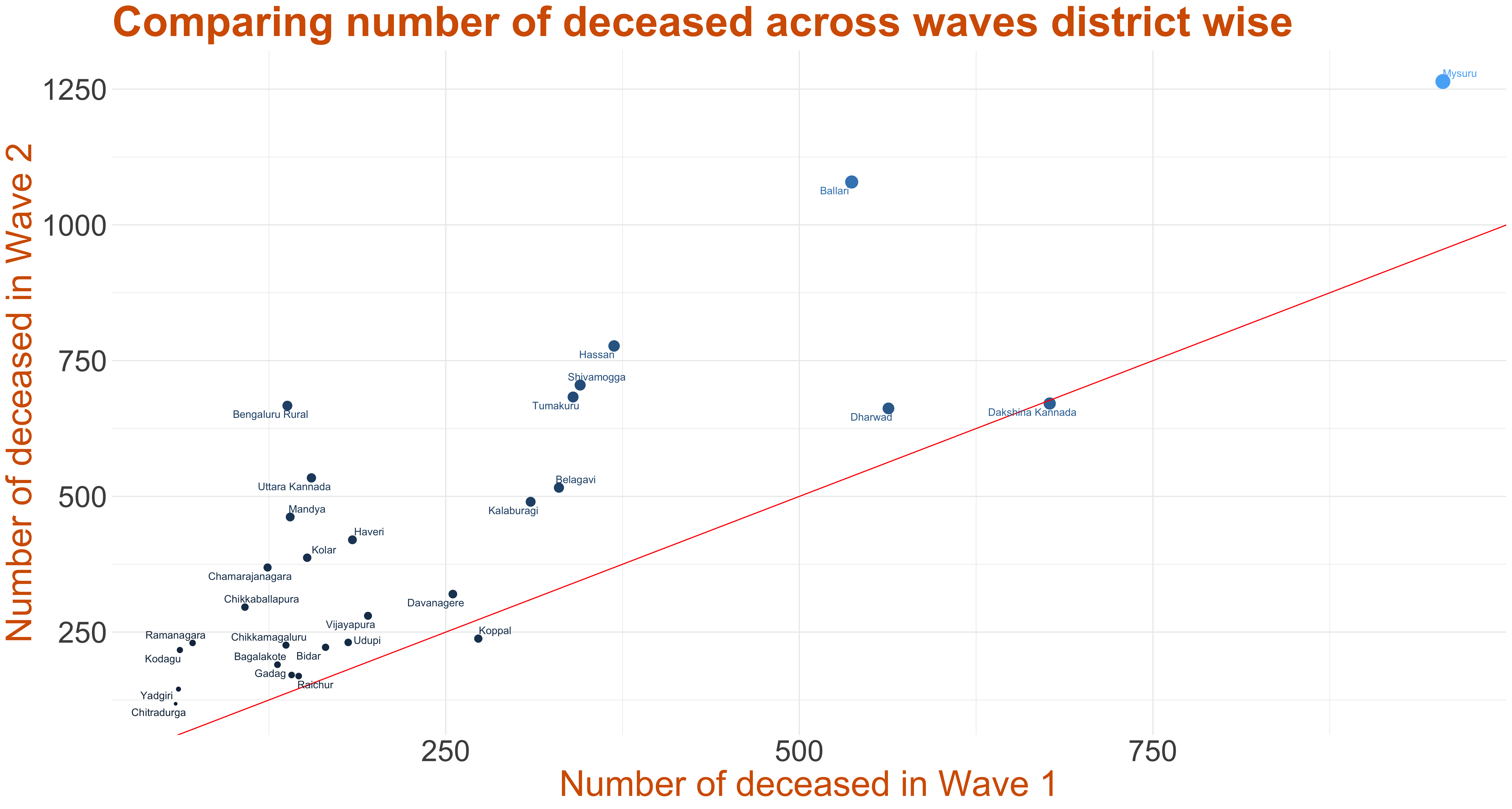
Number of Deceased Across Waves
We have partitioned the pandemic timeline into three waves.
- Wave 1 - till the end of October 2020
- Middle wave - from November 2020 till the end of January 2021
- Wave 2 - from February 2021 till present
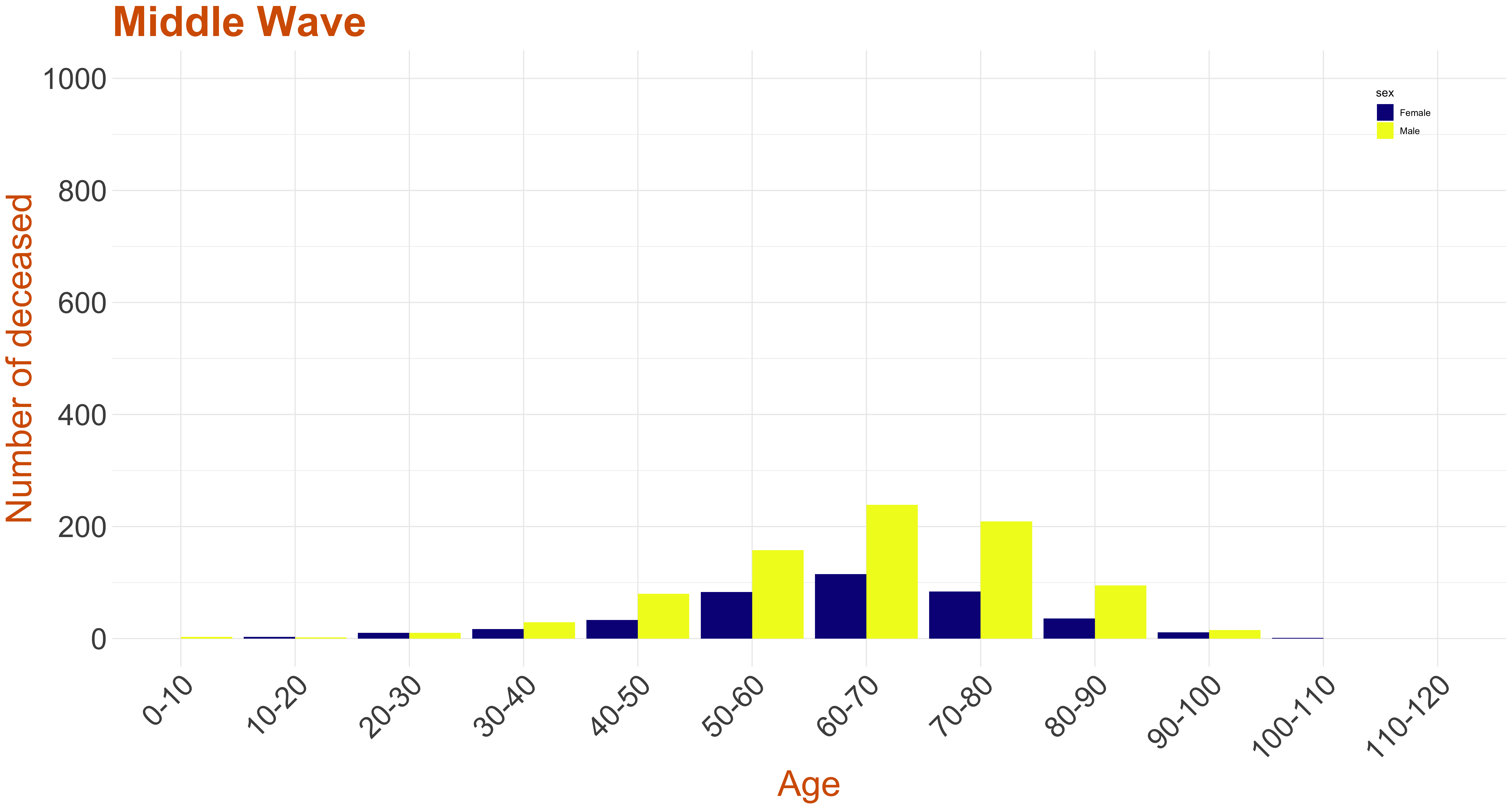
As the number of deceased during the Middle Wave were comparatively low, for some of the plots, we have only considered Wave 1 and Wave 2 data for our analysis.
The graph on the right is a plot of number of deceased in each district in wave 1 versus the number of deceased in wave 2. The point size indicates the sum of deaths during the two waves across districts. The line y=x has been plotted. This suggests that the districts above the line have wave 2 death count higher than wave 1 death count, while districts below the line have wave 1 death count higher than that of wave 2. The number of deceased in Bengaluru Urban during wave 1 is 3836, during middle wave is 488 and during wave 2 is 11235 as of 2nd July, 2021. Due to the large count, this district has not been plotted.
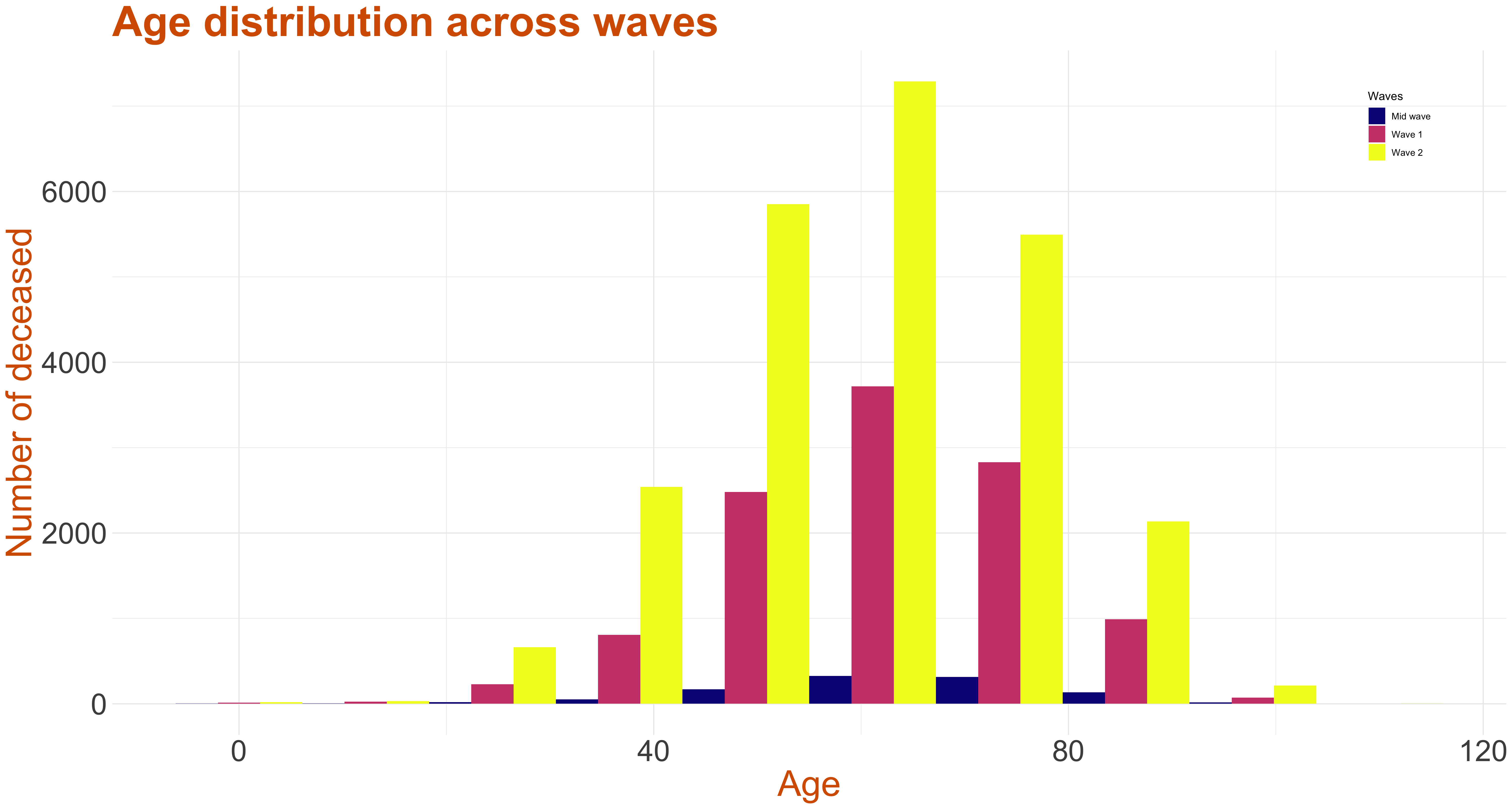
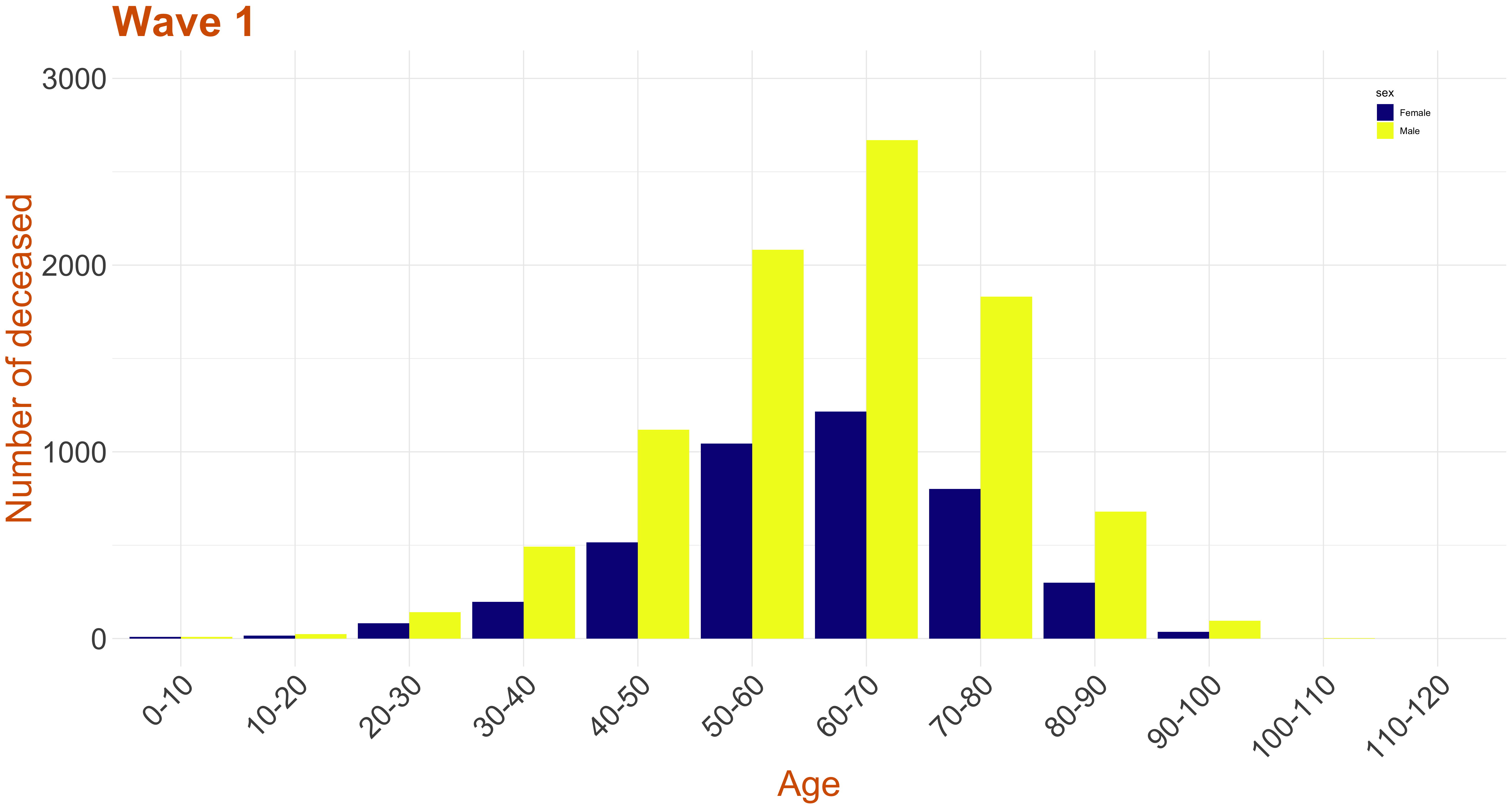
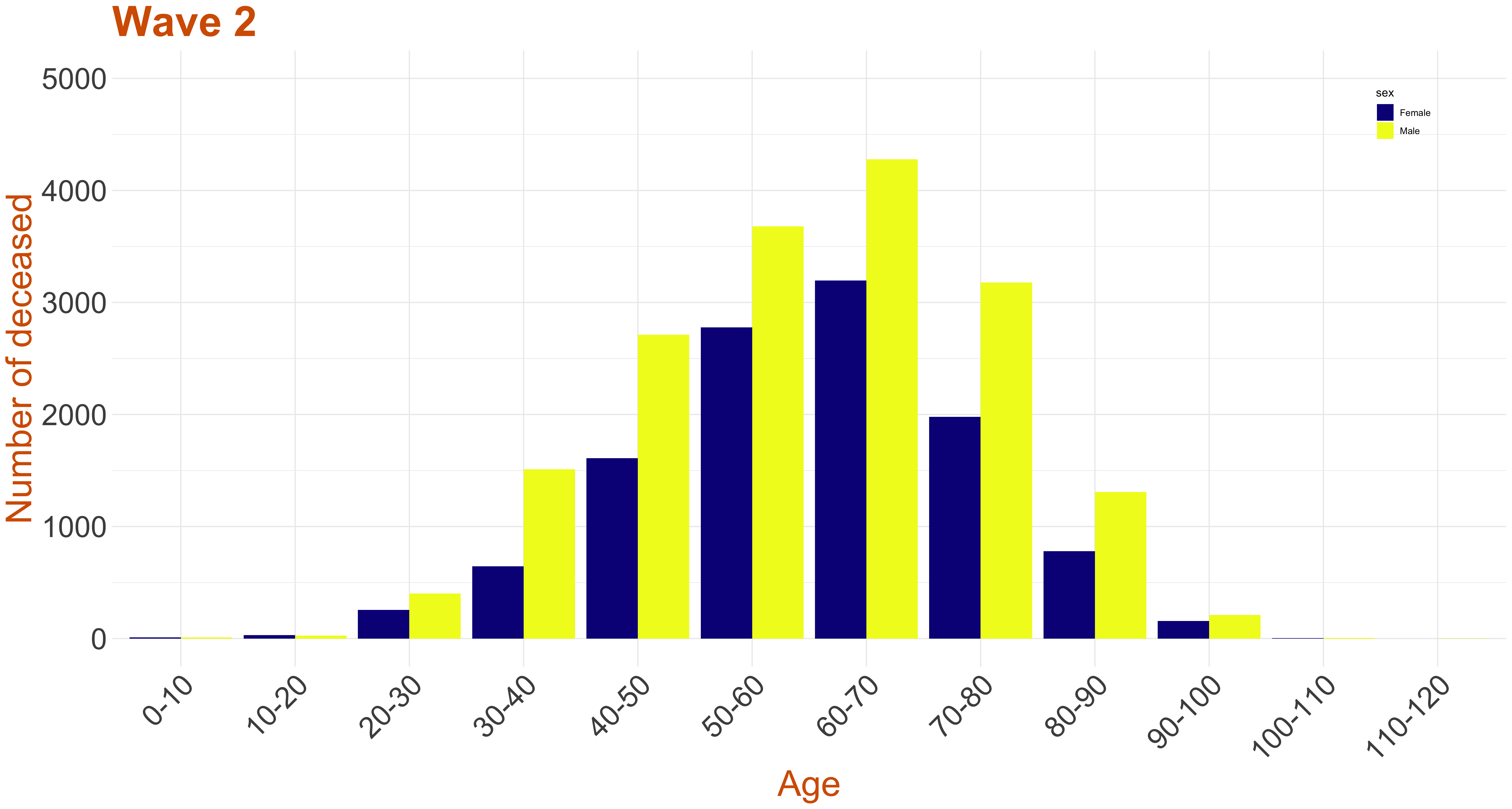
Age Distribution Across Waves
The graph in right, we plot a stacked histogram of age distribution across waves. The deceased population between 0-40 has increased three fold during wave 2 and around two fold in the other age groups.
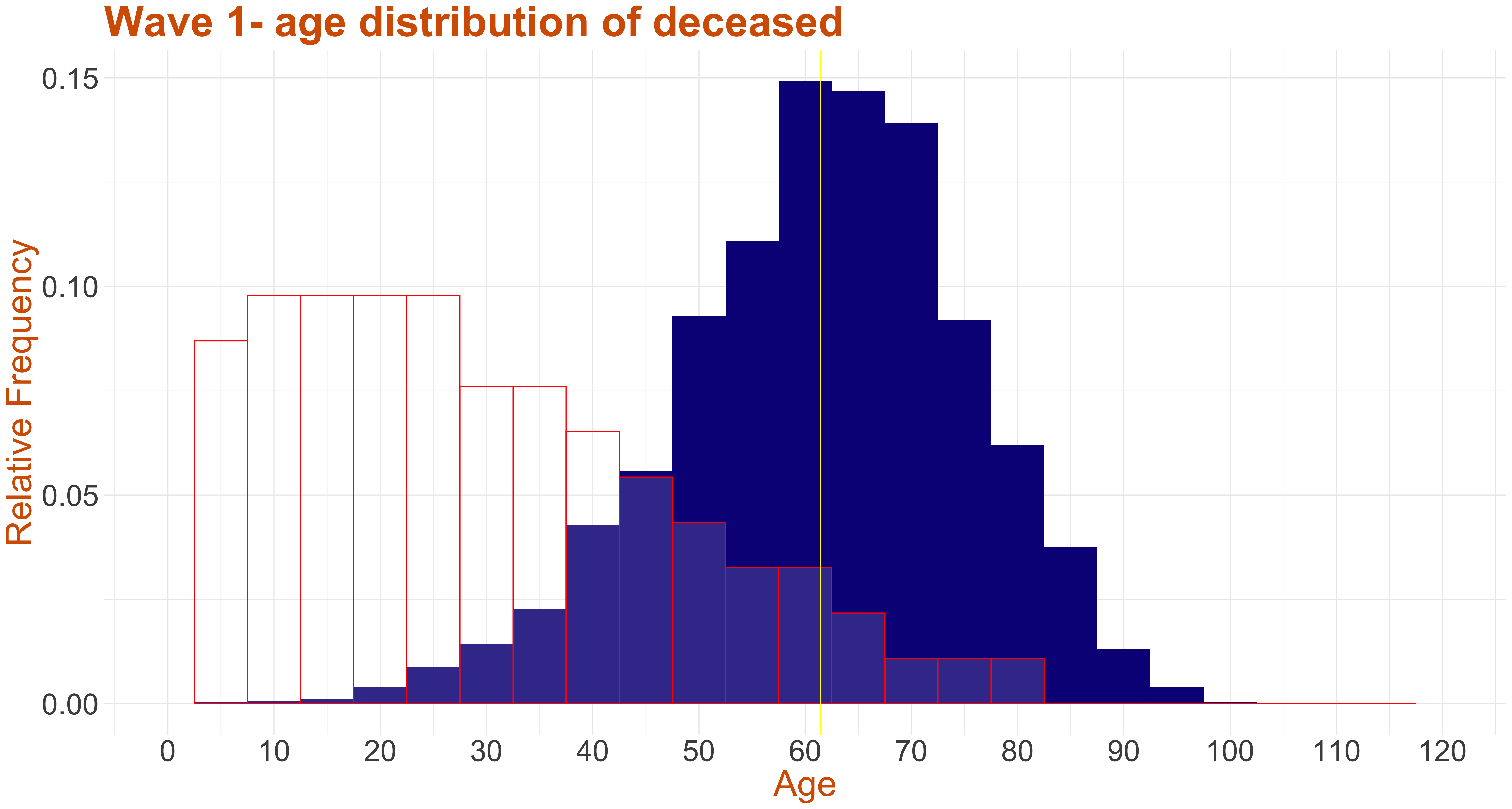
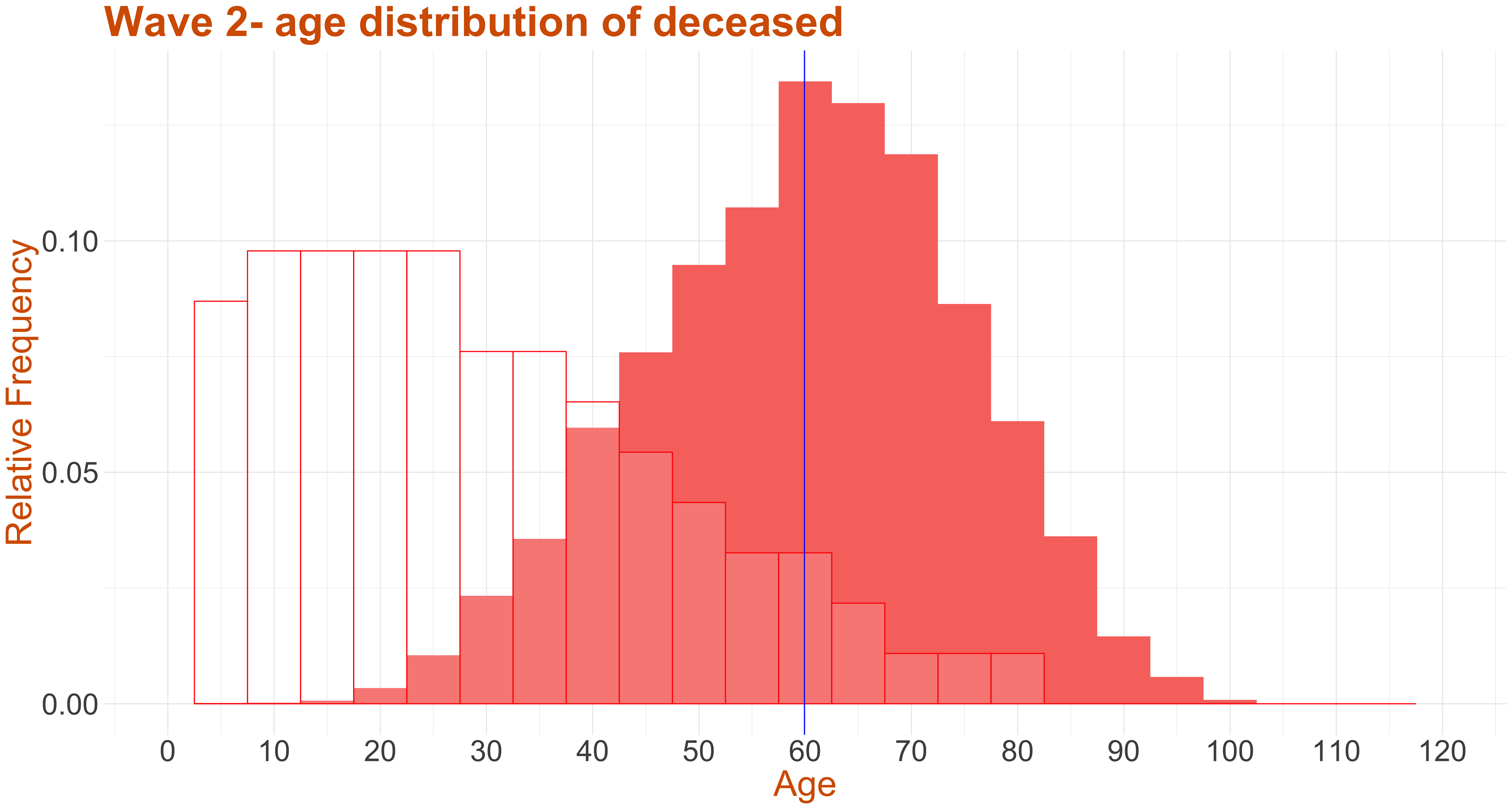
The two graphs shown below present the age distribution of wave 1 and wave 2 deceased COVID-19 patients along with the census of population of Karnataka for reference.
Though the trends in wave 1 and wave 2 are almost similar, from the graph it can be seen that the mean age of deceased in wave 1 is around 61
and wave 2 is around 60.
Gender Distribution Across Waves
In all the below stacked age-gender graphs, the yellow color indicates the males while the blue indicates the females.
Data: Wavewise Deceased Age counts and Ratio
The number of deceased across the age categories of 0-10, 10-20, 20-30, 30-40, 40-50, 50-60, 60-70, 70-80, 80-90, 90-100, 100-110 and 110-120 is calculated. The number of males and females dead in each of the mentioned age category is also calculated. Then, the ratio the number of males dead to the number of females is calculated.
The column has data on:
To understand the male and female death counts from the data, let us consider an example. Say, the total death count for some age category during some wave is 40 and the corresponding male to female ratio is 1.5. This implies that the number of males is 1.5 times the females. So, the total count, which is the sum of the number of males and females, will be (1.5 + 1 = 2.5) times the number of females. Finally, the number of females, here, would be 40/2.5 = 16 and number of males would be 40-16 = 24.
It can be observed that most of the ratios are above 1, suggesting that the number of males dead is higher than that of the females. You can download the data from here.
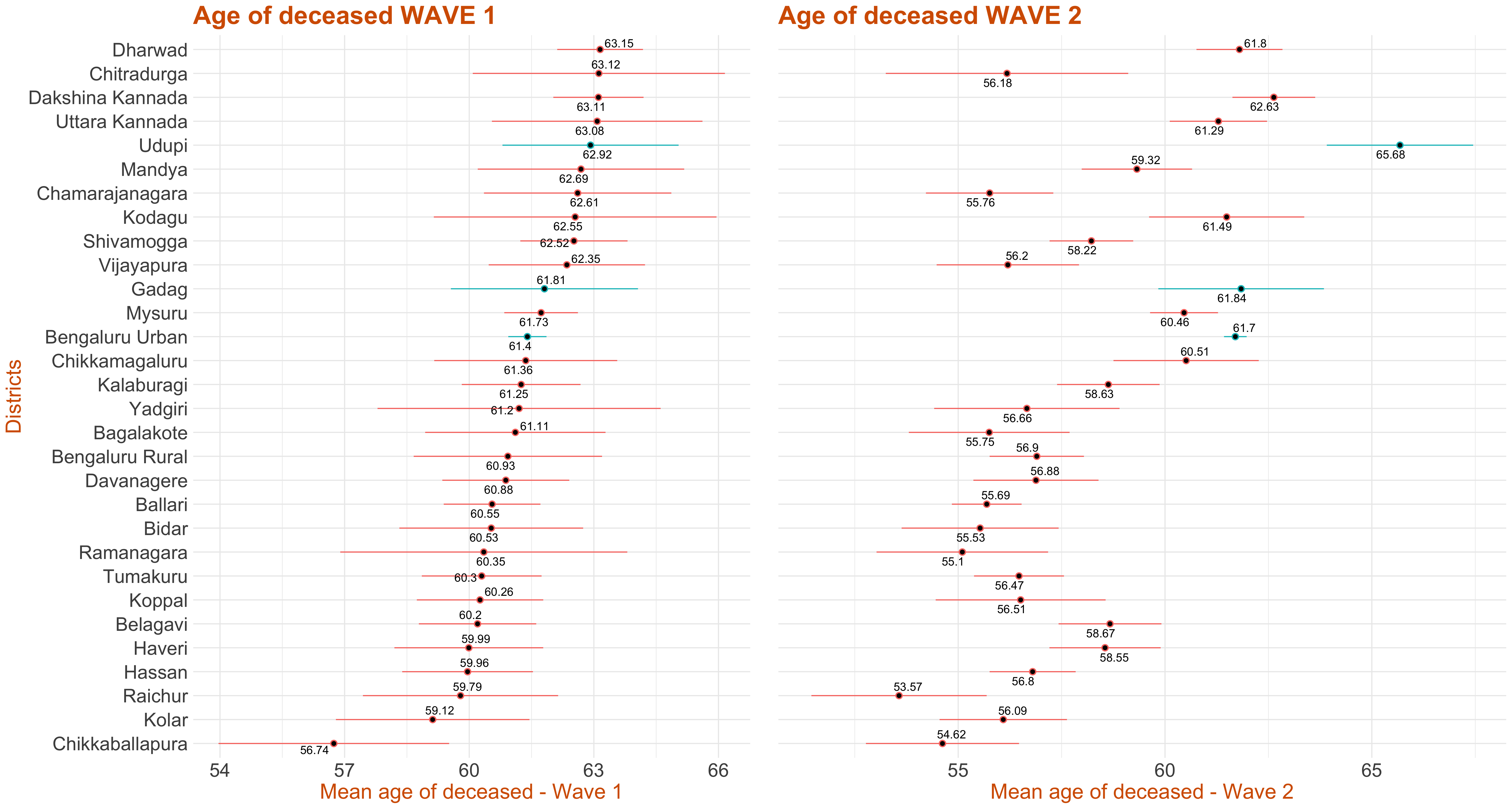
Confidence Interval for Age Across Districts
This plot represents the confidence interval for the age of the deceased by each district. It has been ordered in descending order of mean age of the deceased in wave 1. The 95% t-interval around the mean age has been calculated and plotted. A wide variation about the districts can be observed. If the colour of the interval line is red,it implies that the corresponding district has high mean age of deceased in wave 1 as compared to wave 2, else if the interval line is green, it implies that this district has high mean age of deceased in wave 2 as compared to wave 1.
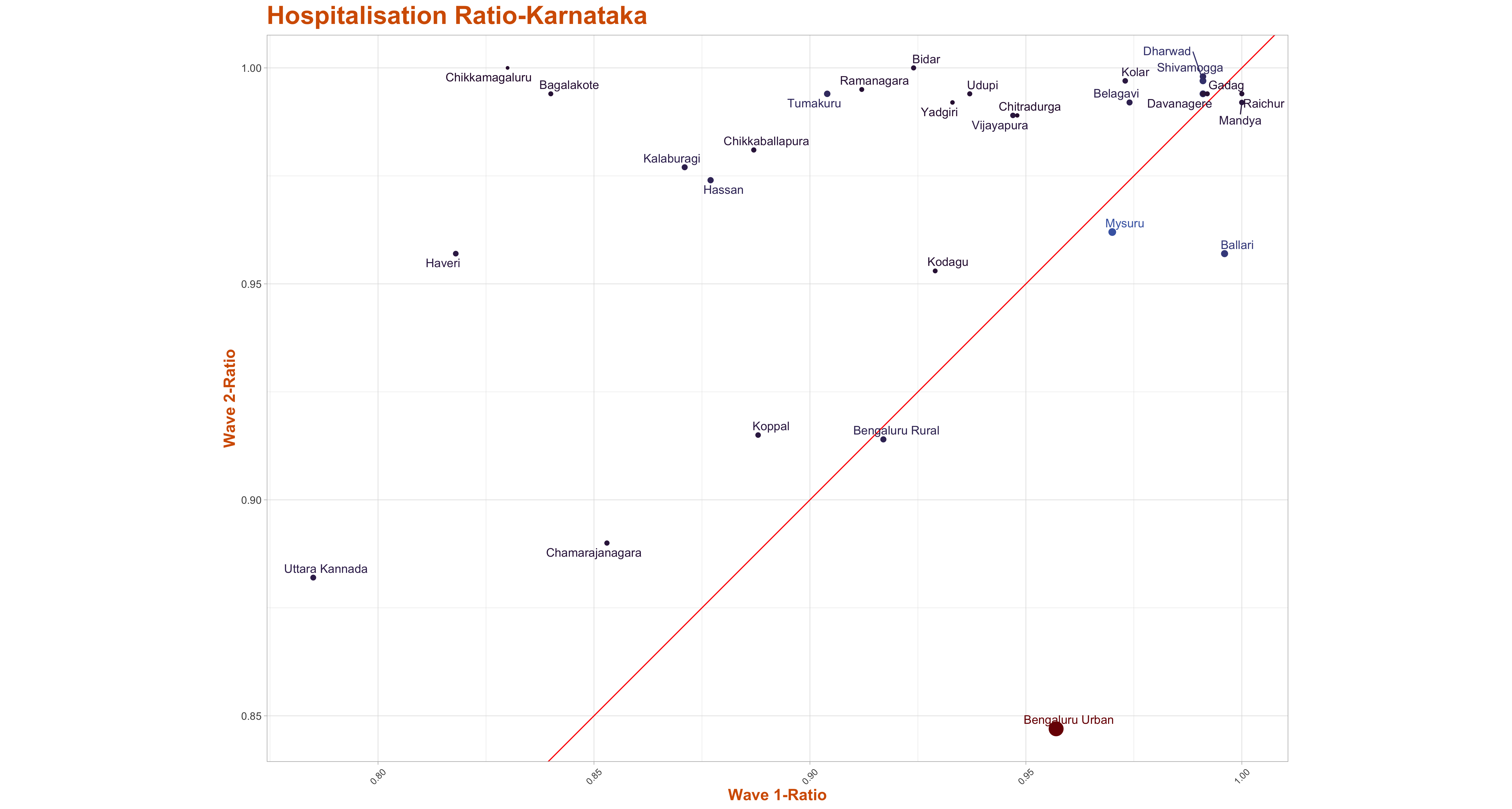
Hospitalization of Deceased patients Across Waves
The scatter plot of Hospitalization Ratio of the deceased patients has been presented here across districts wave-wise.The Media Bulletin reports each deceased patient as either admitted to hospital, brought dead or died at residence, we call both the categories brought dead and died at residence as deceased patients who were not hospitalized.Then for each district, we count the total deceased patients and total hospitalized patients and take the ratio of hospitalized patients to total deceased patients to arrive at the hospitalization ratio.We calculate the ratio for each district wave wise and then plot a scatter plot along with line y=x. The districts above the line x=y indicates that those have a higher hospitalization ratio in 2nd wave in comparison to the 1st wave.
Data: Hospitalization Ratio across Waves
As per the media bulletin published by the state government, each individual death is reported either as hospitalised, brought dead,or died at residence.In the data file, for each individual district, we first categorise the deaths into waves, and we provide the count of total death, total deceased patients who were hospitalised, and deceased patients who were not hospitalised, that is, we added the deceased who were either brought dead or died at residence.Then we also calculate the ratio of hospitalisation and the ratio of unhospitalised patients and the values are listed in individual column of the csv file attached.
The column has data on:
You can download the data from here.
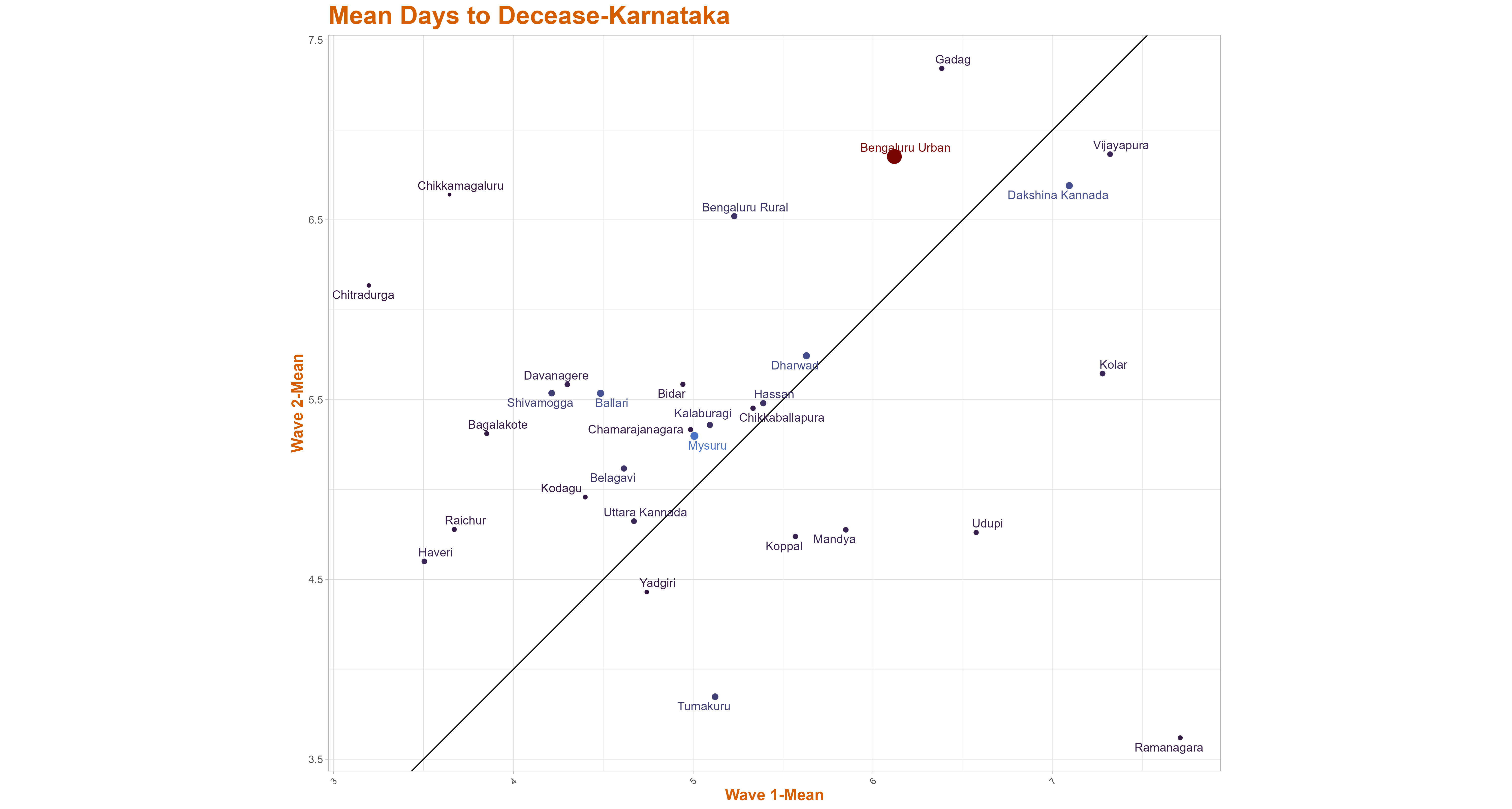
Mean Days to Decease
The graphs below represents the scatter plot of mean days to decease across districts wave-wise. The x-axis represents the wave-1 mean days to decease where as the y-axis represents the wave-2 mean days to decease. The size of the blob indicates the total death in that district. The districts above the line x=y have high mean days to decease in wave-2 as compared to wave 1 and the districts below the line x=y have high mean days to decease in wave-1 as compared to wave 2.
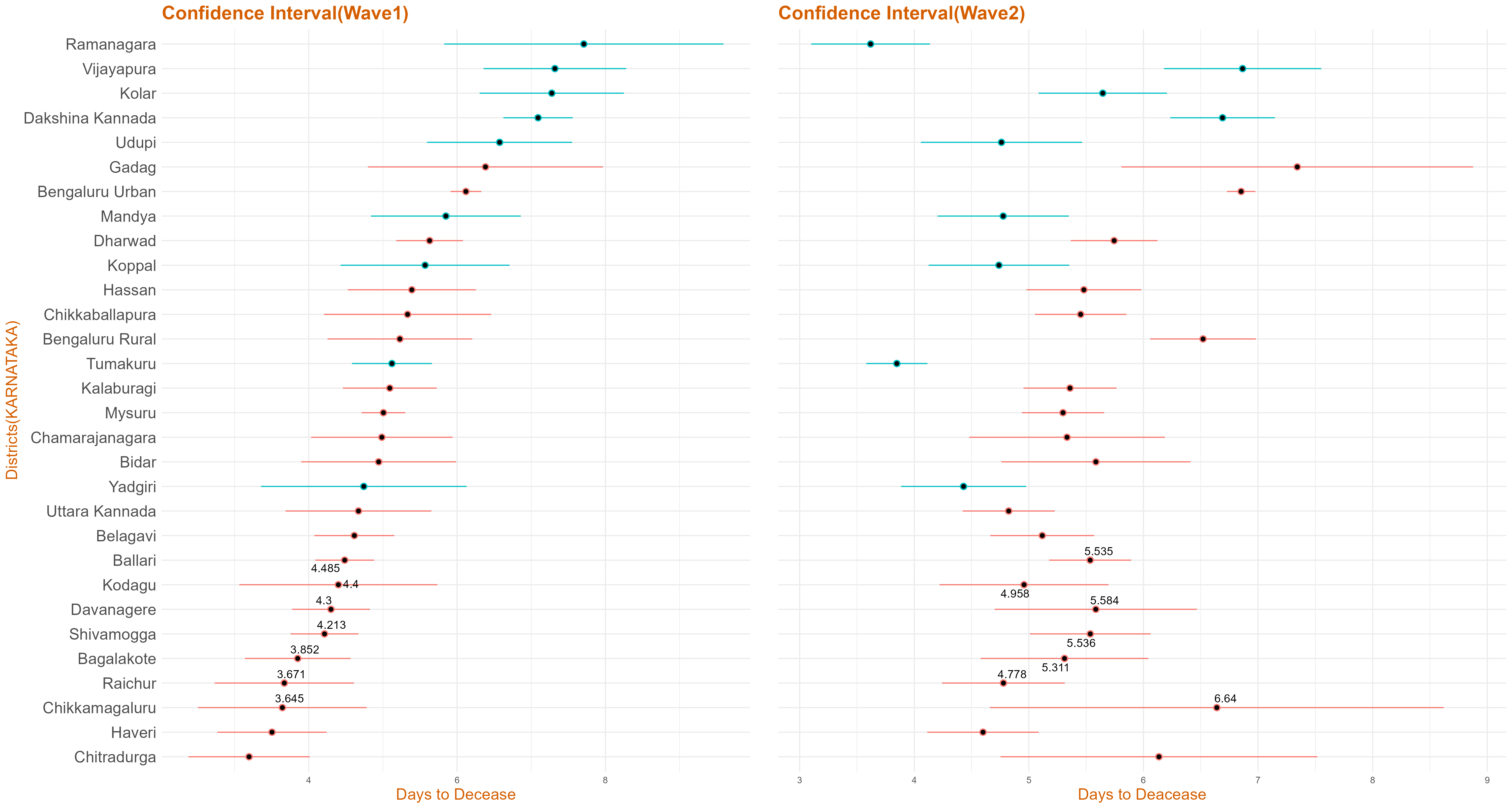
Confidence Interval for Days to Decease
The graph below represents the confidence interval for days to decease(wave-wise) in Karnataka based on the data collected. The 95% t-interval around the mean is calculated and plotted below.If the colour of the interval line is red, it infers that this district has high mean days to decease in wave 2 as compared to wave 1, else if the interval line is green, it implies that this district has high mean days to decease in wave 1 as compared to wave 2.
Data: Days to Decease (Wave1 Vs Wave2))
From the media bulletin, we take difference of the admission date and the date of decease for each deceased patient who was hospitalised and call the difference as days to decease.We then take the death counts across district wave-wise.
The column has data on:
You can download the data from here.
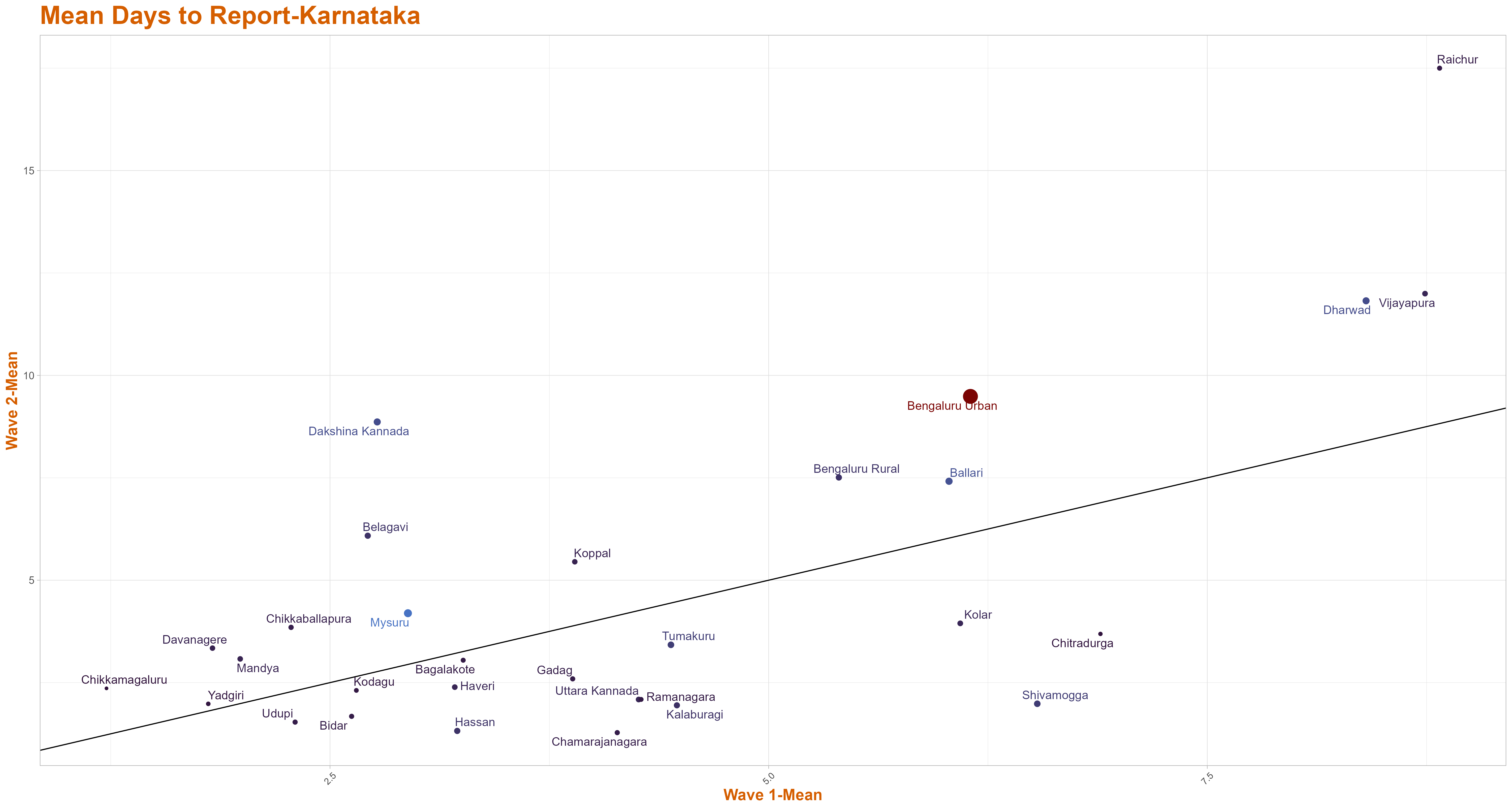
Mean Days to Report
The graphs below represents the scatter plot of mean days to report across districts wave-wise. The x-axis represents the wave-1 mean days to report where as the y-axis represents the wave-2 mean days to report. The size of the blob indicates the total death in that district. The districts above the line x=y have high mean days to report in wave-2 than wave 1 and the districts below the line have high mean days to report in wave-1 than wave 2.
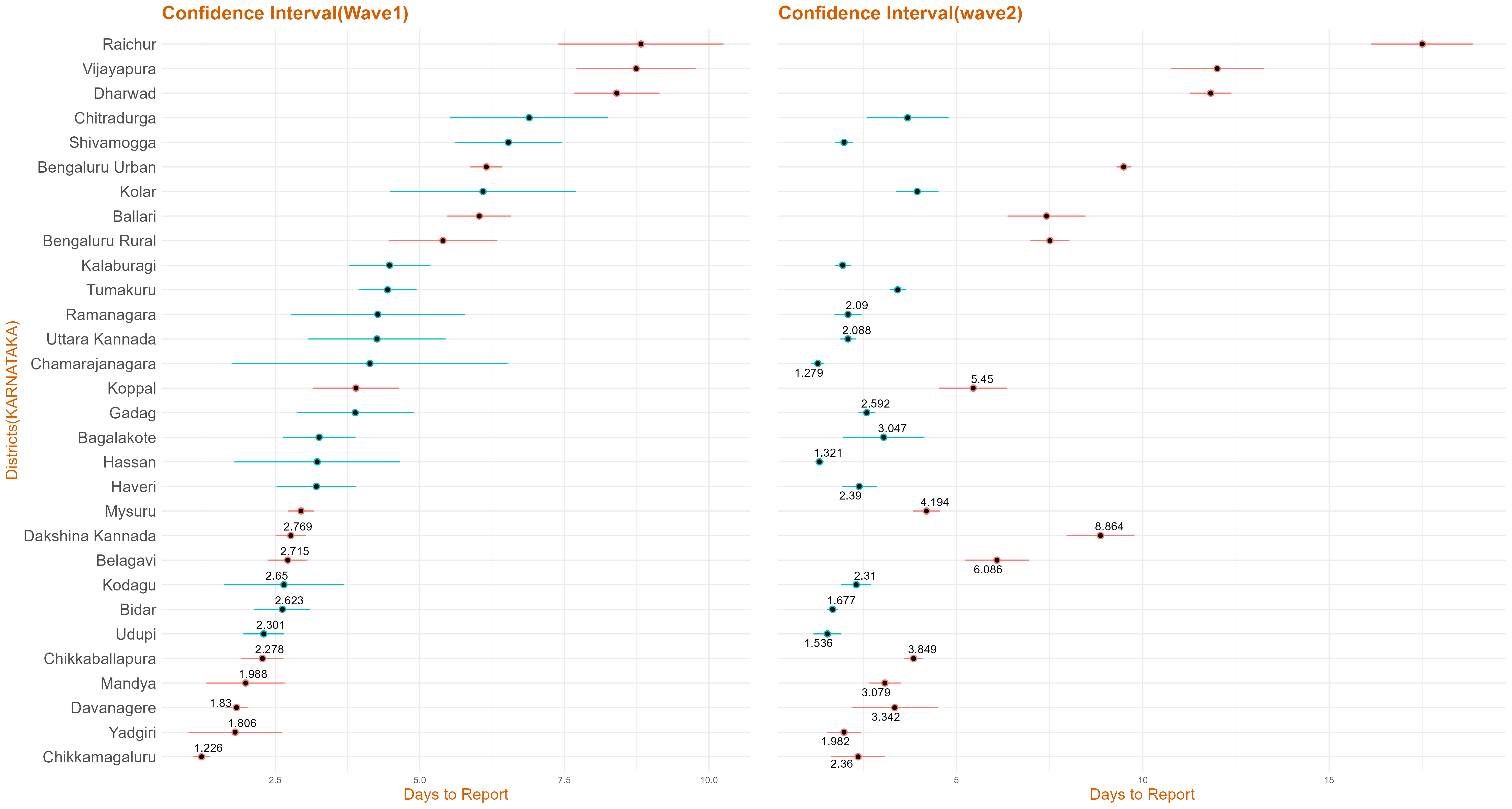
Confidence Interval for Days to Report
The graph below represents the confidence interval for days to report(wave-wise) in Karnataka based on the data collected. The 95% t-interval around the mean is calculated and plotted below. If the colour of the interval line is red, it infers that this district has high mean days to report in wave 2 as compared to wave 1, else if the interval line is green, it implies that this district has high mean days to report in wave 1 as compared to wave 2.
Data: Days to Report (Wave1 Vs Wave2))
From the media bulletin published by the state government, we took the difference between the date of decease and the media bulletin date and call the difference as the days to report.We then take the death counts across district wave-wise.
The column has data on:
You can download the data from here.