Infection Doubling Time in India
Mathematical models used to characterize early epidemic growth feature an exponential curve. This phase of exponential growth can be characterized by the doubling time. Doubling time is the time it takes for the number of infections to double. Our study here has been inspired by the study of Doubing times of COVID-19 cases worldwide by Deepayan Sarkar.
What is Doubling Time?
For a given day, the doubling time tells you the number of days passed since the number of cases was half of the current count. A higher doubling time means it is taking longer for the cases to double, and indicates that the infection is spreading slower. Conversely, a lower doubling time suggests faster spread of infection. For an infection growing at a constant exponential rate, the doubling time is constant. However, as observed in the COVID-19 situation, due to interventions like social distancing, lockdown and containment of hotspots of infection, the doubling time fluctuates and is a function of time. It also varies between districts, states, and countries which maybe in different stages of infection.
One technical note before we begin: All the graphs start from the first date on which the count surpassed 50 and the number of infections was at least twice as that on 10th March. Hence, different graphs have different starting dates.
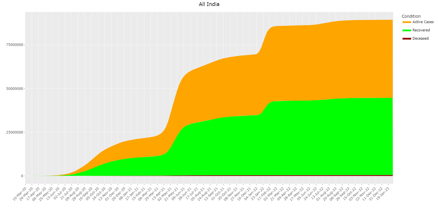
All India Timeline
The plot presented as an area graph, provides a comprehensive overview of COVID-19 cases across various categories over time. The x-axis delineates dates, offering a chronological perspective, while the y-axis captures the cumulative numbers of active, recovered, and deceased cases. This visualization encapsulates the trajectory of the pandemic in India, offering insights into the progression of active cases, recoveries, and unfortunate fatalities. The area graph format enables viewers to easily discern the relative proportions of each category and track changes in their distribution over time.
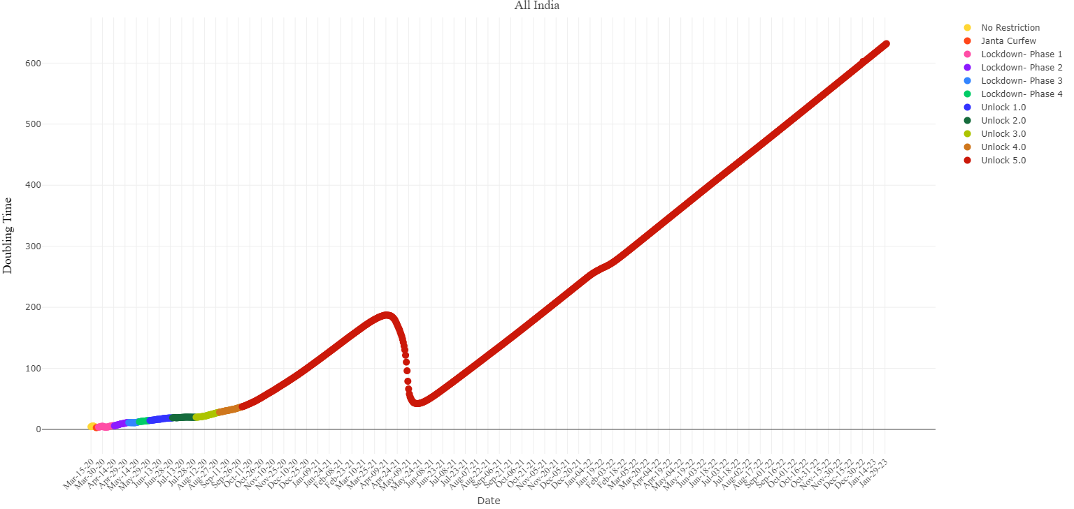
All India Doubling Time
Consider the graph below, where we have plotted the all-India infection time line on log scale. The different phases of the lockdown have been colored differently and a regression line has been fitted for each phase of the lockdown.
The slope of the regression line is the effective rate of exponential growth and effective doubling time is log(2) divided by
the rate of growth. The legend indicates the time taken for infections to double in each phase.
As indicated above, the dots represent the number of infections over time on the log scale. The y-axis has been plotted in the log scale, that is,
, 10, 102,103,... will be equidistance instead of 10,20,30,... on the linear scale.
Hovering over the dots will give you the precise value of doubling time. For example, if we hover the mouse over March 30th then we find that the doubling time is 5.04. Indeed, on March 30th the total number of infections was 1200 odd and March 25th the total number of infections was 560 odd.
One can compare the doubling times of India with other countries at the Doubling times of COVID-19 cases worldwide website.
Doubling Time for States in India
We presents an analysis of the doubling time for COVID-19 cases across various states during different phases of the lockdown. On the x-axis, dates are plotted to showcase the progression of time, while the y-axis represents the doubling time for each state. Doubling time is a critical metric in understanding the rate of growth or decline of infections, indicating how long it takes for the number of cases to double. By segmenting the data into different phases of the lockdown, this plot provides insights into how the effectiveness of containment measures influenced the spread of the virus in different regions over time. It helps in assessing the impact of lockdown policies on controlling the outbreak and identifying areas that may require targeted interventions or support. Click here to see plots of each state.
Maharashtra Doubling Time
Using doubling time we can understand whether or not the growth of the infection is in the exponential phase or not. We shall now examine graphs of Maharashtra and Kerala. For Maharashtra, in the log-scale, we observe that the slopes of the regression lines for each phase of the lockdown specify the effective doubling time. In the doubling time graph we observe that doubling times don't seem to follow any trend till April 27th, 2020. Since then they have been roughly increasing till 17 June. Thus one may understand the growth of the infections in Maharashtra by taking the two graphs together.
Kerala Doubling Time
Next we examine Kerala. In the graph below, the doubling time has been increasing consistently till May 15th, 2020. However, from 22th May onward, the doubling times have been decreasing, with a sharp dip seen on 24th May, 2020. This can be attributed to the relaxation in lockdown which allowed migration into the state. Below, in the log-scale graphs it can be observed that the different phases of the lockdown have different effective doubling times.
In the States Time Line Pages we have plotted the doubling time graphs for states with more than 90000 infections, for states that have between 90000 to 9000 infections and for states with less than 9000 infections. As with Kerala, other states also may show a decrease in doubling time after 22nd May due to relaxation in the lockdown.