Deceased Data in India
This section presents a comprehensive analysis of mortality related to the pandemic within the country. It encompasses various plots and visualizations that shed light on different aspects of fatalities caused by COVID-19. The section typically includes plots such as "Total Deceased Cases Over Time" which illustrates the cumulative number of deaths recorded over the course of the pandemic, providing a longitudinal view of mortality trends. Additionally, plots like "Deceased by Infected Ratio" are featured, offering insights into the relationship between confirmed cases and fatalities, aiding in understanding the severity and fatality rate of the virus.
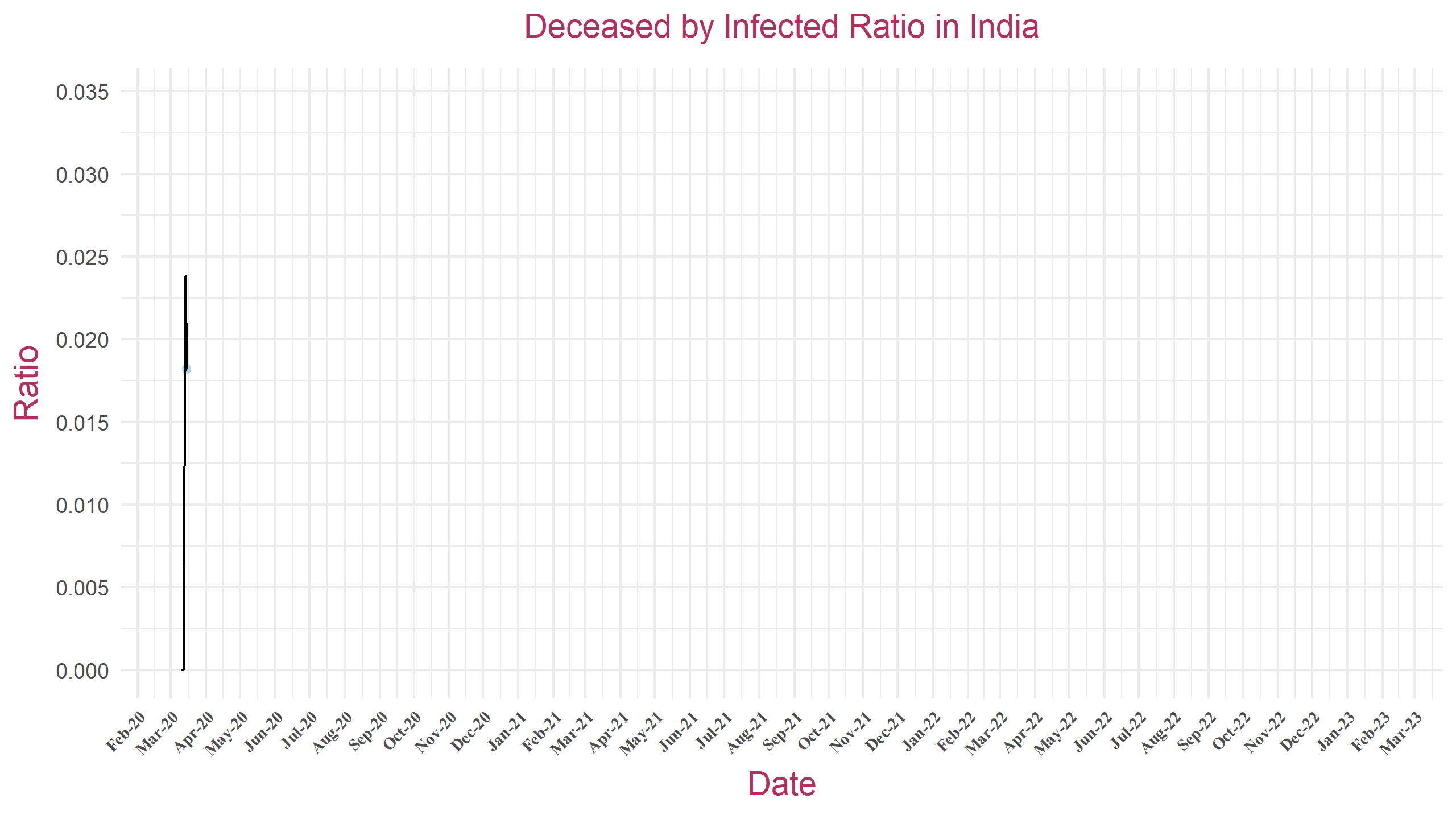
Deceased by Infected Ratio
The "Deceased by Infected Ratio" plot depicts the ratio of deceased individuals to the total number of infected cases over time. On the x-axis, dates are plotted to show the progression of the COVID-19 pandemic, while the y-axis represents the calculated ratio. This plot offers insights into the severity of the virus's impact by tracking how the mortality rate relative to the infection rate evolves throughout the pandemic.
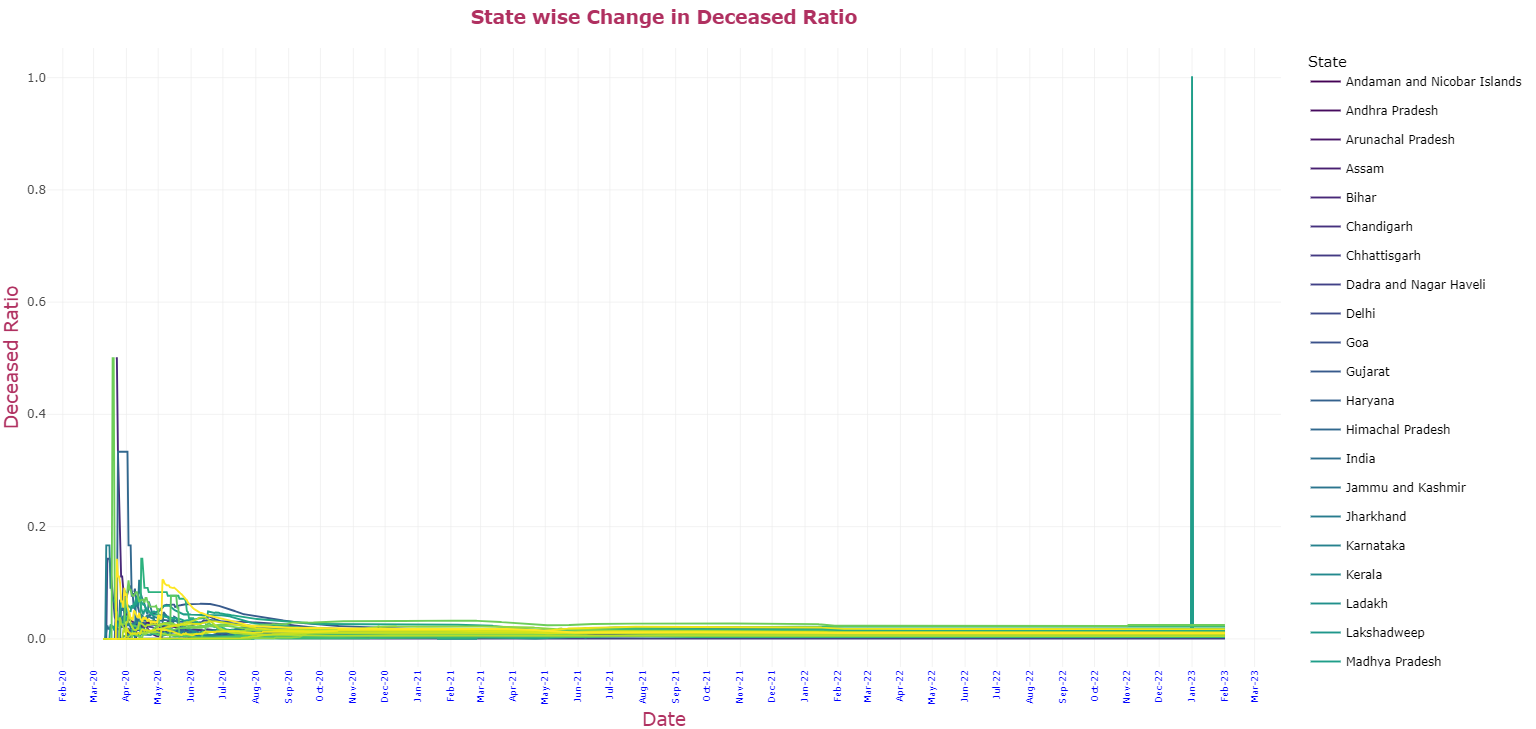
State wise Change in Deceased Ratio
The "Statewise Change in Deceased Ratio" plot depicts the variation in the deceased ratio across different states over time. On the x-axis, dates are represented to provide a temporal perspective, while the y-axis displays the deceased ratio, which is the proportion of confirmed COVID-19 cases that result in fatalities. This visualization enables viewers to track how the mortality rate has evolved in various states throughout the course of the pandemic.