Hospitalization Requirements
During the spread of an infection as contagious as COVID-19, it is imperative for the state to understand the capacity of Hospital beds, ICU beds, ICU Oxygen/Ventilators required. This will reduce a patient's waiting time for treatment and also maximize health care response.
Total Tests Done
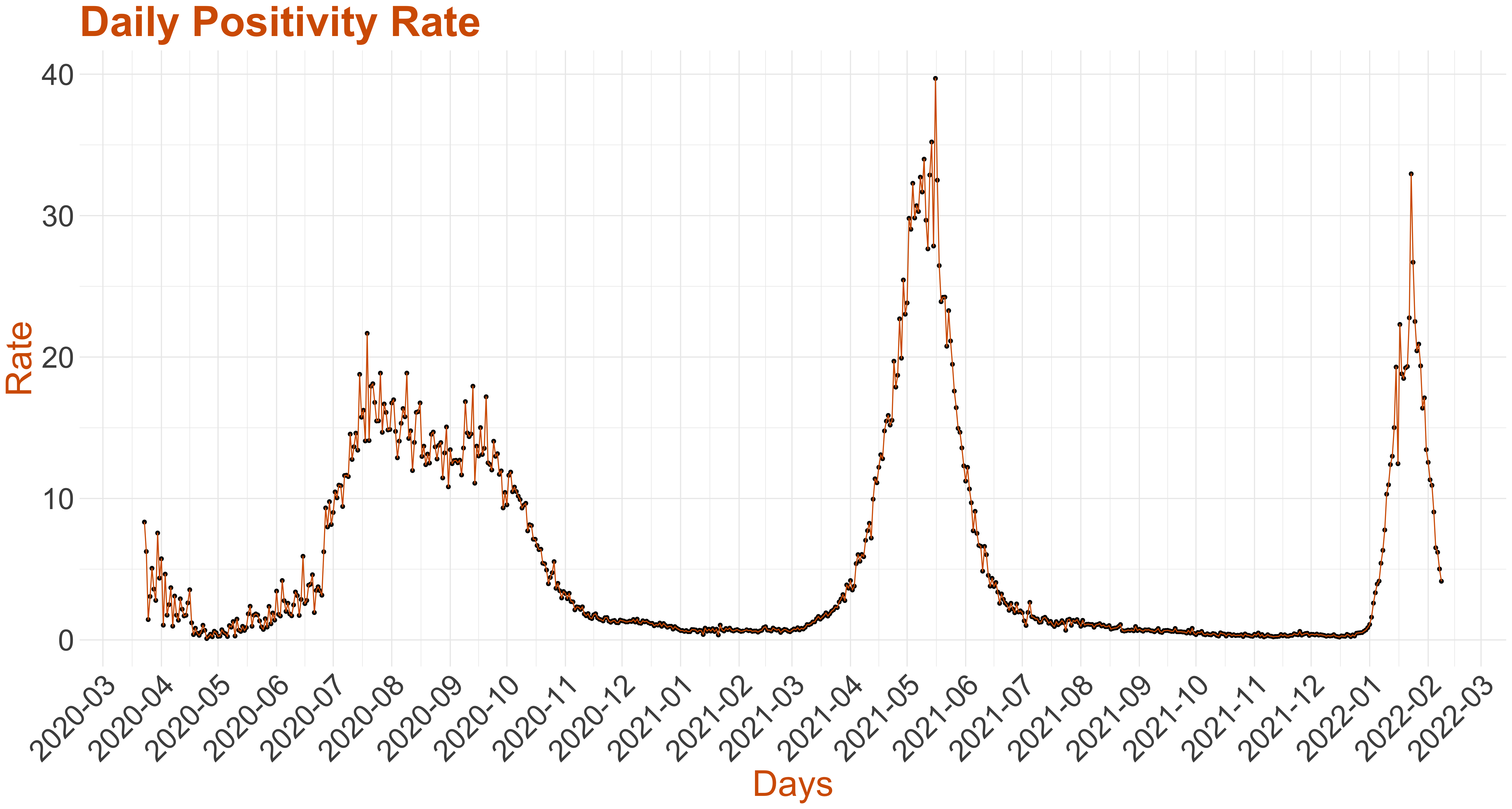
It is widely believed a strong testing regimen is the best indicator of infection spread.
The above graph is a continuous analog of a stacked bar chart. It is used here to show the composition of the testing done in Karnataka. The growth in area of red colour over time represents the total number of positive tests till that day, green colour over time represents the total number of negative tests till that day and finally the blue color represents the total number of tests whose results are awaited till that day.
From 17-July onwards, the Media Bulletins contained information on the number of Rapid Antigen tests and RTPCR & other methods. Different tests are used for different types of patients and may have different test positive fractions. We consider all the tests cumulatively done, including the Rapid Antigen Tests.

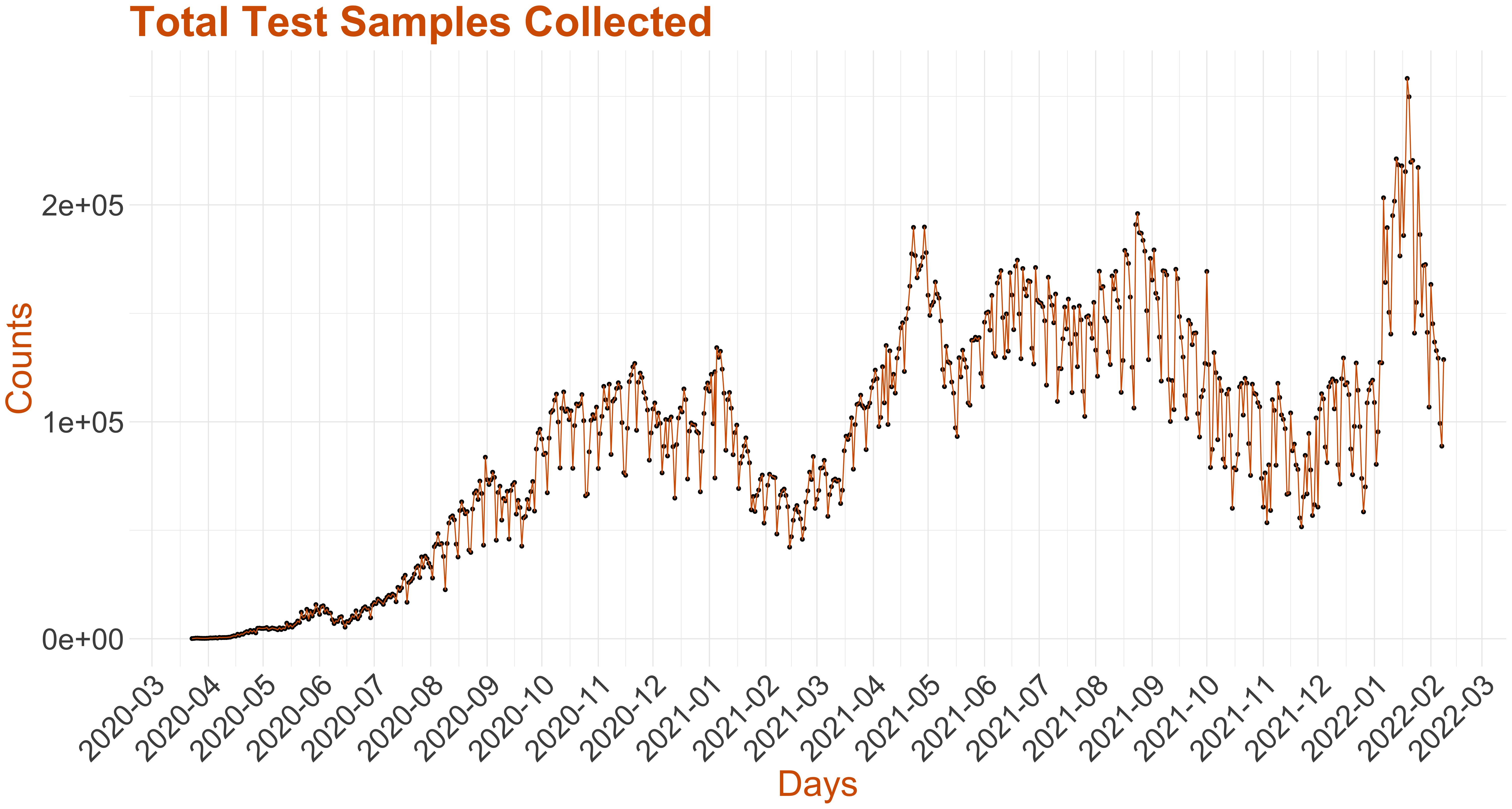
Total Test Samples Collected
In this graph we plot the total number of tests done on a daily basis since March 2020 in the state.
There were two typographical errors in the Media Bulletins. On 17th March, 2020 the number of positive tests was incorrectly mentioned as 1 even though the cumulative count had gone up by 4. This we have rectified in the above. On 25th March there was a discrepancy in the cumulative and daily counts for negative samples. 25th March onwards, we have considered the daily counts instead of the cumulative counts of negative samples in the Media Bulletins.

ICU Utilization Timeline-Karnataka Districts
In Karnataka, the utilization of Intensive Care Units (ICUs) within the district healthcare system has evolved through a dynamic timeline, reflecting a complex interplay of factors. From urban hubs to rural areas, each district presents its unique challenges and requirements in managing critical care services. Over the years, ICU utilization has shown fluctuations, influenced by diverse variables such as population density, healthcare infrastructure, and the prevalence of diseases. Seasonal patterns, sudden spikes due to emergencies or epidemics, and gradual increases in demand characterize this timeline. Click here to see the graphs for all districts.
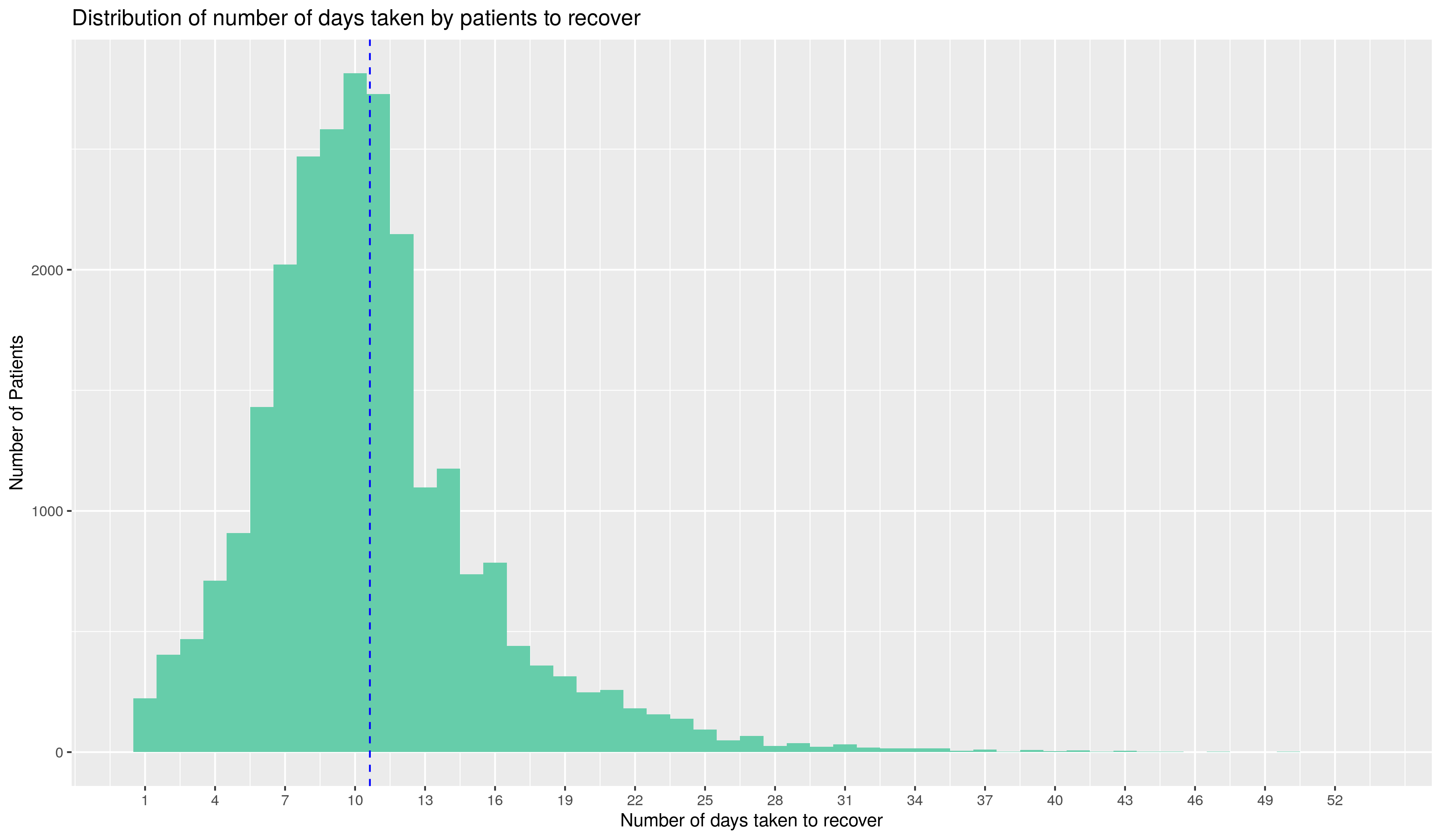
Days to recover
To better approximate the hospital beds requirement, and get an idea of how long an infected person remains infectious, we plot the time taken for recovery for the patients in Karnataka alongside the time taken for the patient to succumb to the disease.
On the right, we have plotted a histogram of the number of days to recover for all discharged patients. The blue dotted line shows the mean of the recovery time of the patients. Note that the above graph contains information only on those patients whose recovery has been reported by the state. For a few days after 8th May, the recovery data was provided in a consolidated manner. This graph contains information on all the patients who have recovered, excluding the ones who have recovered on those days.
Days from tested Positive to succumbed to the disease
On the right, we plot the same for those who have succumbed to the disease. This distribution continues information on all those patients who have succumbed to the infection.
Further, it is seen in the graph on the right that a large fraction of patients who have succumbed to the disease have tested positive on the day they died. This is because the first column also includes those patients who passed away and later tested positive for COVID-19.
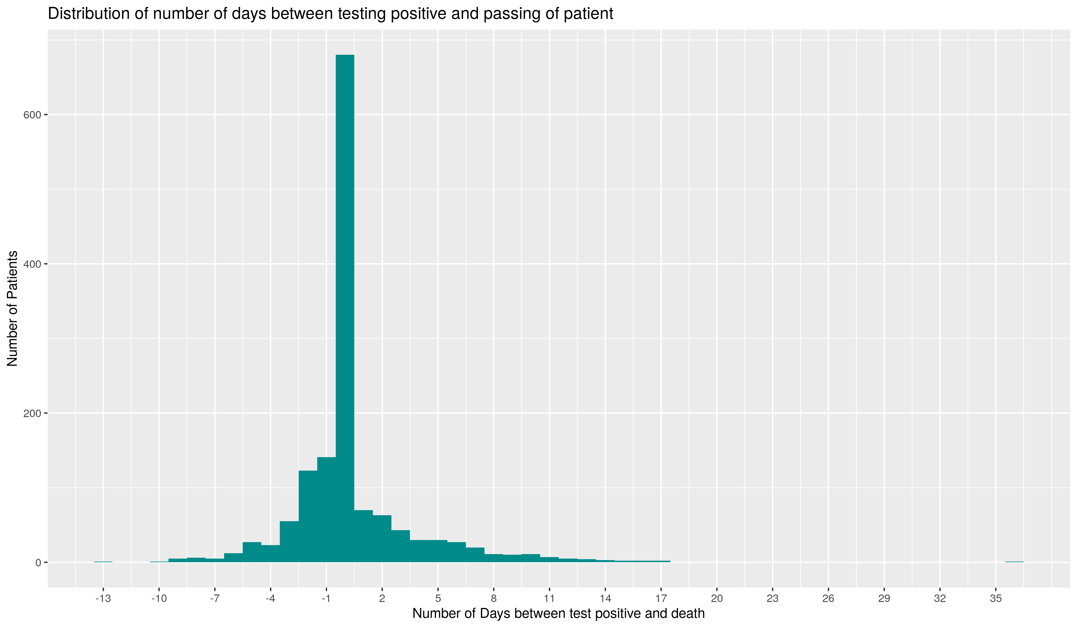
Days from tested Positive to succumbed to the disease
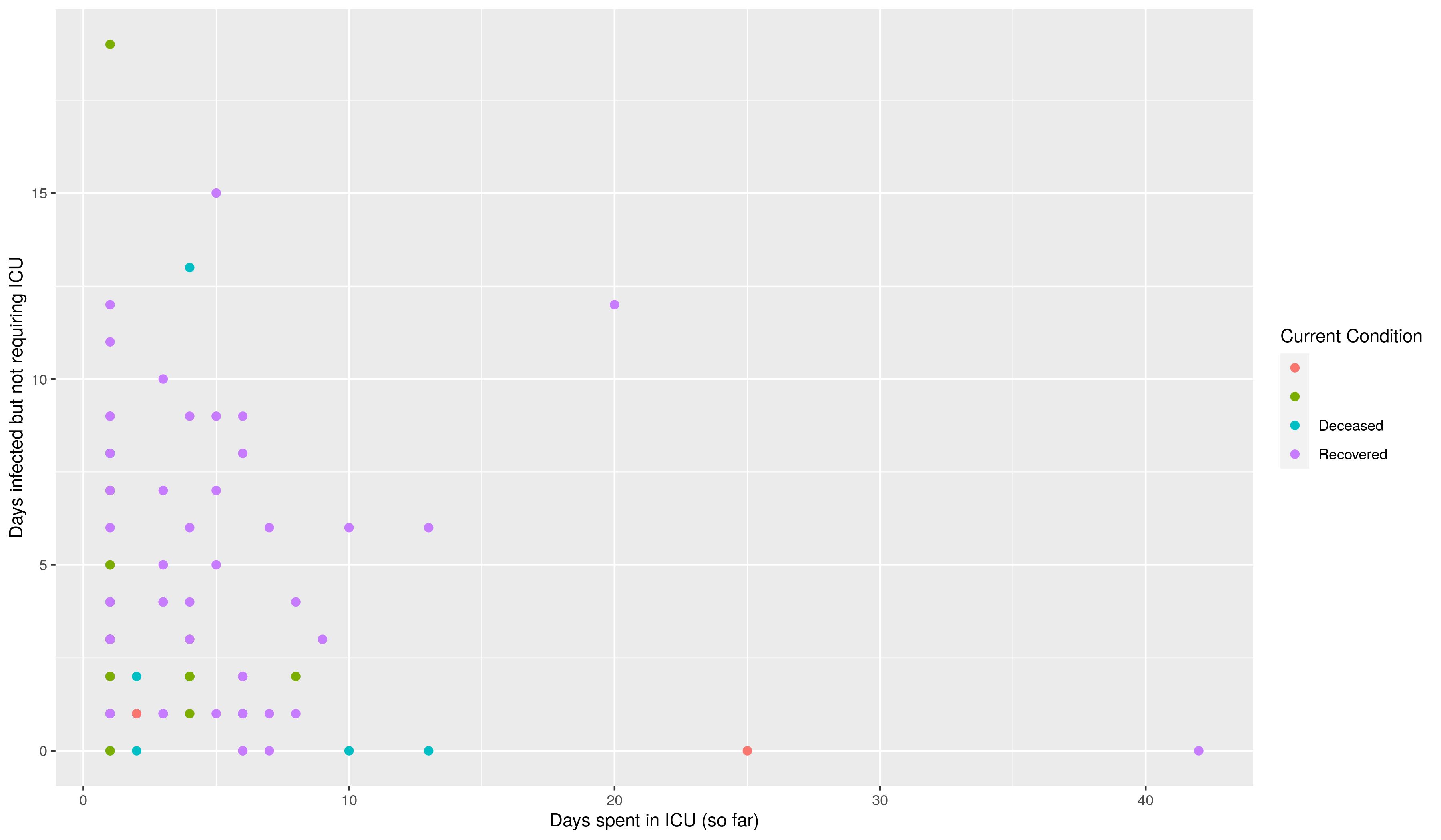
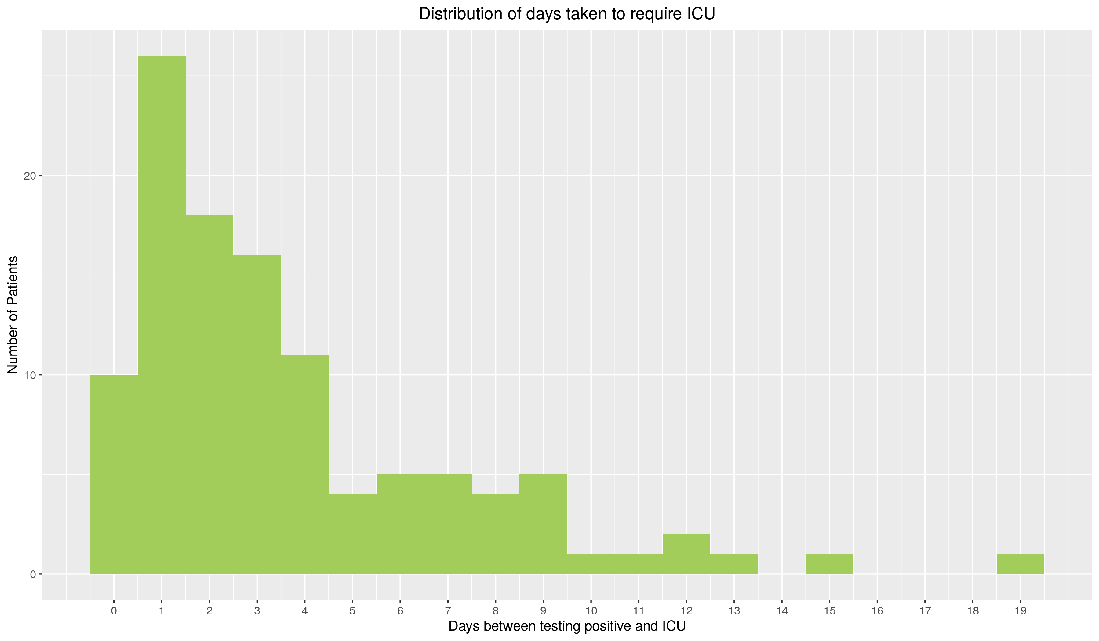
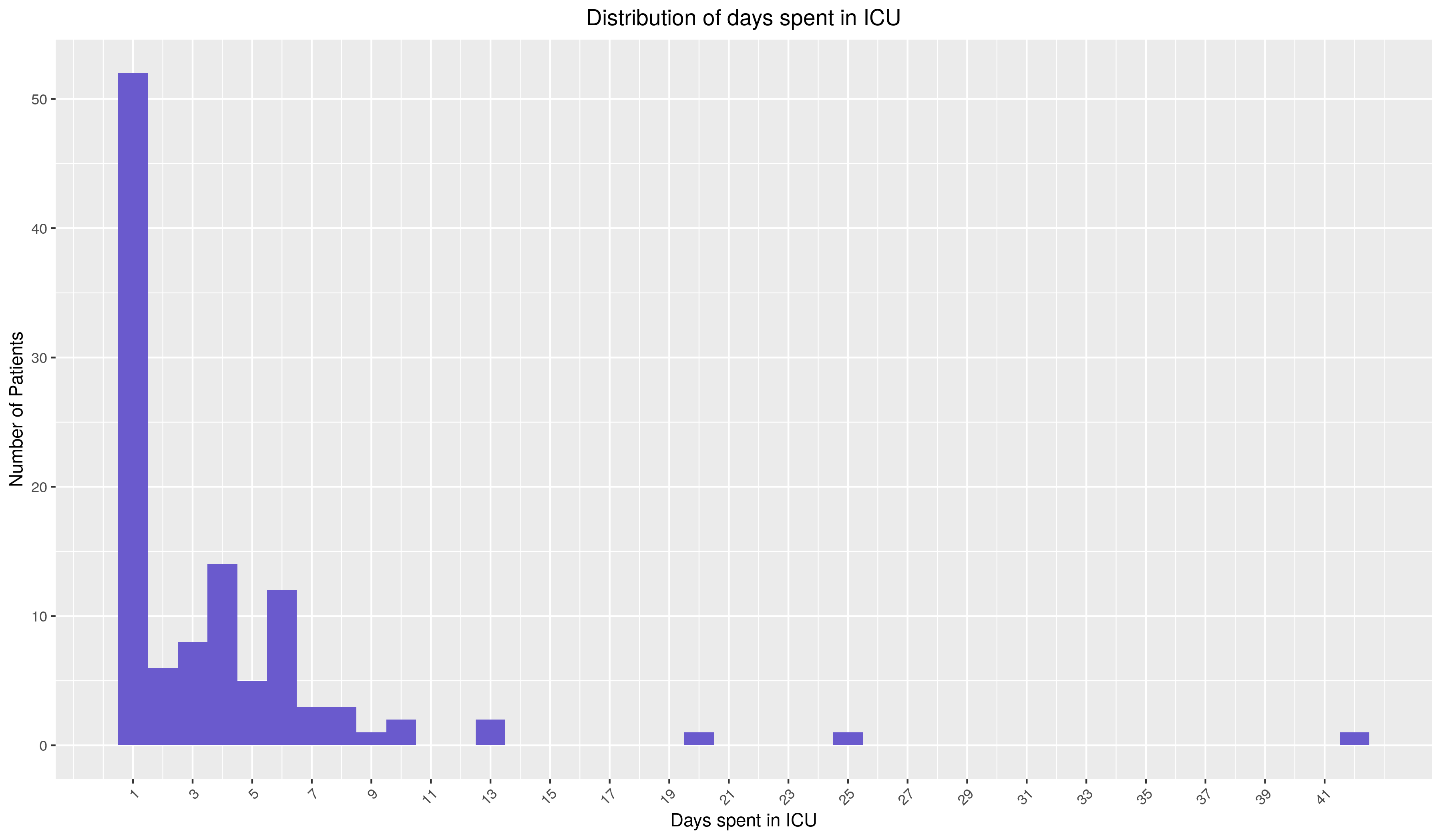
For those patients who were in ICU before May 8th, below is a scatter plot of the days they were infected before requiring an ICU and the number of days they've spent in the ICU so far.
The y-axis represents the number of days between the patient's testing positive and requiring ICU. The y-axis has the days they spent in an ICU. Since this graph also contains information on those patients who are still in ICU, some of the points may move further left. The points are colored based on the patient's current condition i.e. if they're recovered, deceased, still in ICU or requiring hospitalization. Hovering on the points will give you information on the patient's age, sex, city of residence and the cluster of origin of the infection.
Note that this graphs has been frozen on 8th May. The colors represent the condition of those patients who were in ICU on 8th May.