Active Cases in India
Active COVID-19 cases for all over india and each states are plotted. Along with the active cases, increase in cases and daily new cases are considered.
Active Cases for States in India
The plot on the left presents the progression of active COVID-19 cases across various states over time. The x-axis marks the dates, showing the timeline of the pandemic, while the y-axis displays the number of active cases. The plot on the right displays a comparative view of how different states experienced and managed the spread of COVID-19. Click here to see the graphs for all states.
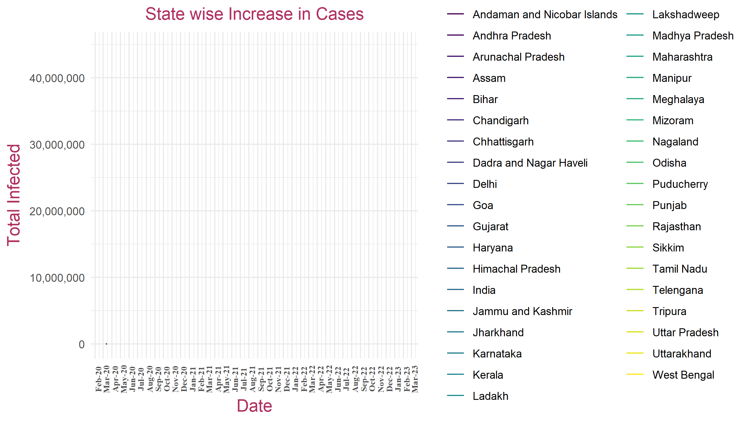
Increase in Cases for States in India
The "Increase in Cases for States in India" plot showcases the daily or periodic rise in COVID-19 cases across different states in India. The x-axis represents the dates, offering a temporal perspective, while the y-axis depicts the number of new cases reported. To see plots without total increased cases in india, click here:gif and html.
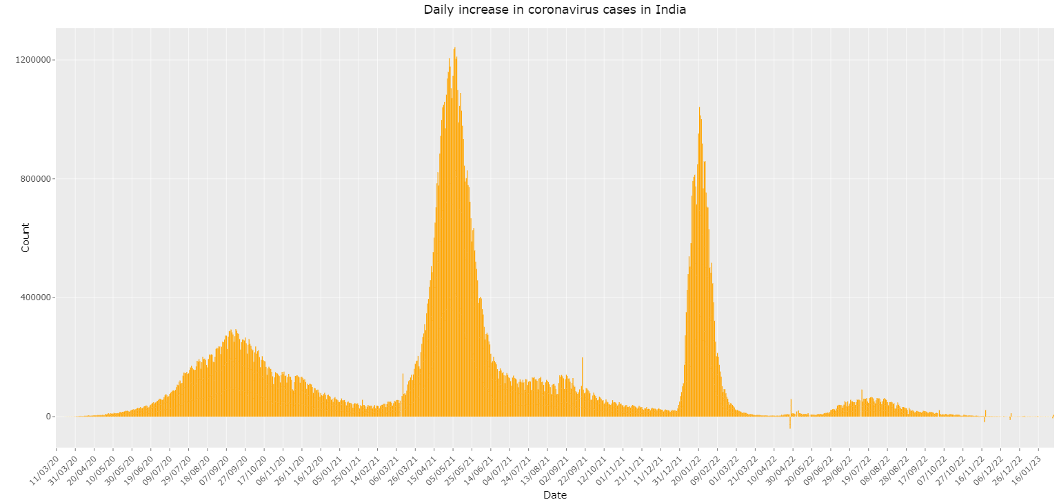
Daily New Cases
The plot showcases the number of new COVID-19 cases reported each day over a specified period. The x-axis represents the dates, providing a sequential timeline, while the y-axis indicates the number of new cases. This plot is crucial for understanding the day-to-day changes in the spread of the virus, identifying trends, and pinpointing spikes in infection rates. By examining this data, one can gauge the impact of public health measures, detect emerging hotspots, and make informed decisions regarding the management and mitigation of the pandemic.