Cluster Timeline and Information
The growth of the clusters in the Karnataka Trace history chart over time.
Cluster Timeline
An animation showing the growth of the clusters in the Karnataka Trace History chart over time.
Different clusters have been represented by differently colored lines.
This animation was frozen on 26th June as the Media Bulletins after that did not contain contact information.
The animation starts from 17th March. Hence, on the x-axis and the slider at the bottom, 1 corresponds to 17th March, 2 to 18th March and so on. The y-axis has the cumulative count of the number of cases. For information on specific clusters, one can click the lines of the clusters not required, on the legend on the right. In order to look at the condition on a specific day, one may click the label of the slider at the bottom for that particular day.
It can be observed that some clusters have flat lines for certain periods of time, which means that there is no growth in the number of cases in this cluster and the infection from these sources has been contained for that period of time.
Click here to get R code and CSV file.
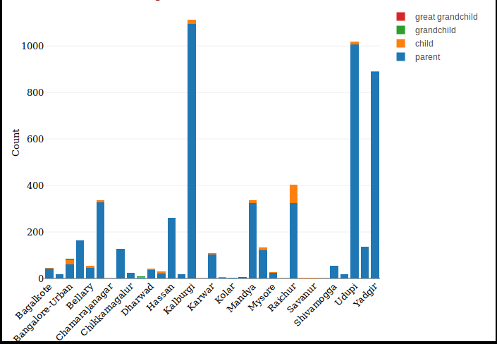
Cluster Information
In the Karnataka Trace History graph, the first generation nodes [at depth one] in the graph of each cluster are the patients who got the infection directly from the place of origin of the infection. These patients we shall call as 'parents' of the cluster. The ‘children’ are the people who contracted the disease from the people labelled as ‘parents’, that is, they are at a depth of two in the trace history chart. Similarly, ‘grandchildren’ and ‘great grandchildren’ have depth three and four respectively. In the above we have plotted the histogram of parents, children, grandchildren and great grandchildren in each cluster. We begin with a description of the parent-to child relationships within each cluster from the trace history.
This graph was frozen on 26th June as the Media Bulletins after that did not contain contact information.

The Cluster From Maharastra
Due to relaxations in travel restrictions after May 3rd,2020, there have been number of new infections due to migration. Migrations from each state have been designated as a separate cluster. The cluster: From Maharashtra is quite large and we have again divided it into sub-clusters according to the resident city of the infected.
This graph was frozen on 26th June as the Media Bulletins after that did not contain contact information.
Number of Active, Cured, Deceased People within each Cluster
The histogram presents a comparative overview of COVID-19 outcomes across different clusters. The x-axis displays the names of various clusters, which could represent regions, states, or specific demographic groups. The y-axis shows the counts of individuals in three categories: active cases, recovered (cured) cases, and deceased. By visualizing this data, the histogram allows for a clear comparison of how different clusters have been affected by the pandemic.

Histogram for Cluster of Maharastra
The cluster: From Maharashtra is quite large and we have again divided it into sub-clusters according to the resident
city of the infected.
Both these graphs were frozen on 26th June as the Media Bulletins after that did not contain contact information.
One can observe that in some clusters all the cases have recovered. SARI in the SARI cluster stands for Severe Acute Respiratory Infection. The parents in this cluster had already developed symptoms of Severe respiratory infection before they were tested for COVID-19. This may explain why the SARI cluster has large number of deaths.

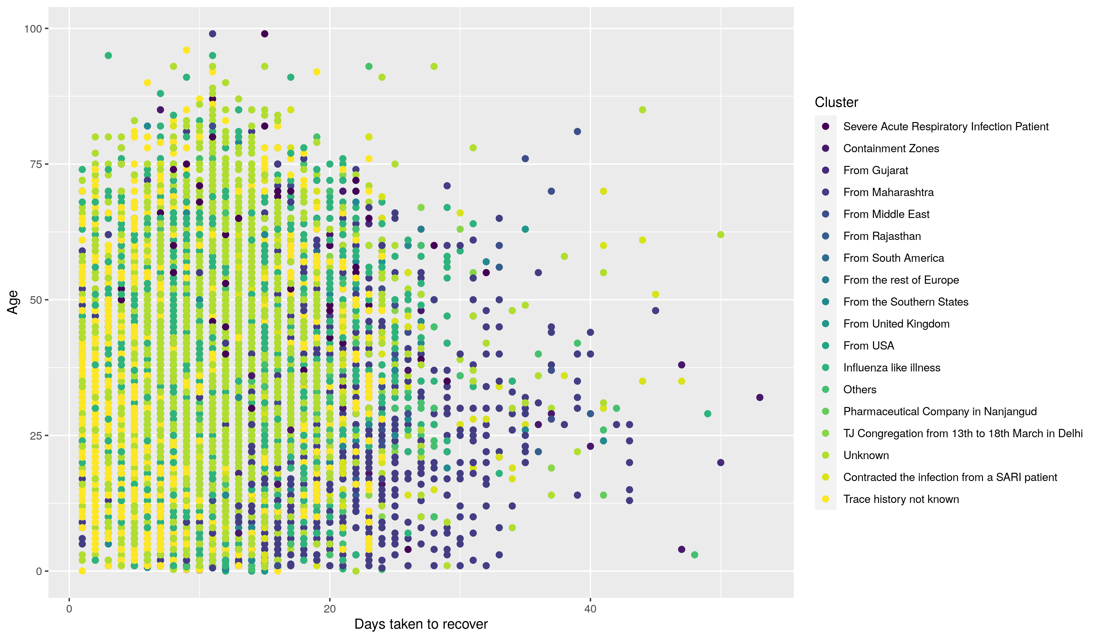
Days taken to Recover
The scatter plot in the right visualizes the relationship between the recovery time from COVID-19 and the age of patients. The x-axis represents the number of days taken to recover, while the y-axis shows the ages of the patients. Each point on the plot corresponds to an individual patient, allowing viewers to see patterns and trends in recovery times across different age groups. This plot helps in understanding how age might influence the duration of recovery from COVID-19, providing insights that can be useful for healthcare planning and resource allocation.
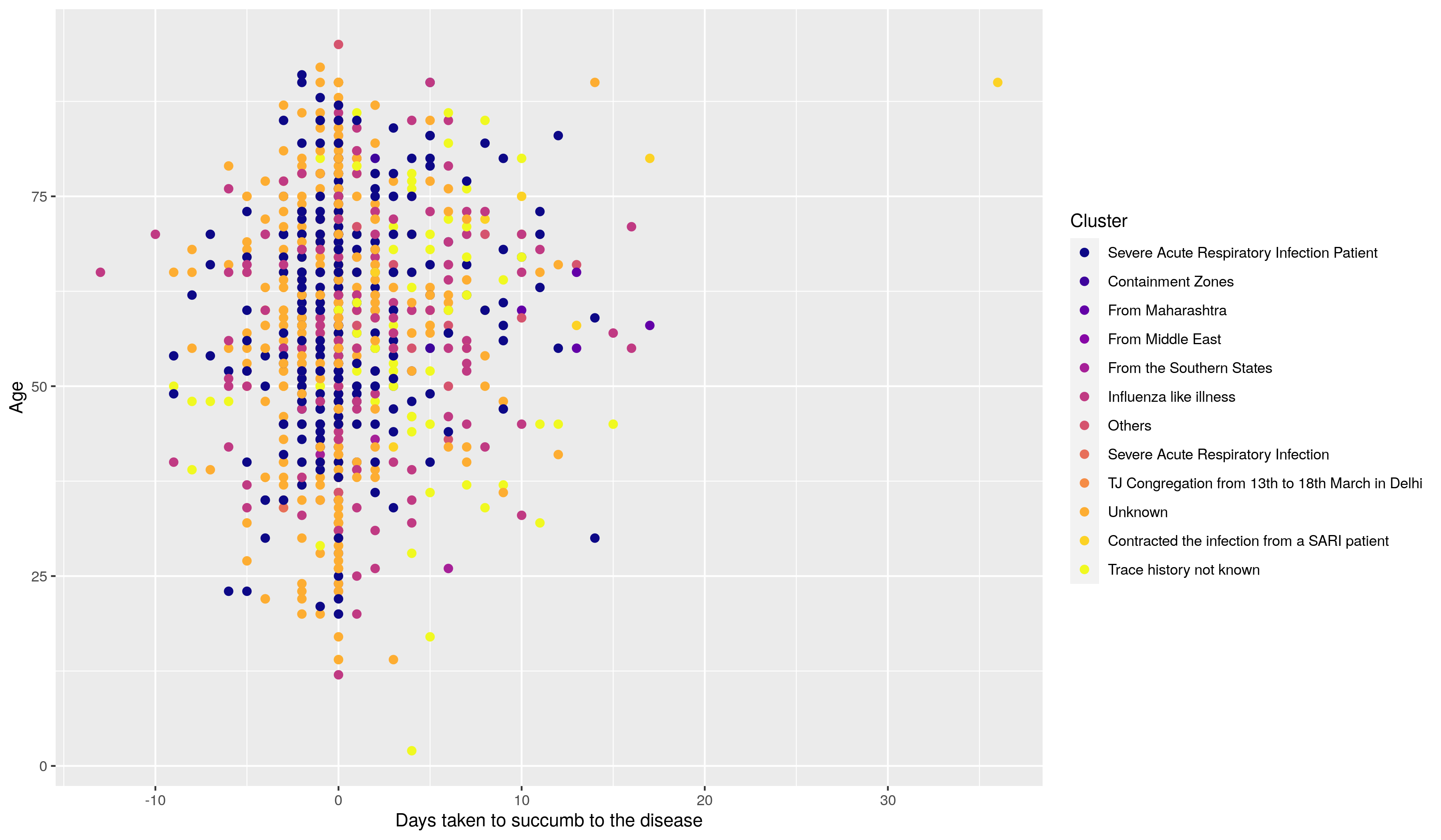
Days taken to succumb to the disease
This scatter plot provides insights into the relationship between the age of individuals and the time it took for them to succumb to COVID-19. On the x-axis, the plot displays the number of days from the onset of symptoms to death, while the y-axis represents the age of the patients. Each point on the scatter plot corresponds to an individual case. This visualization helps identify patterns or trends, such as whether certain age groups tend to succumb more quickly or if the time taken varies significantly across different ages.