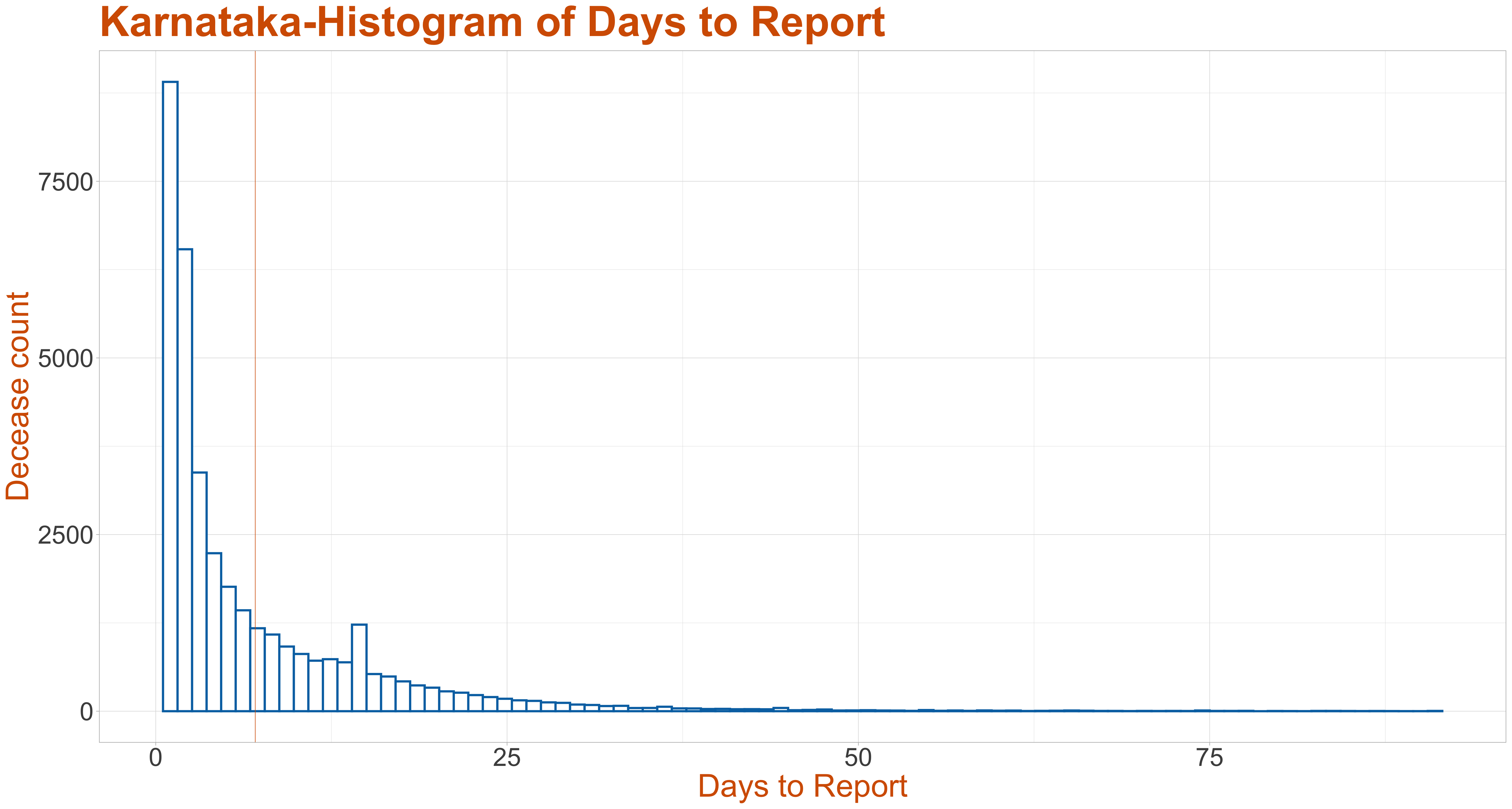
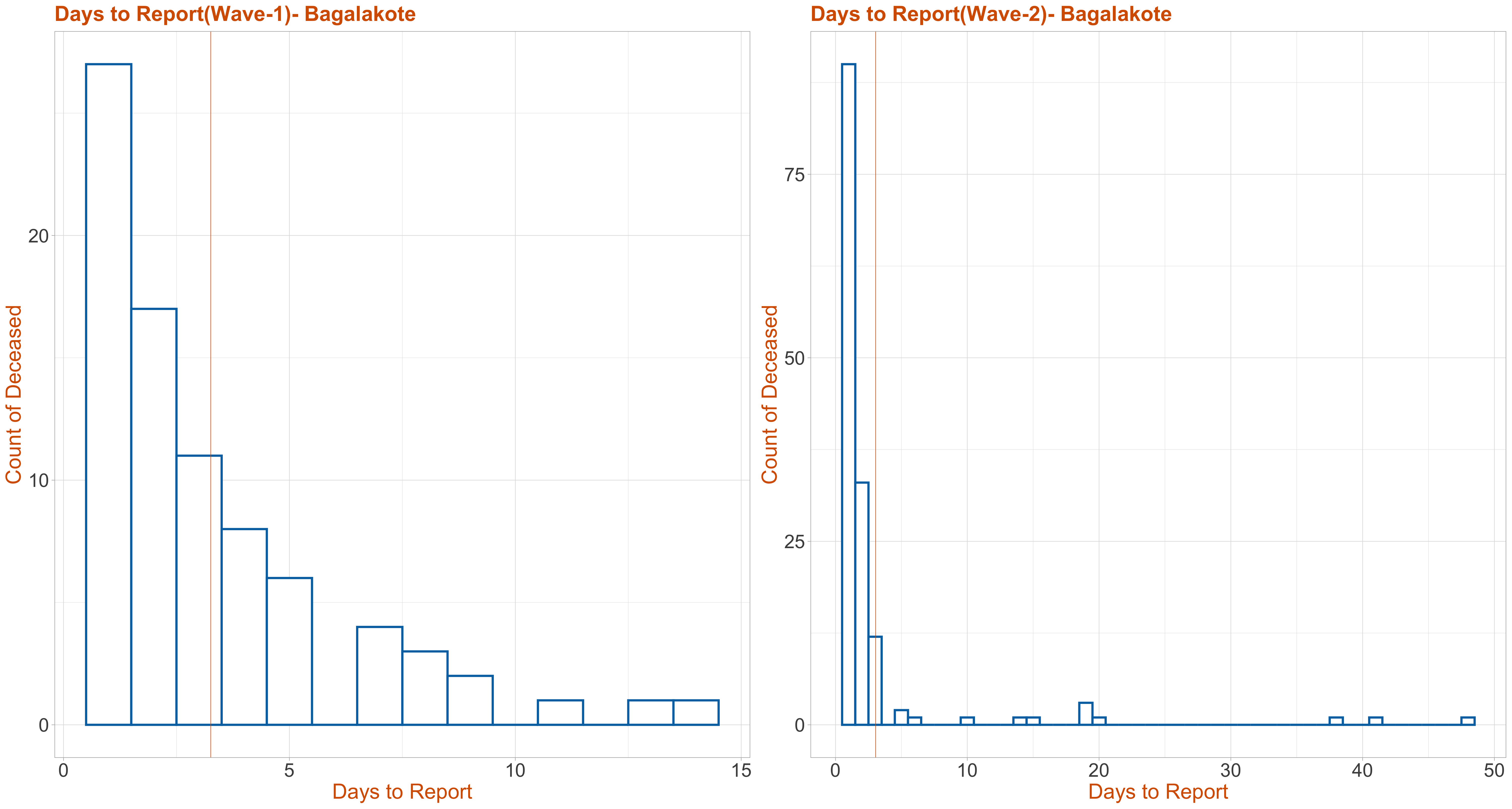
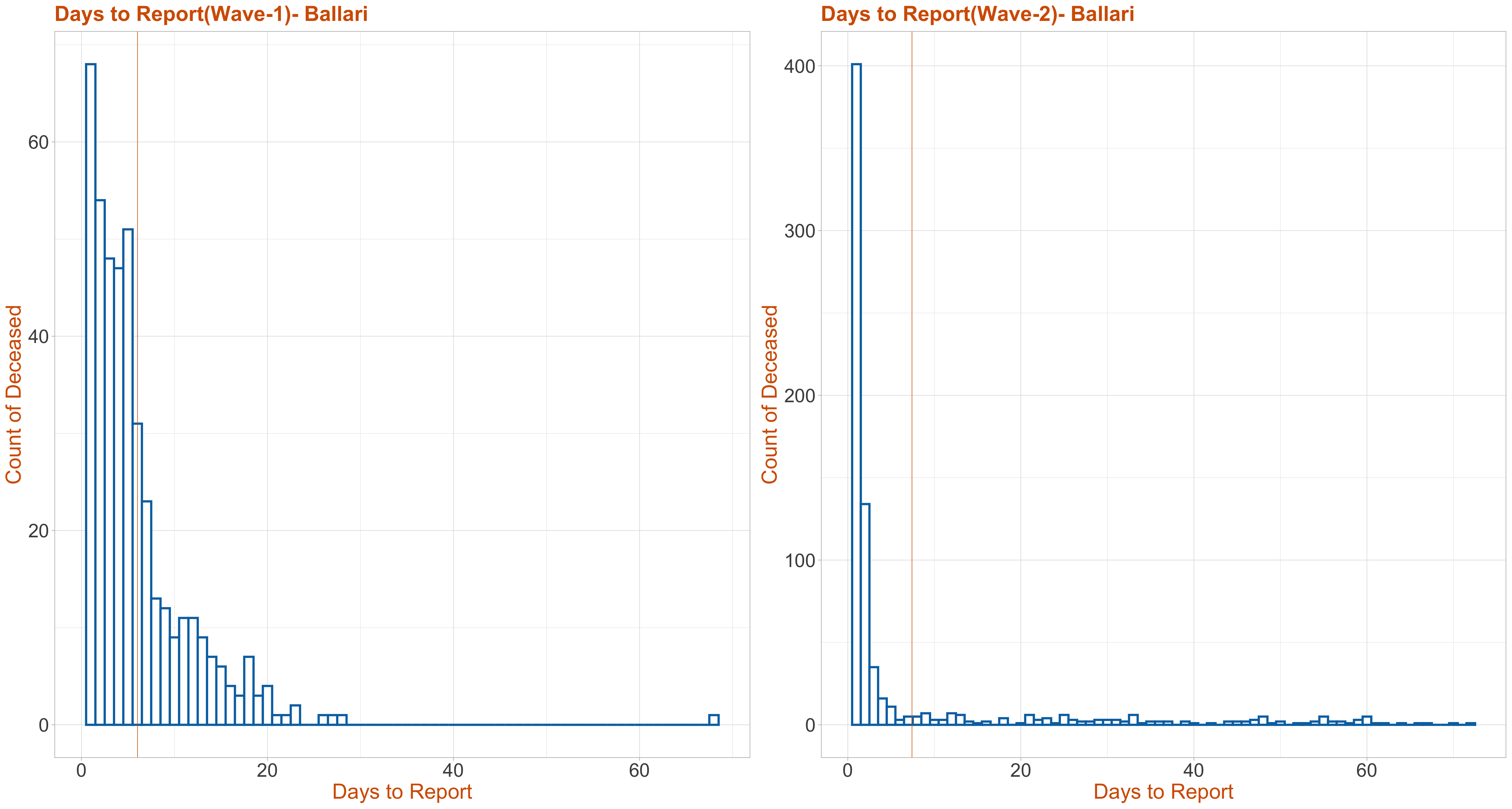
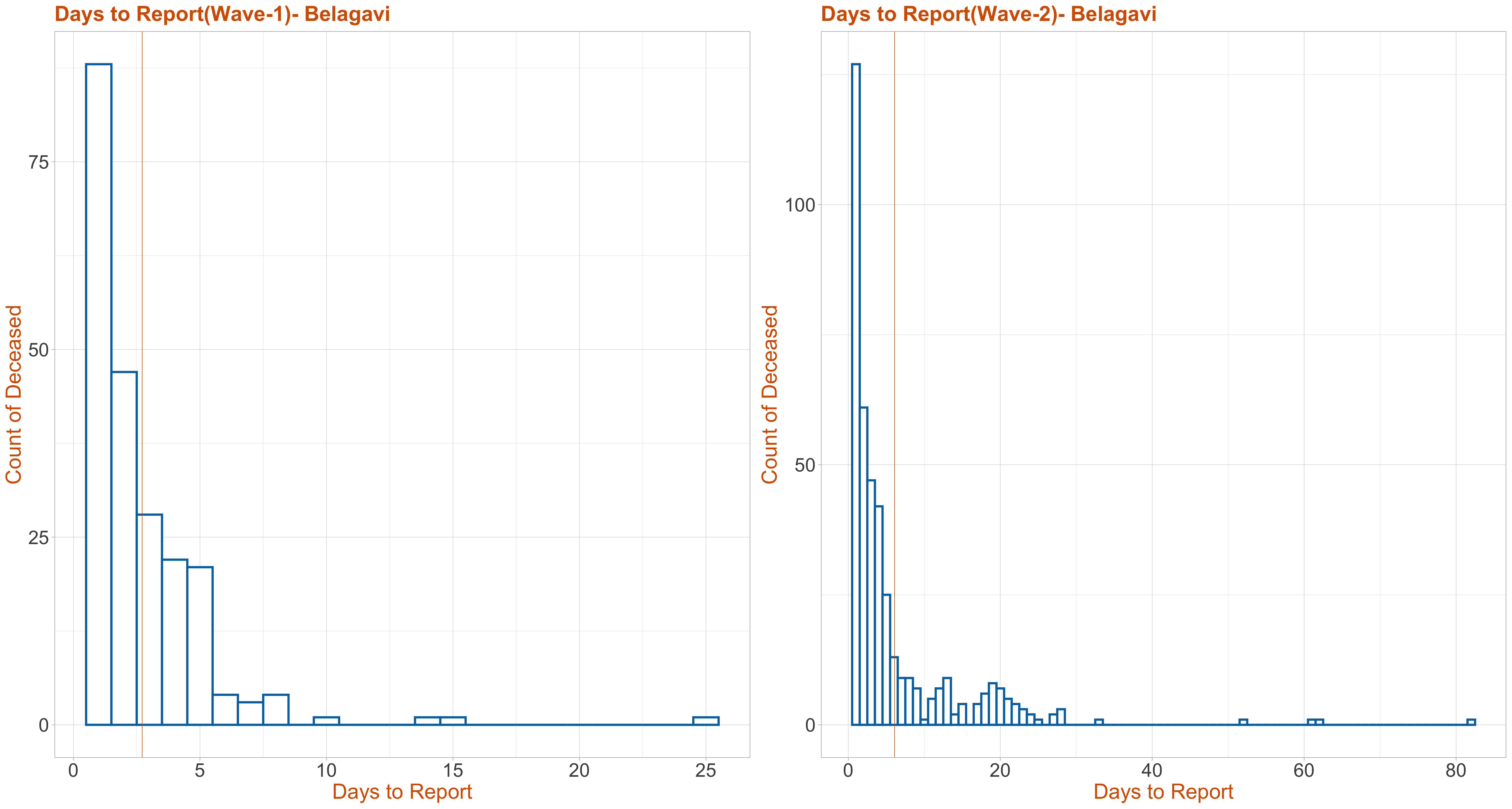
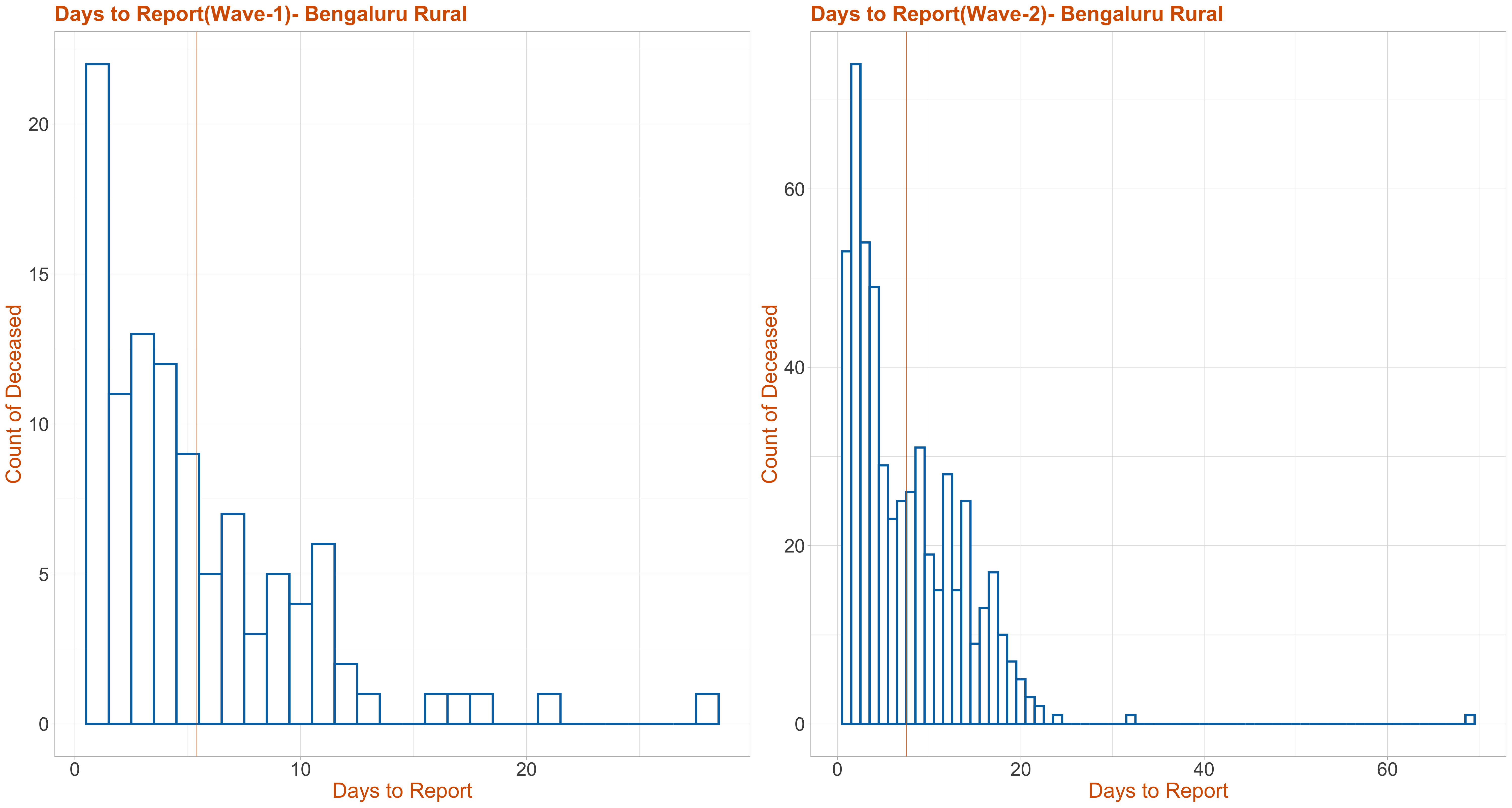
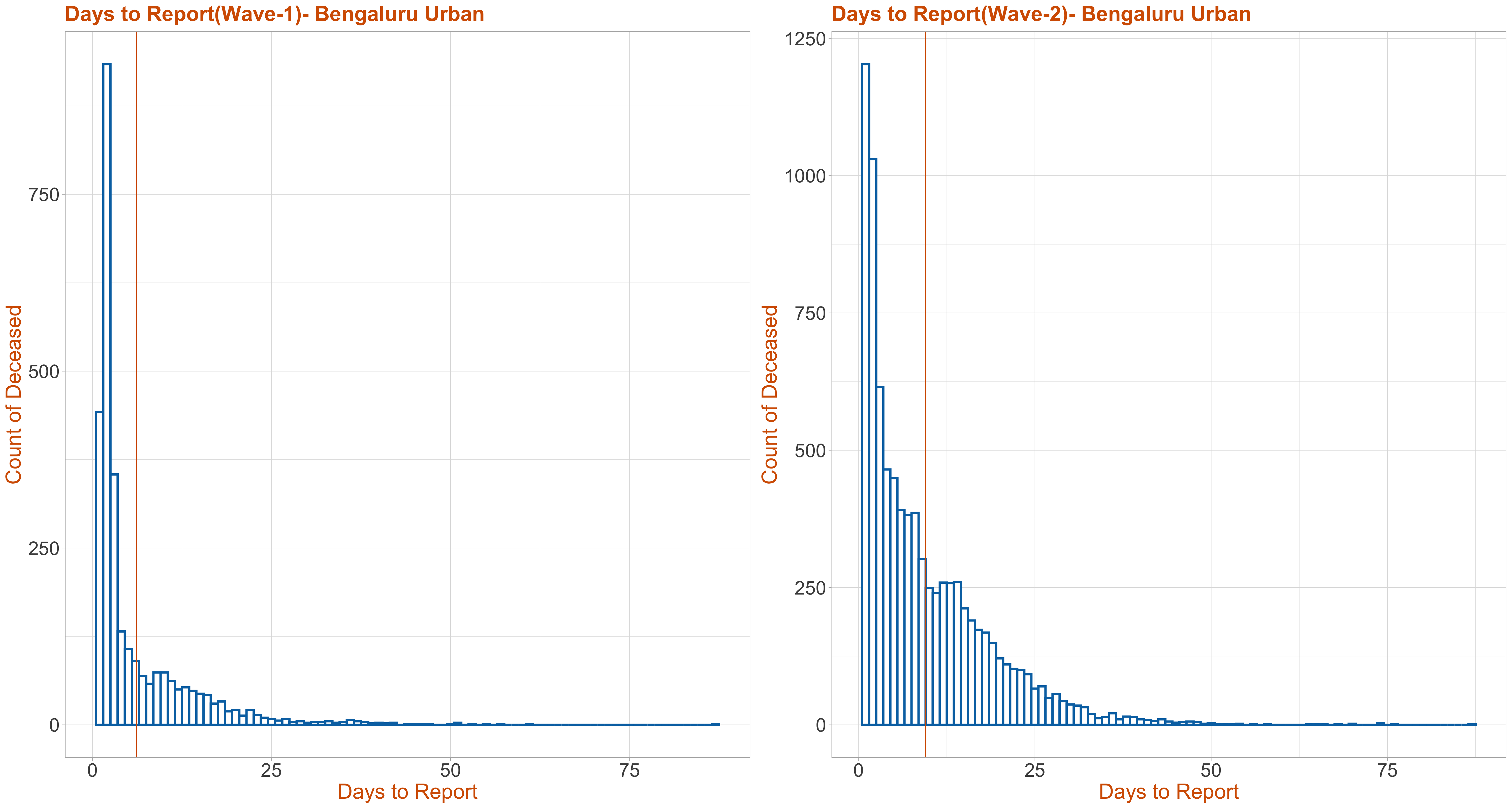
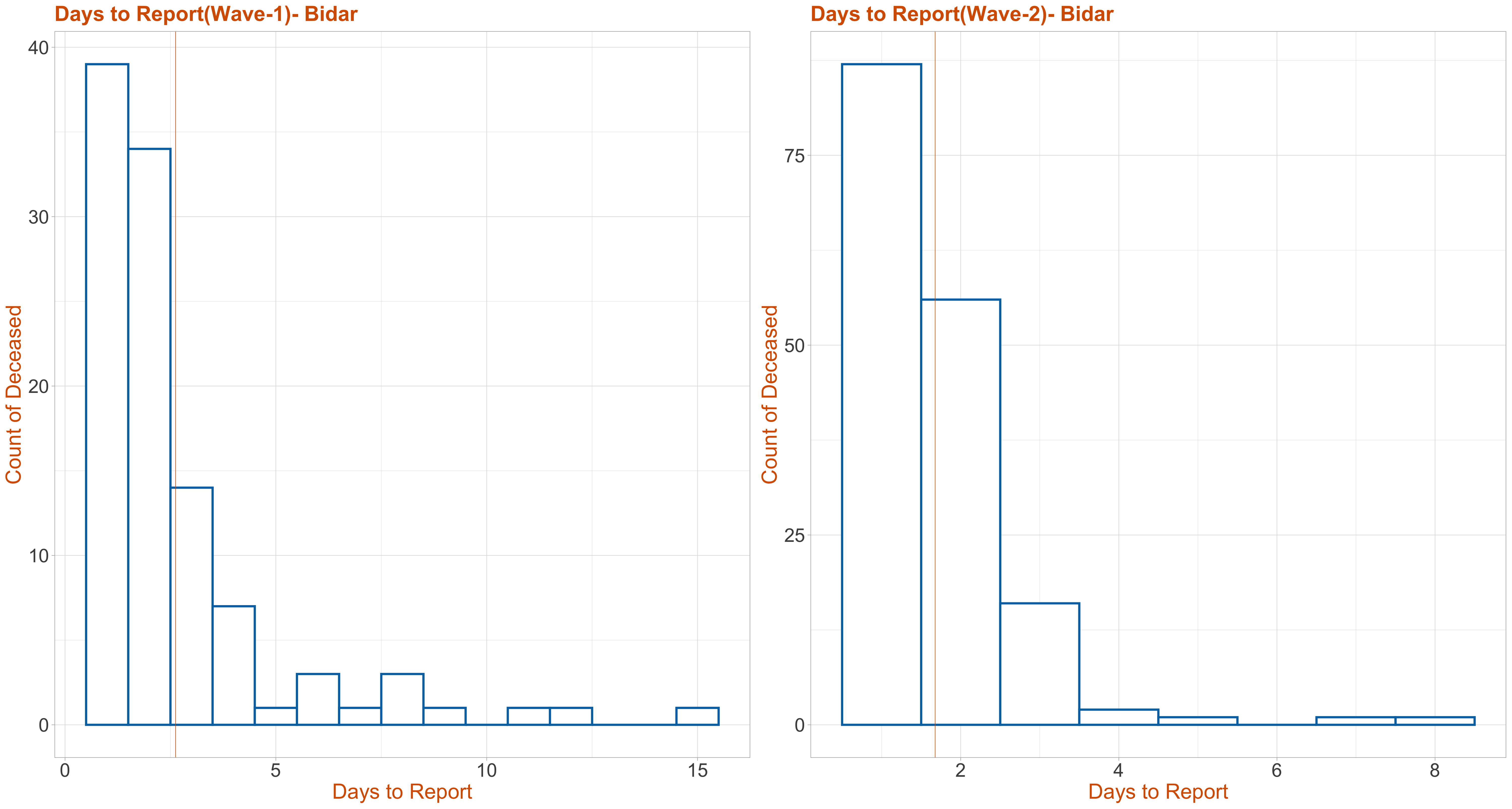
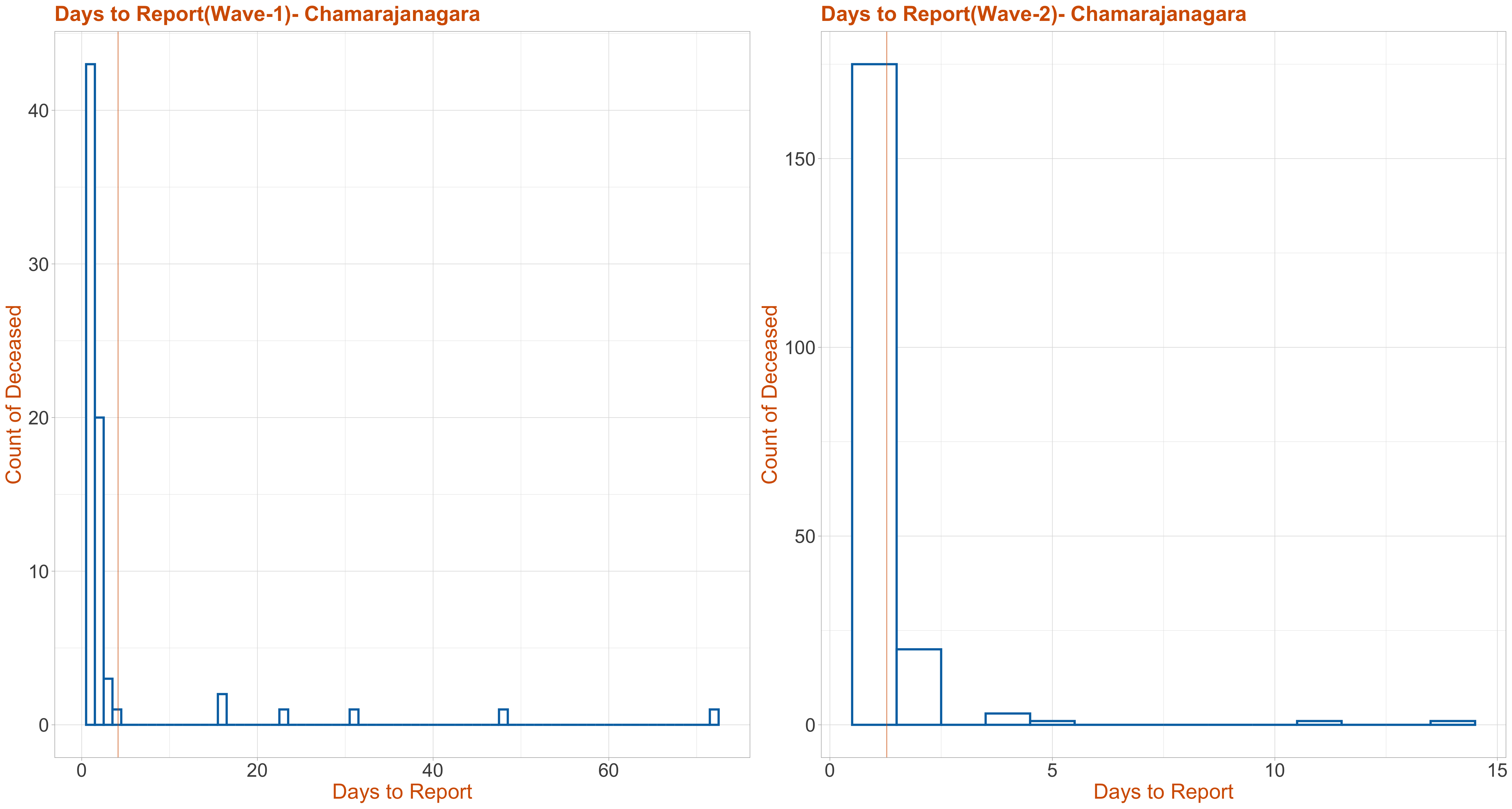
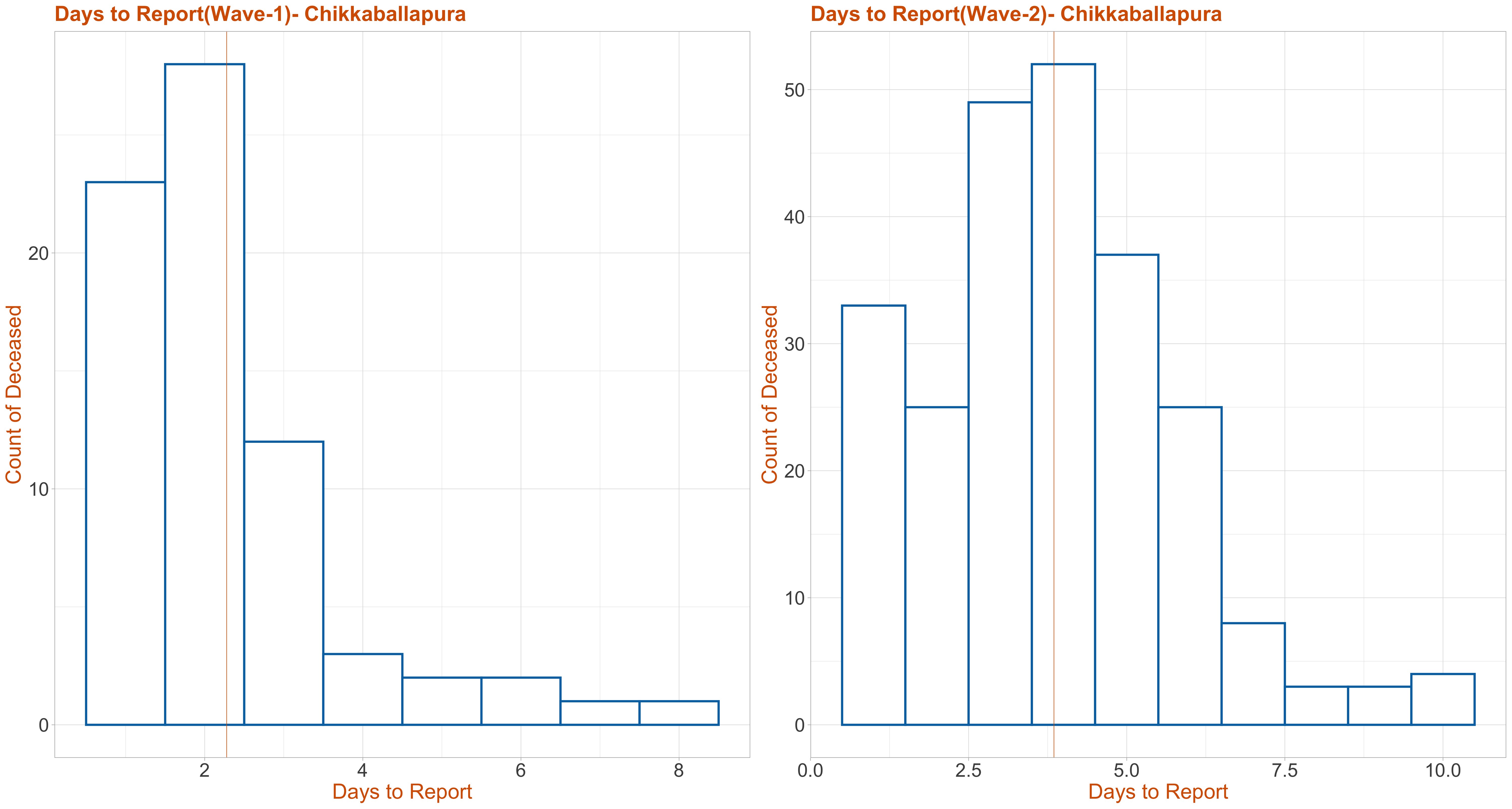
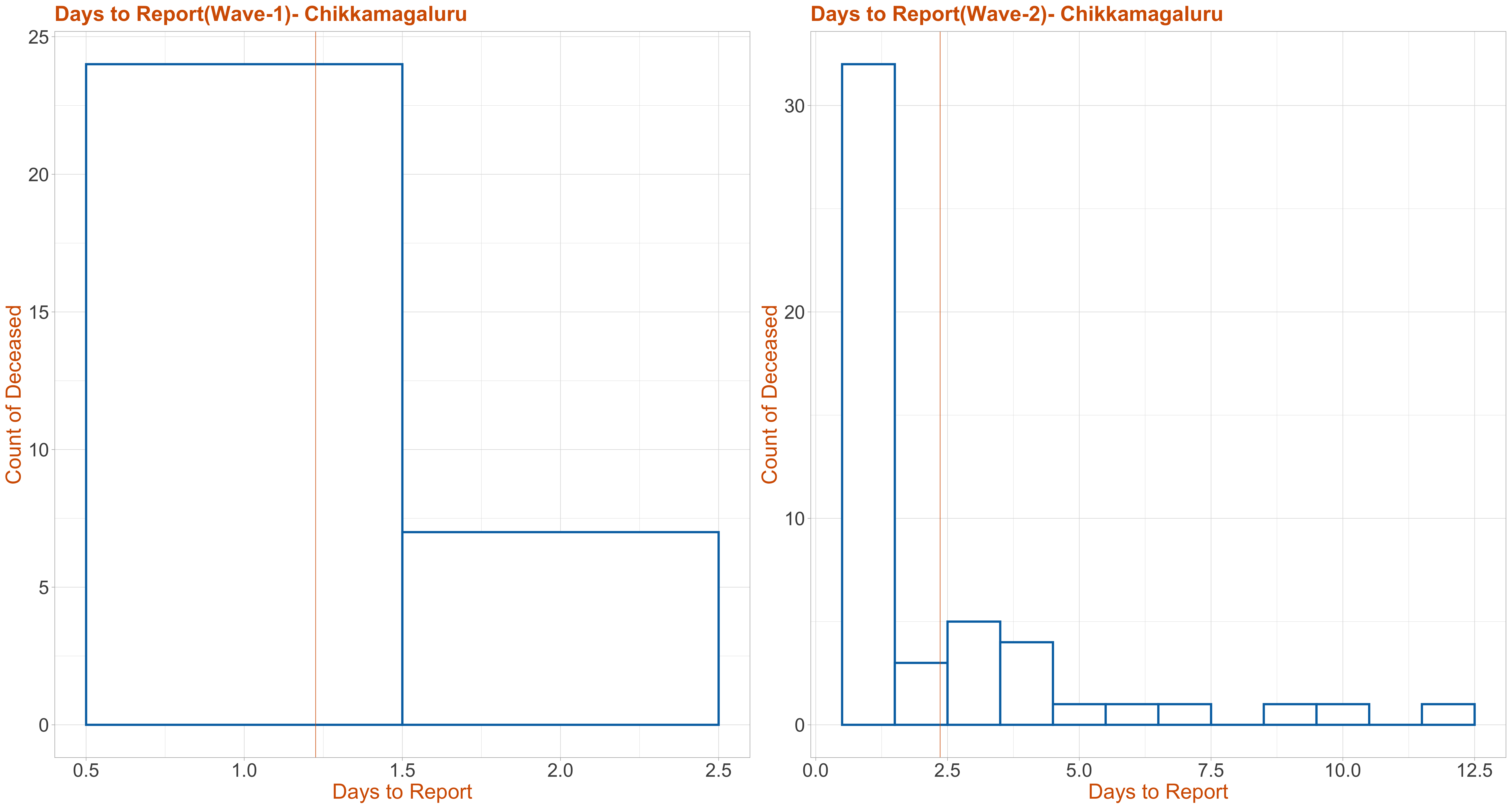
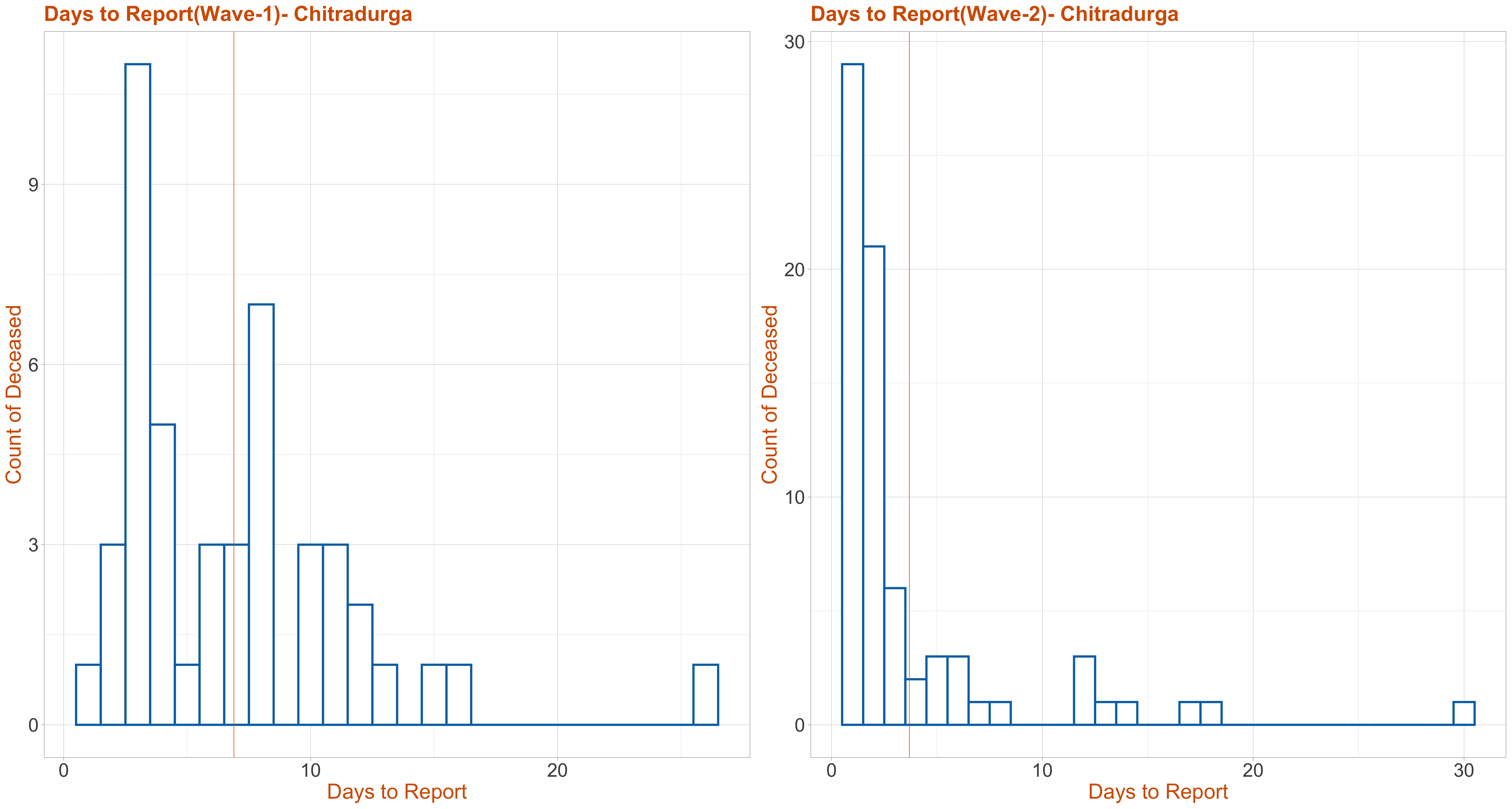
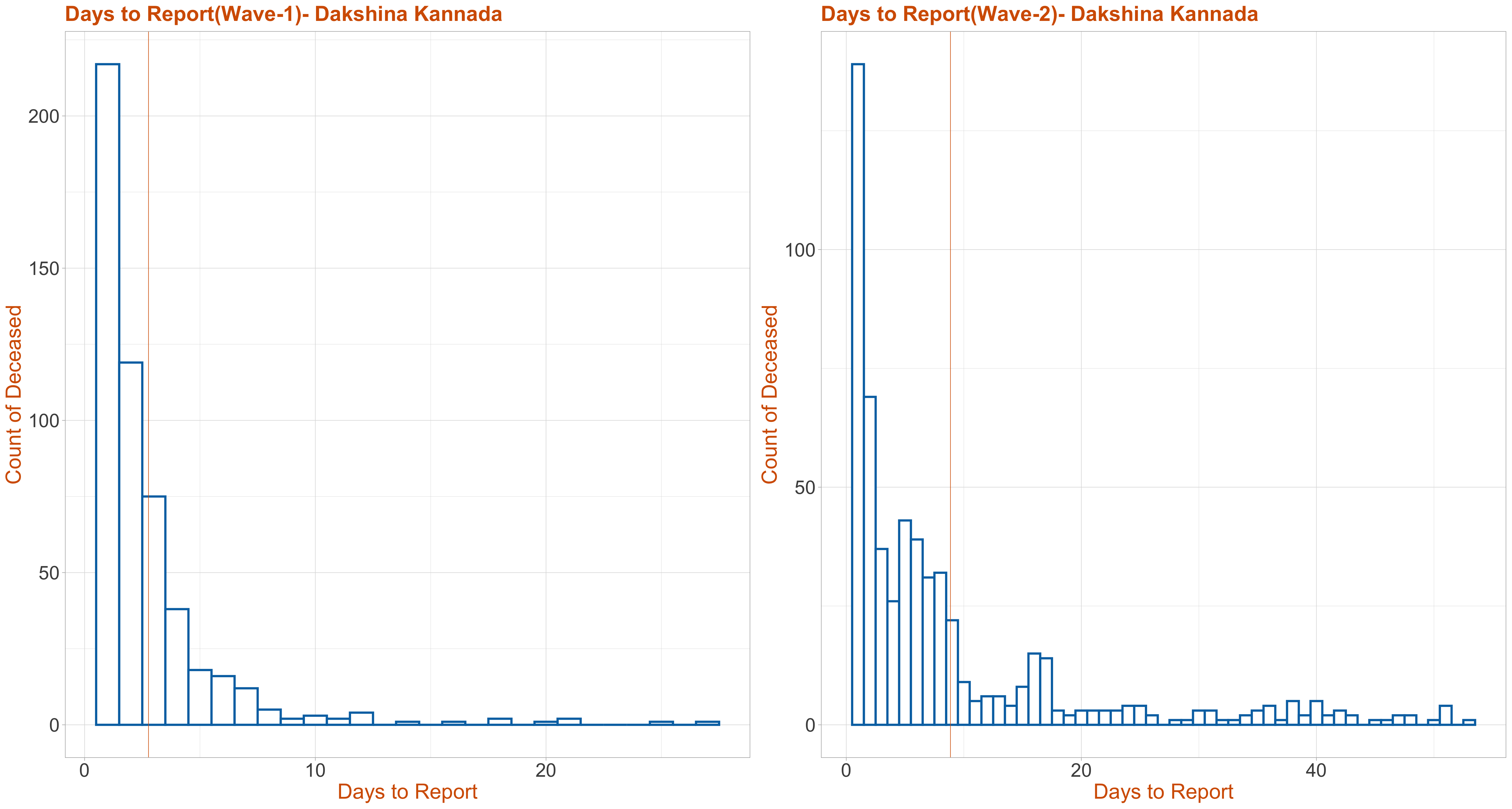
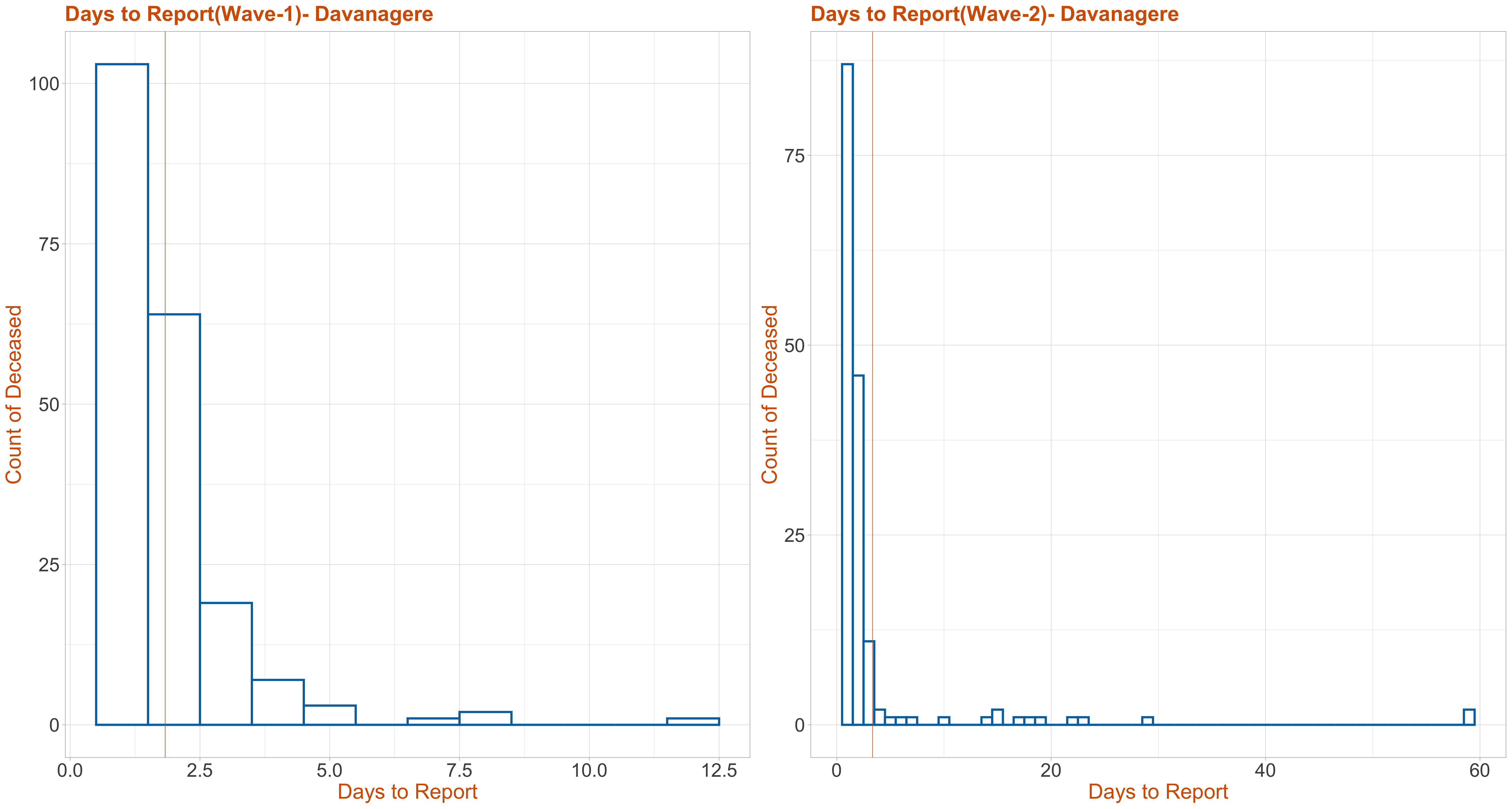
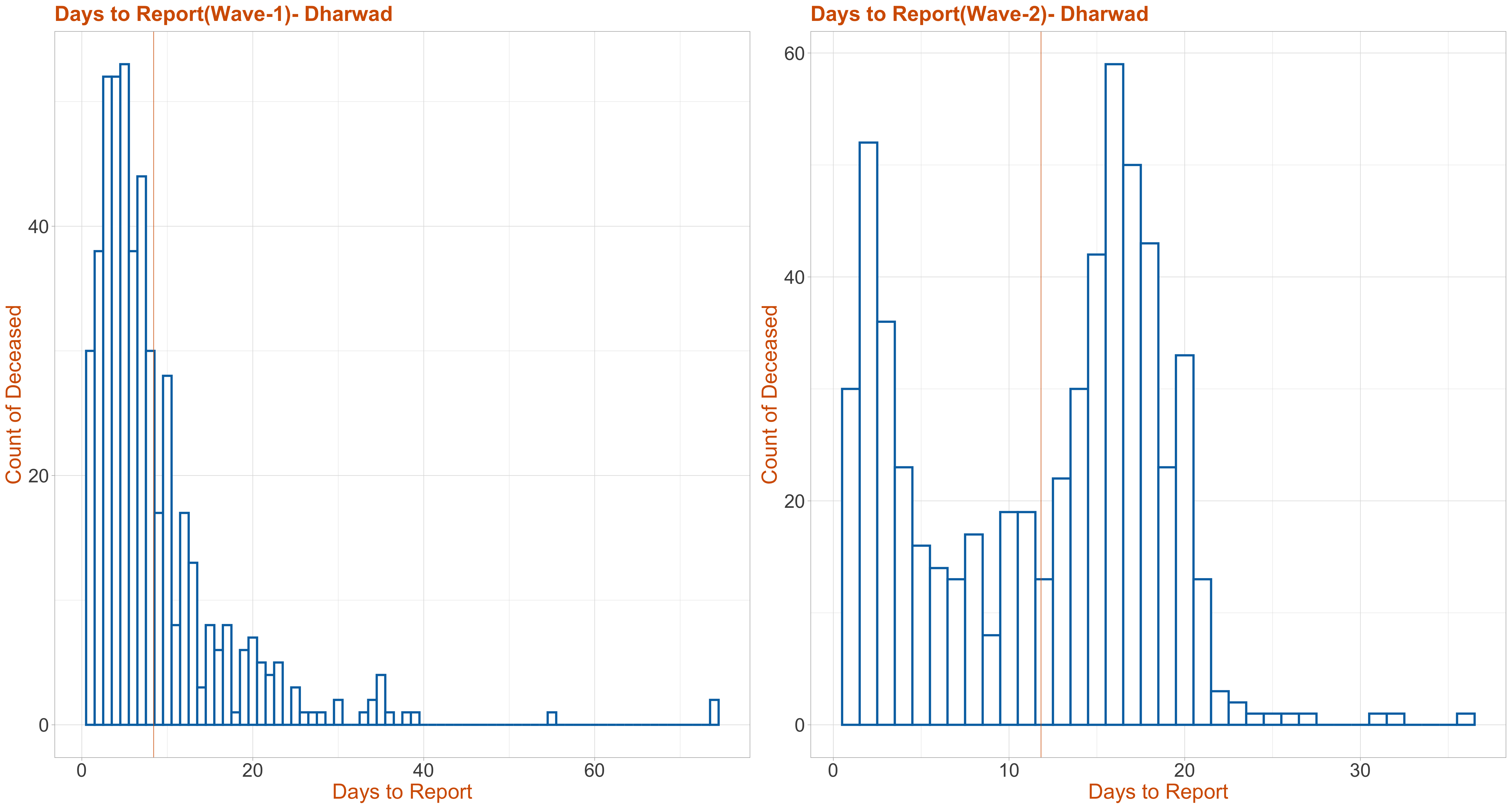
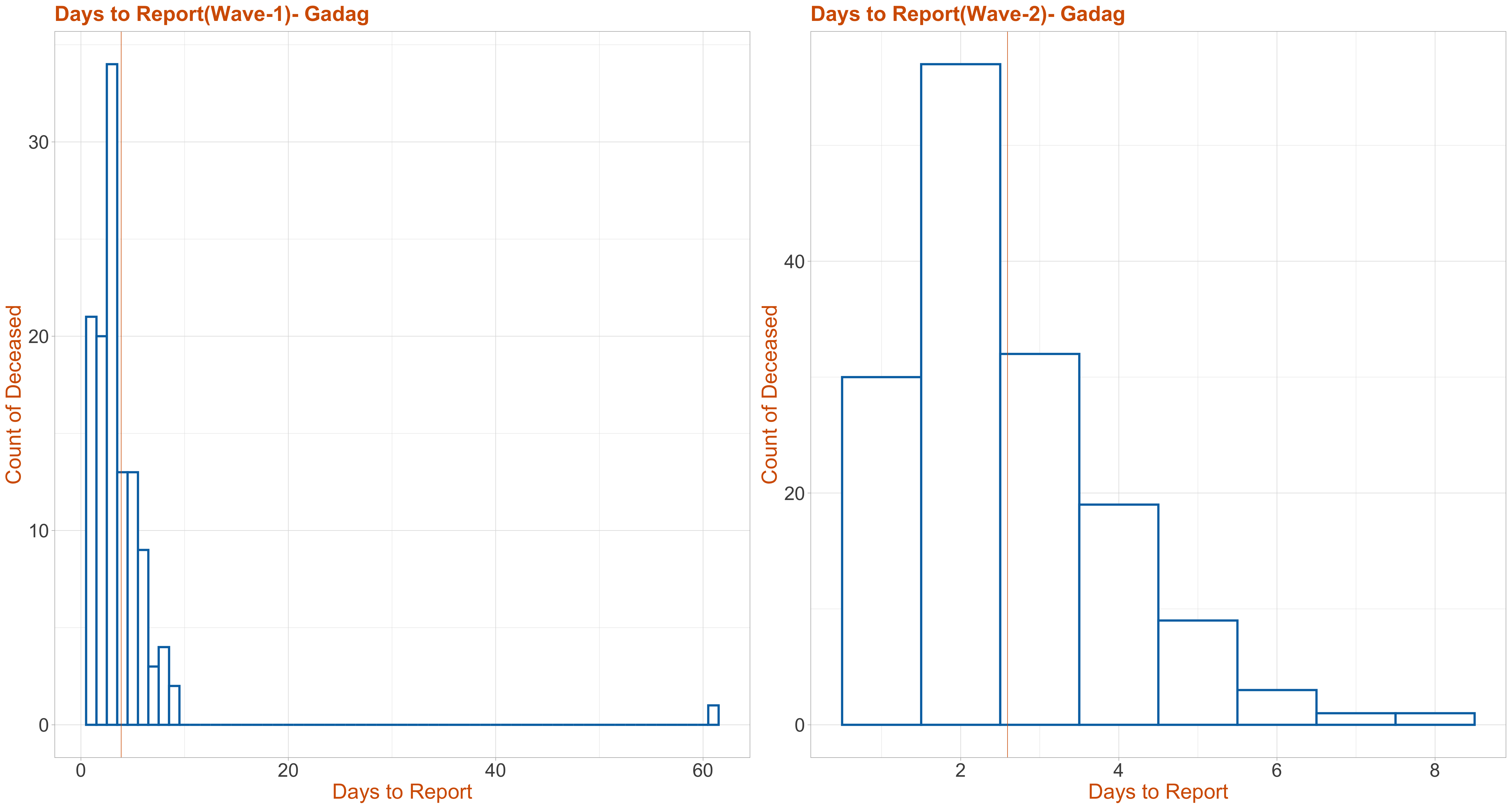
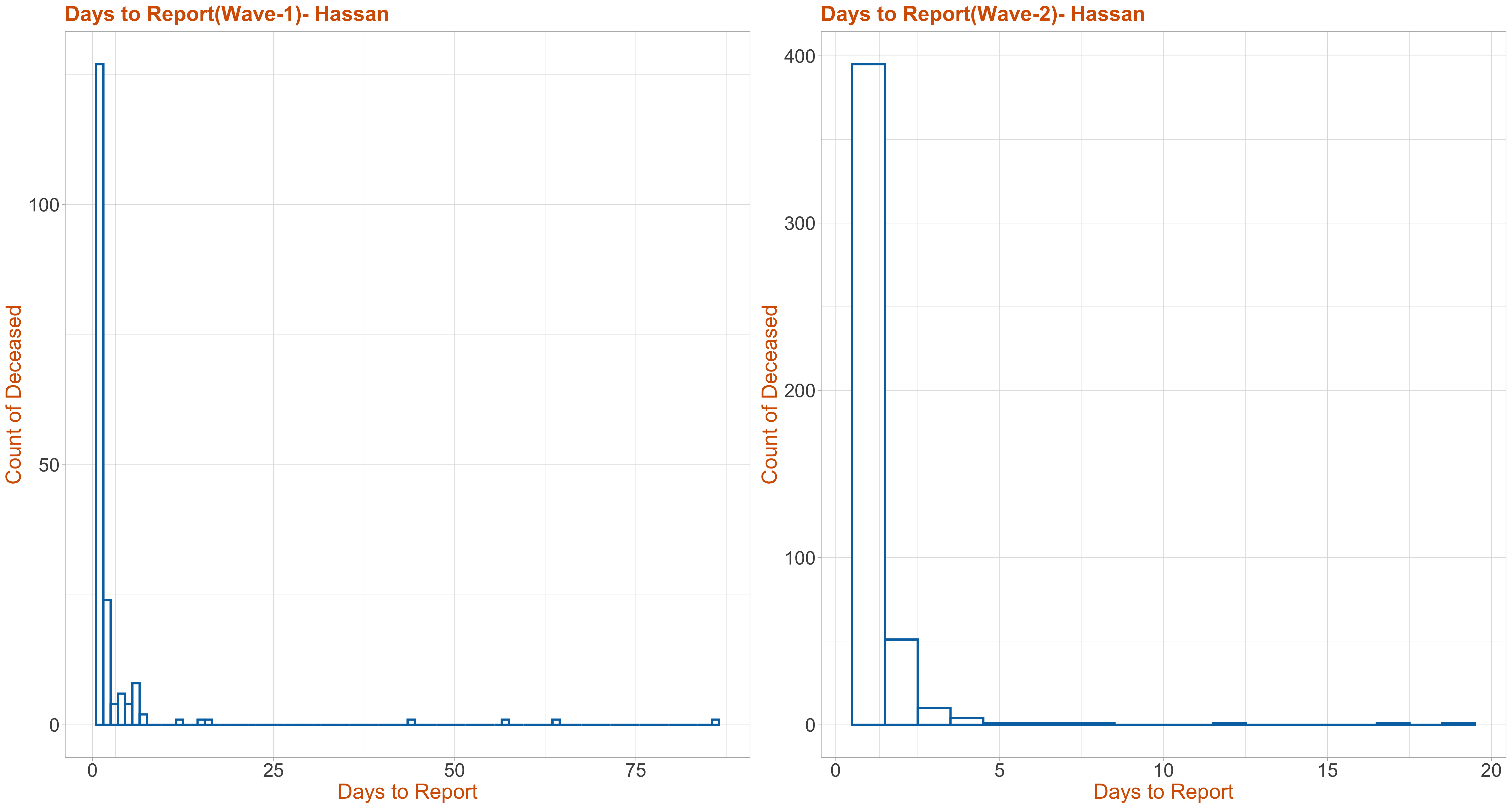
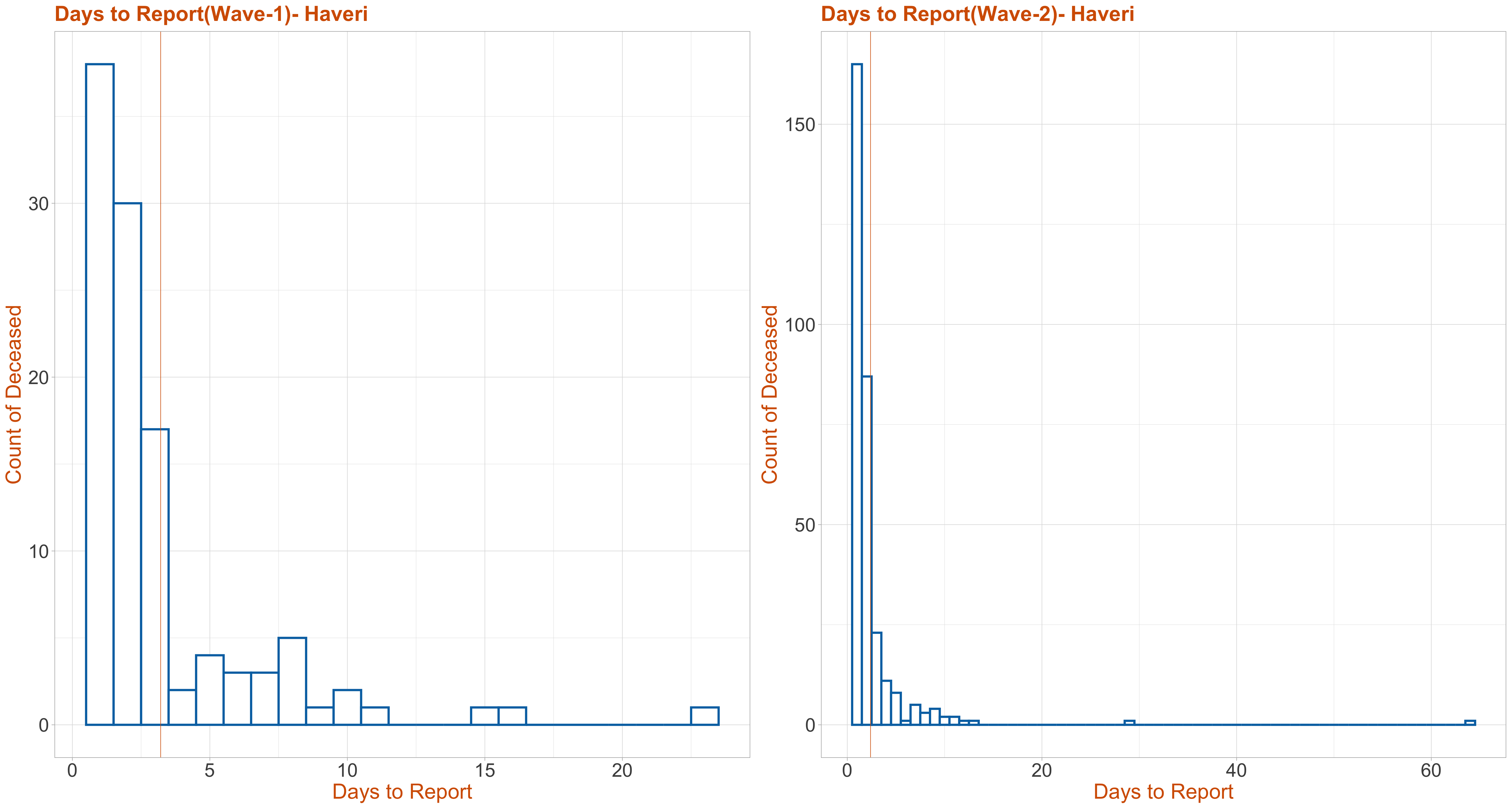
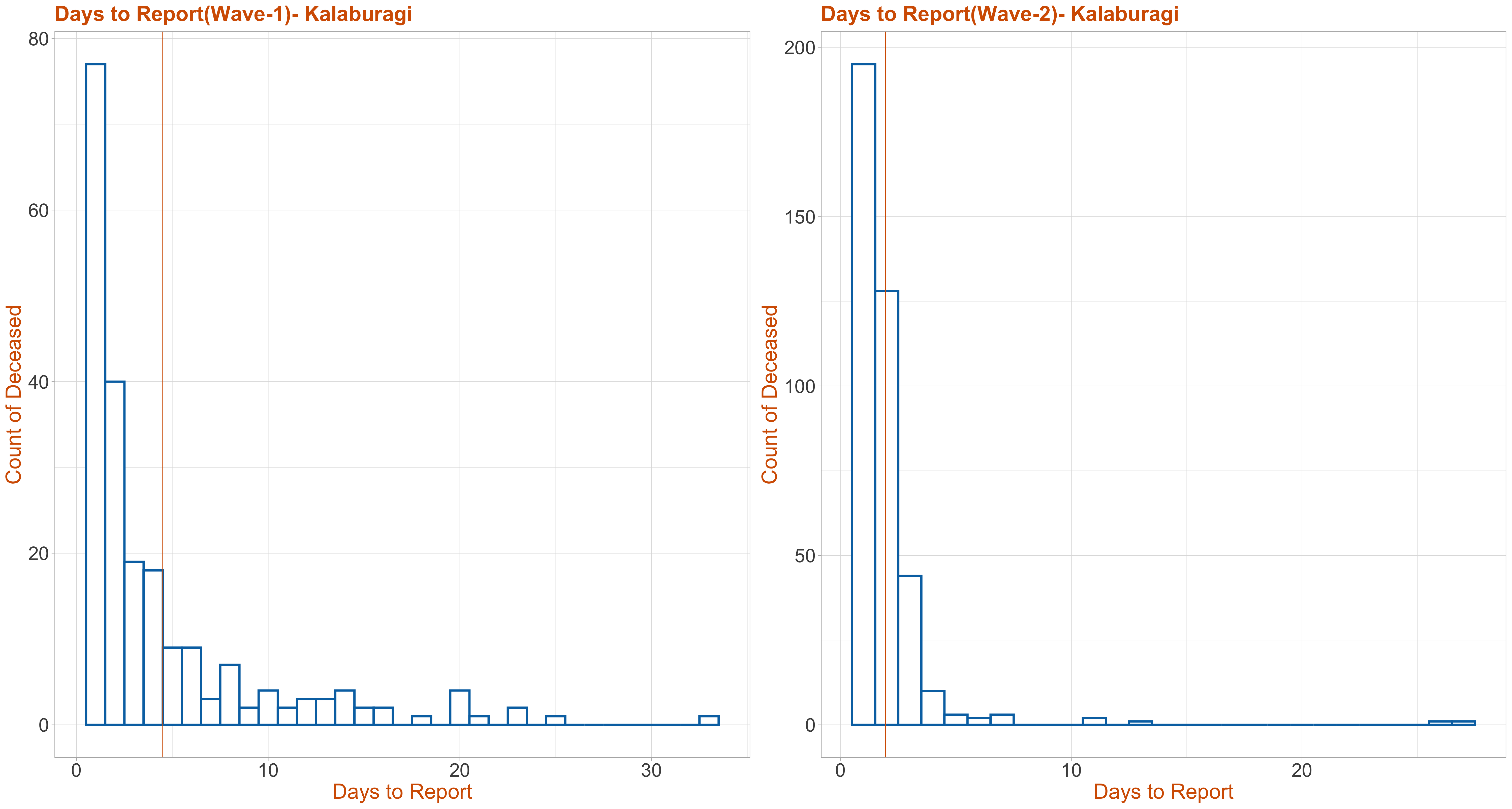
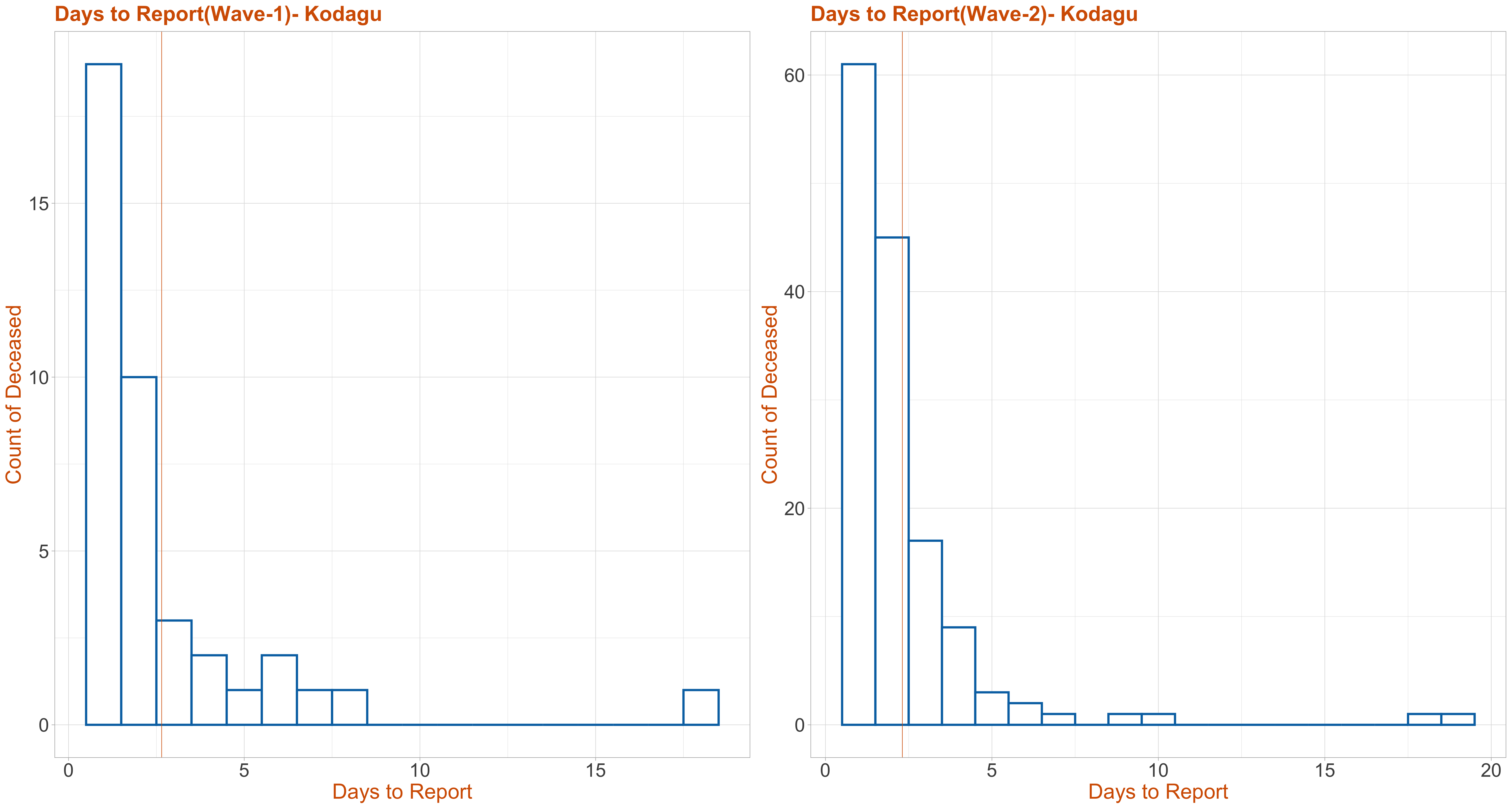
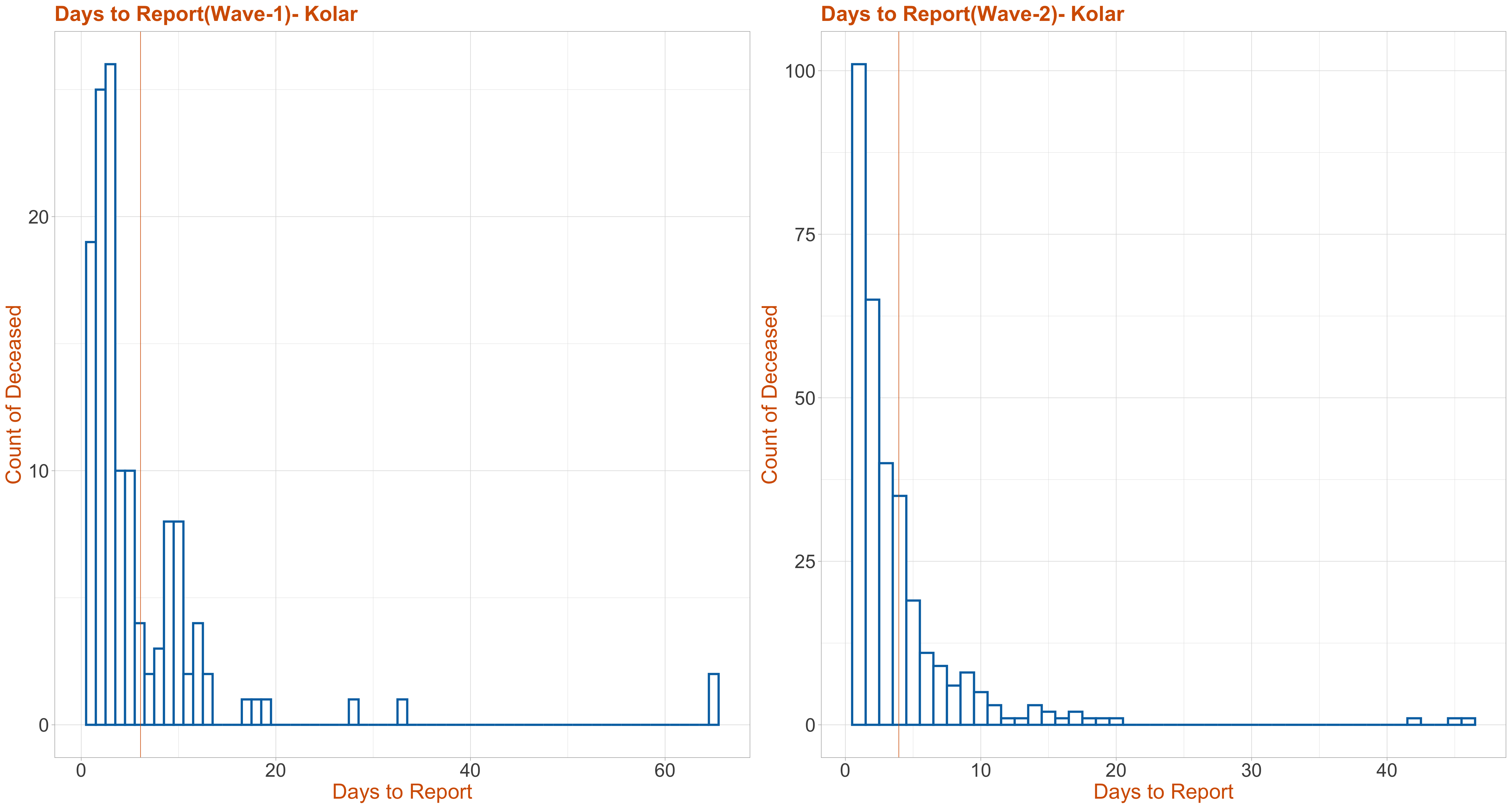
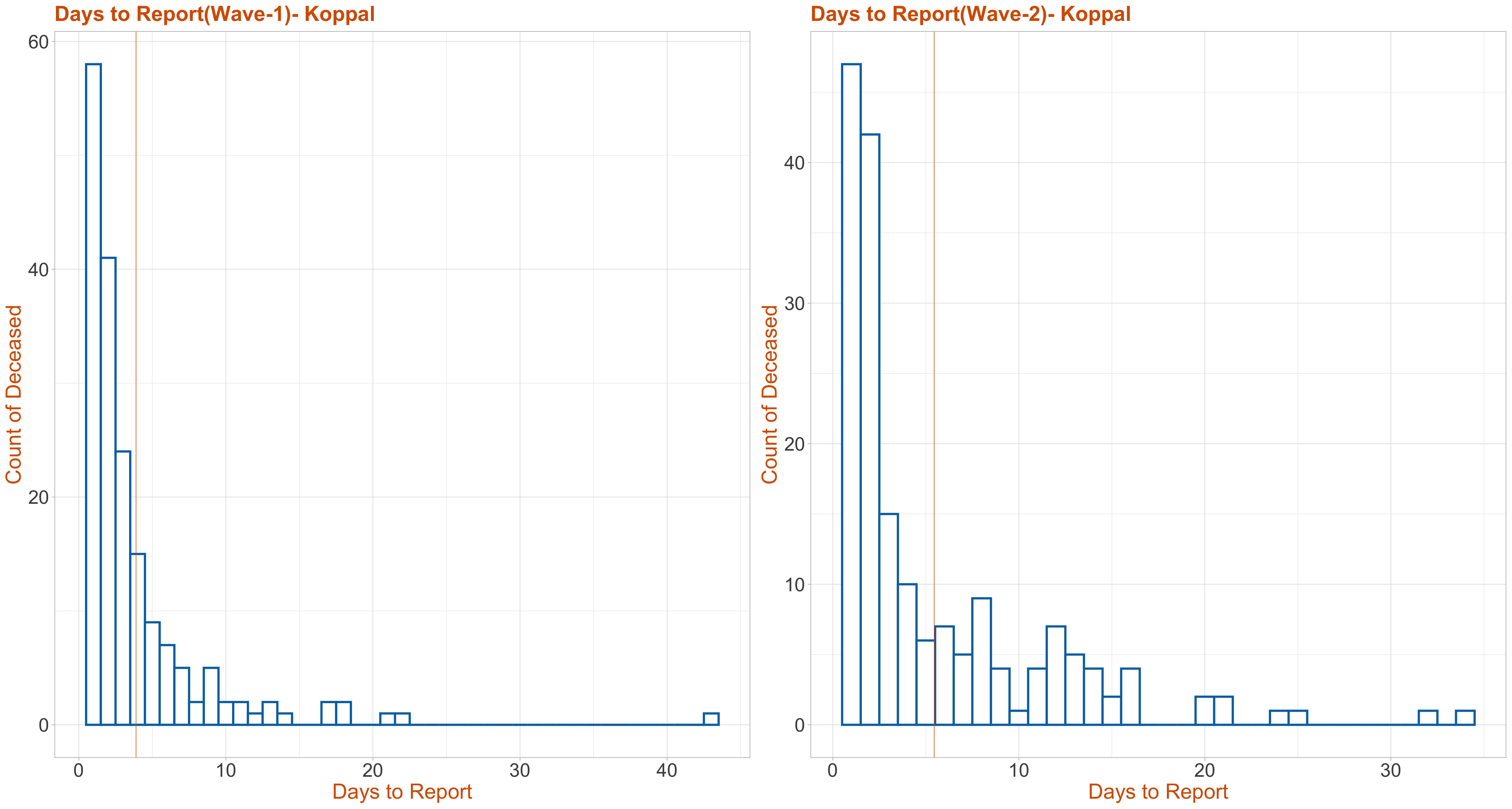
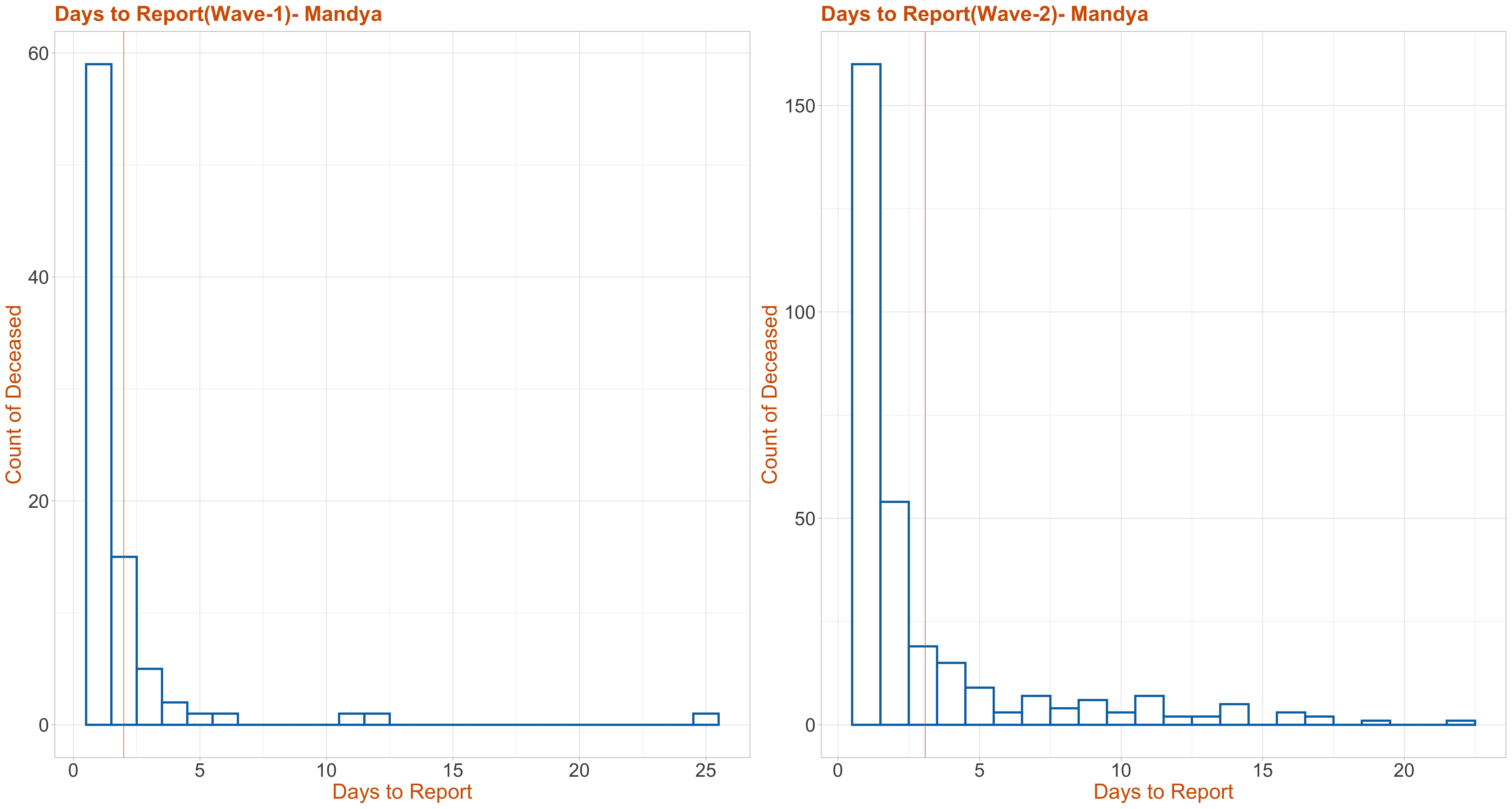
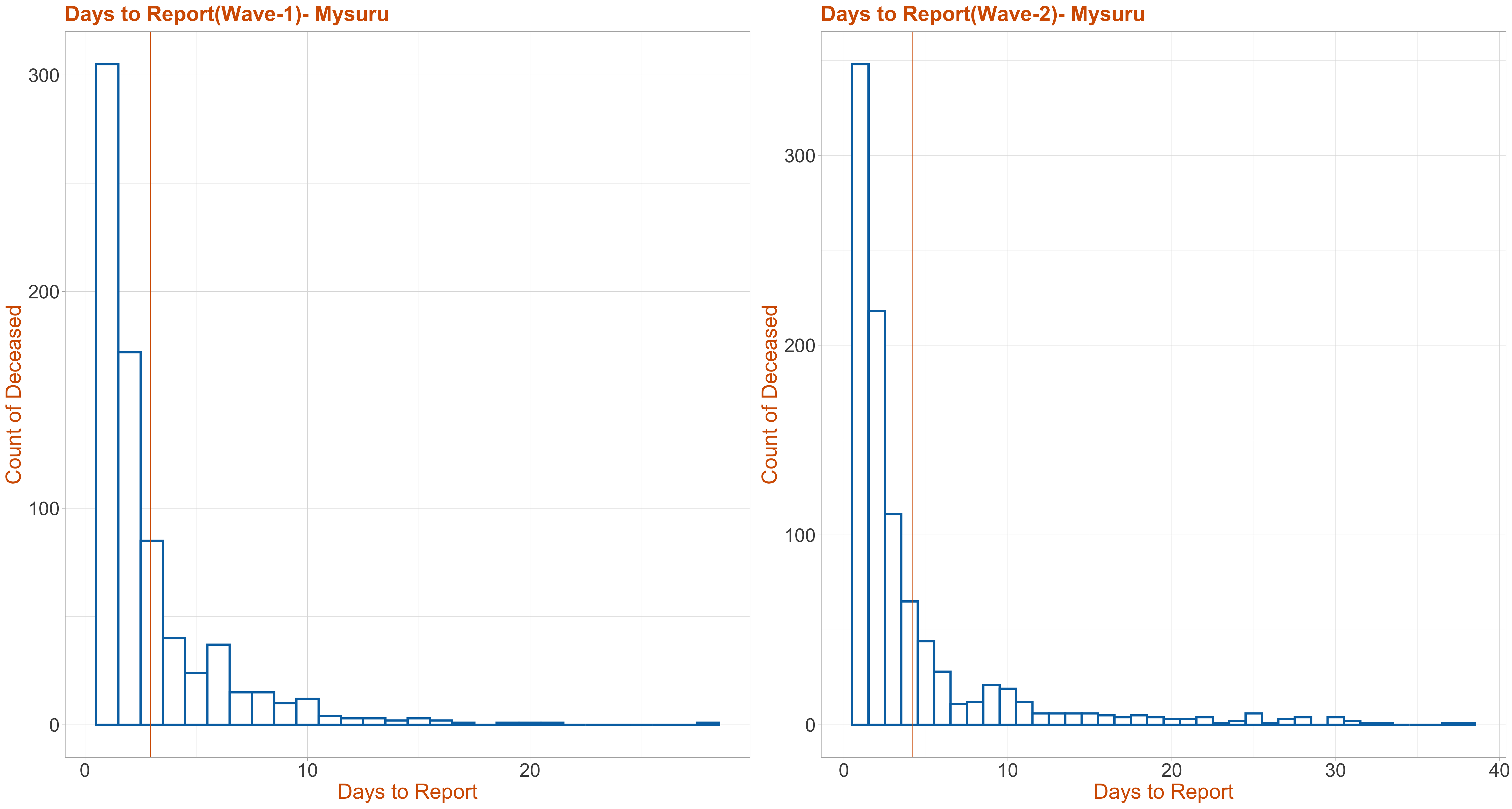
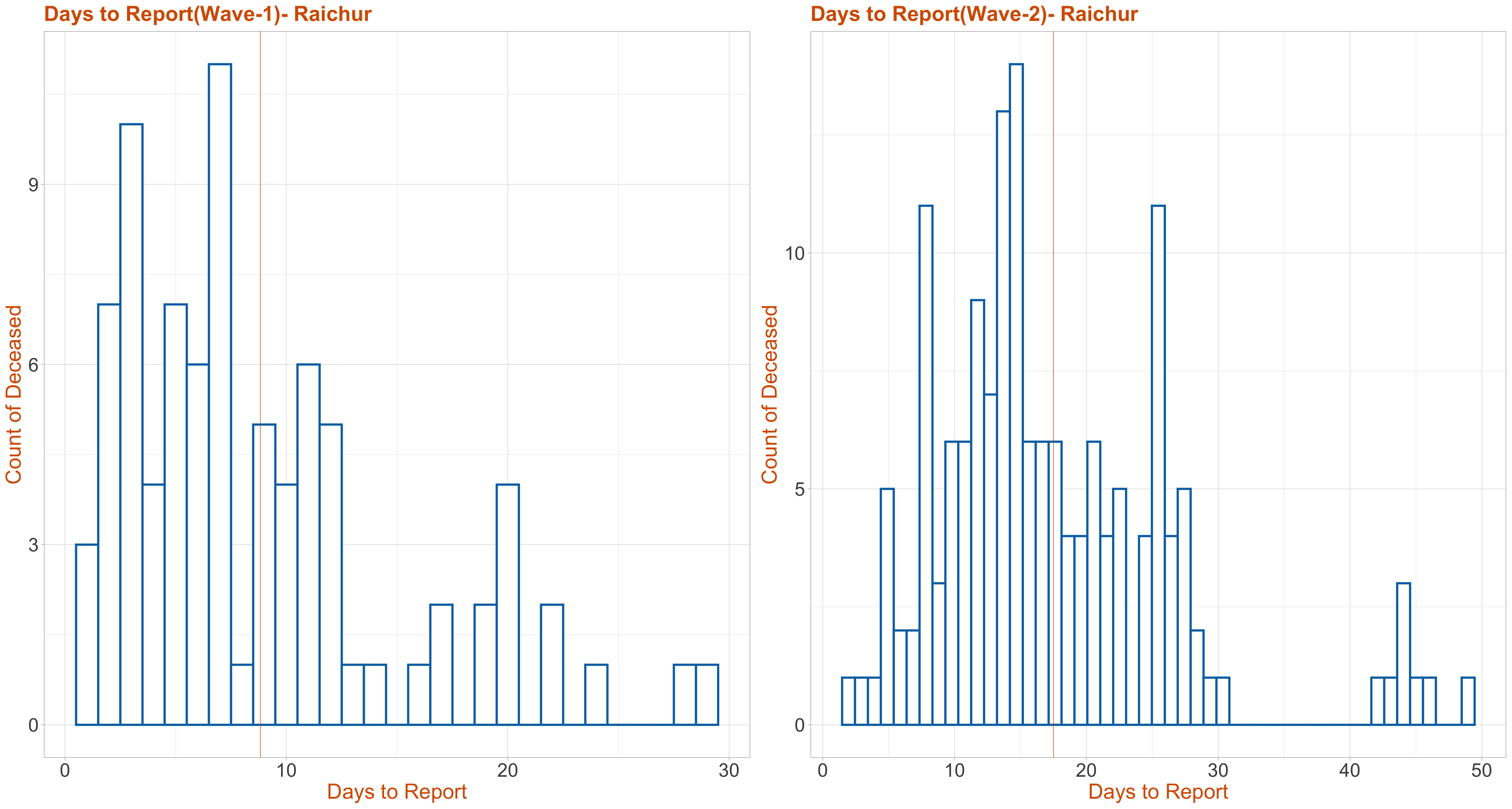
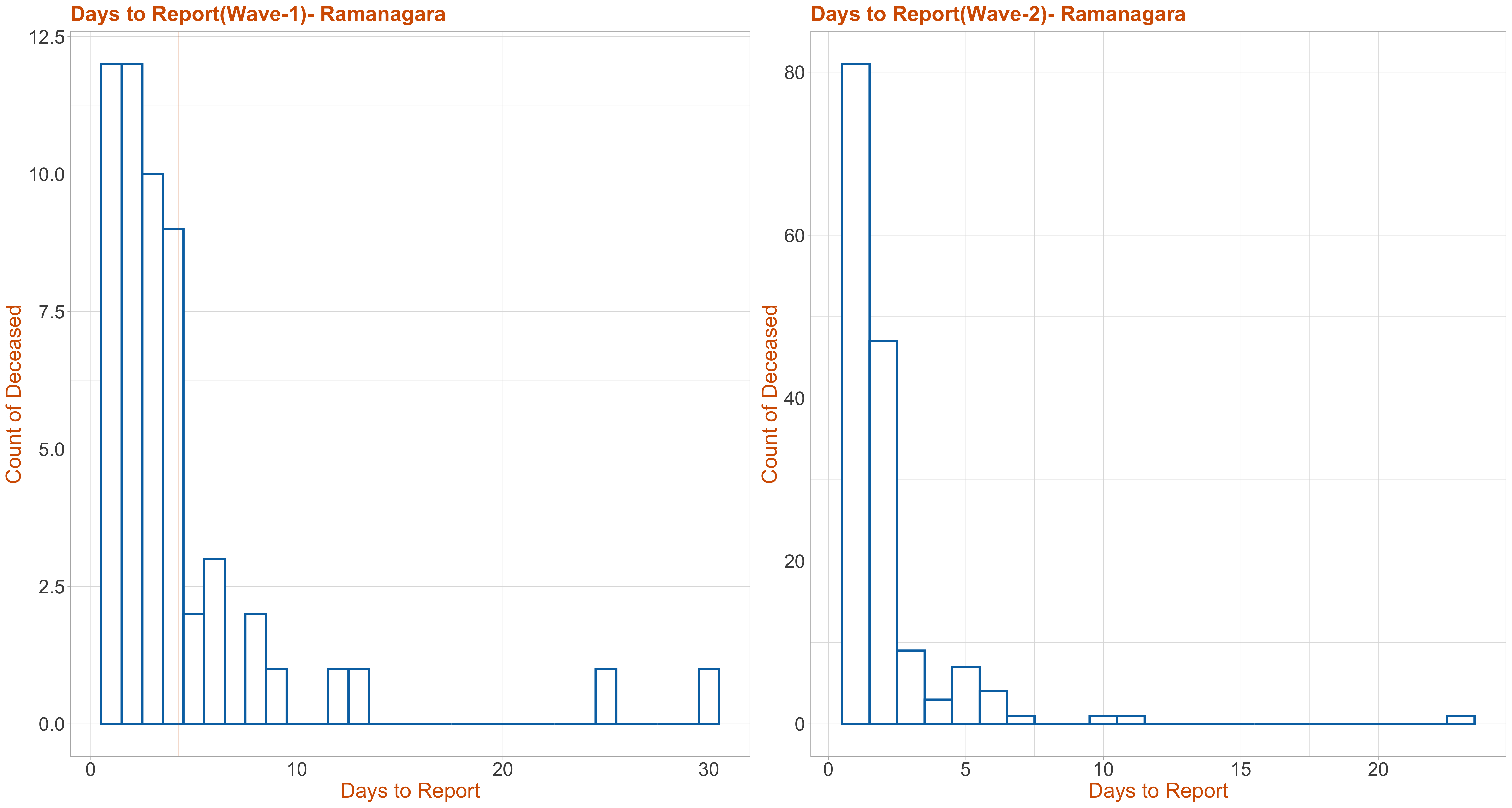
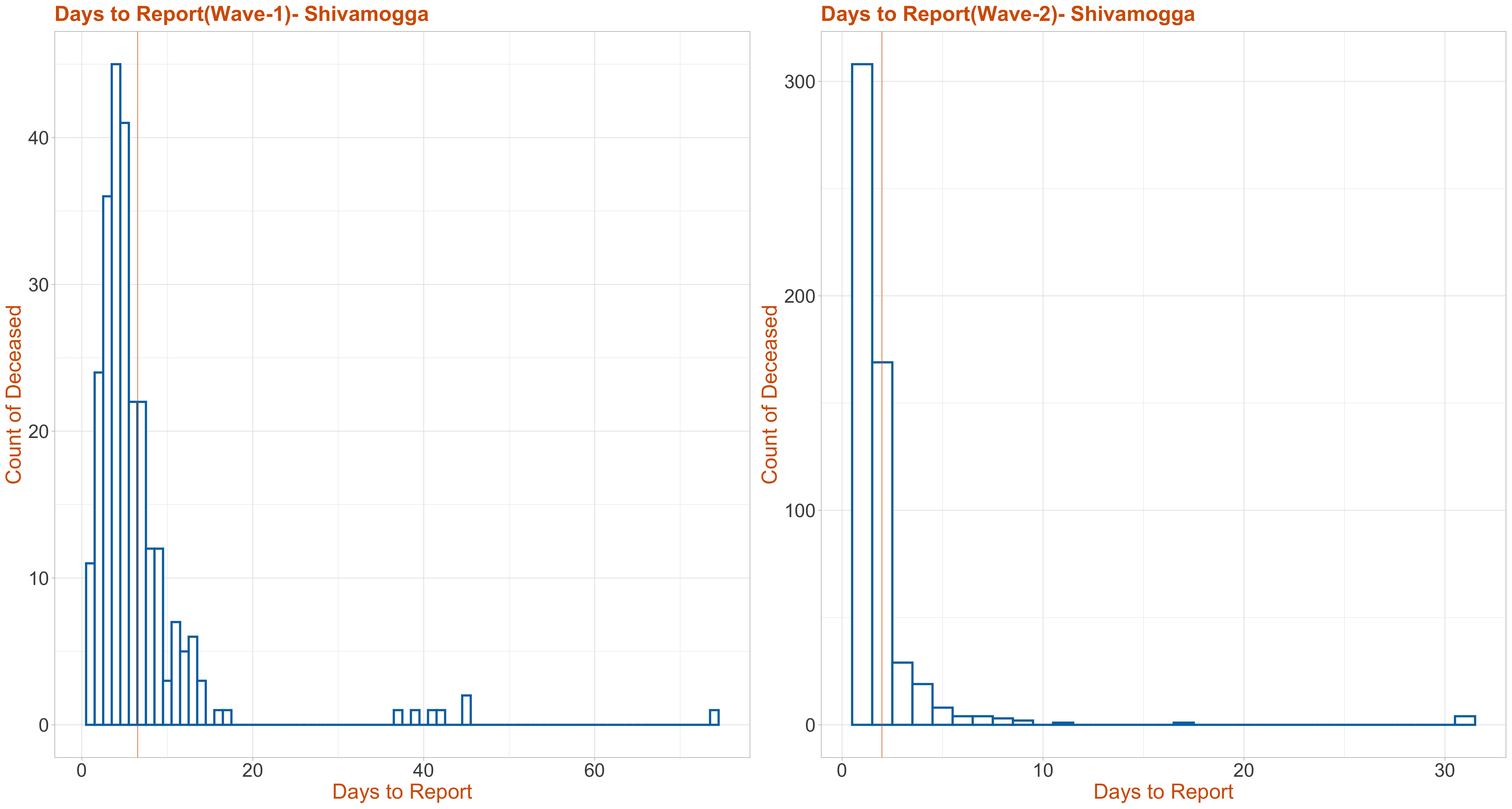
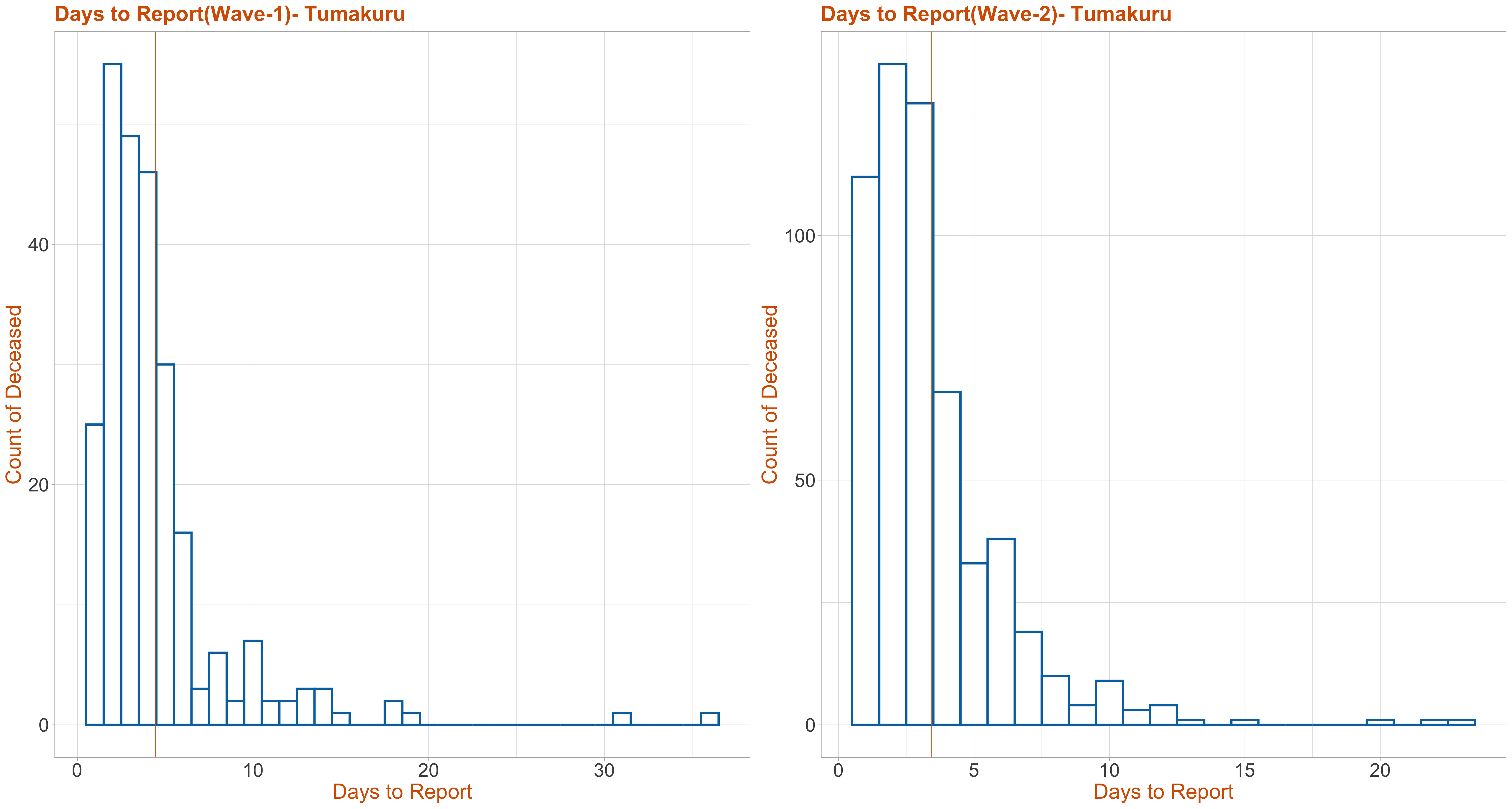
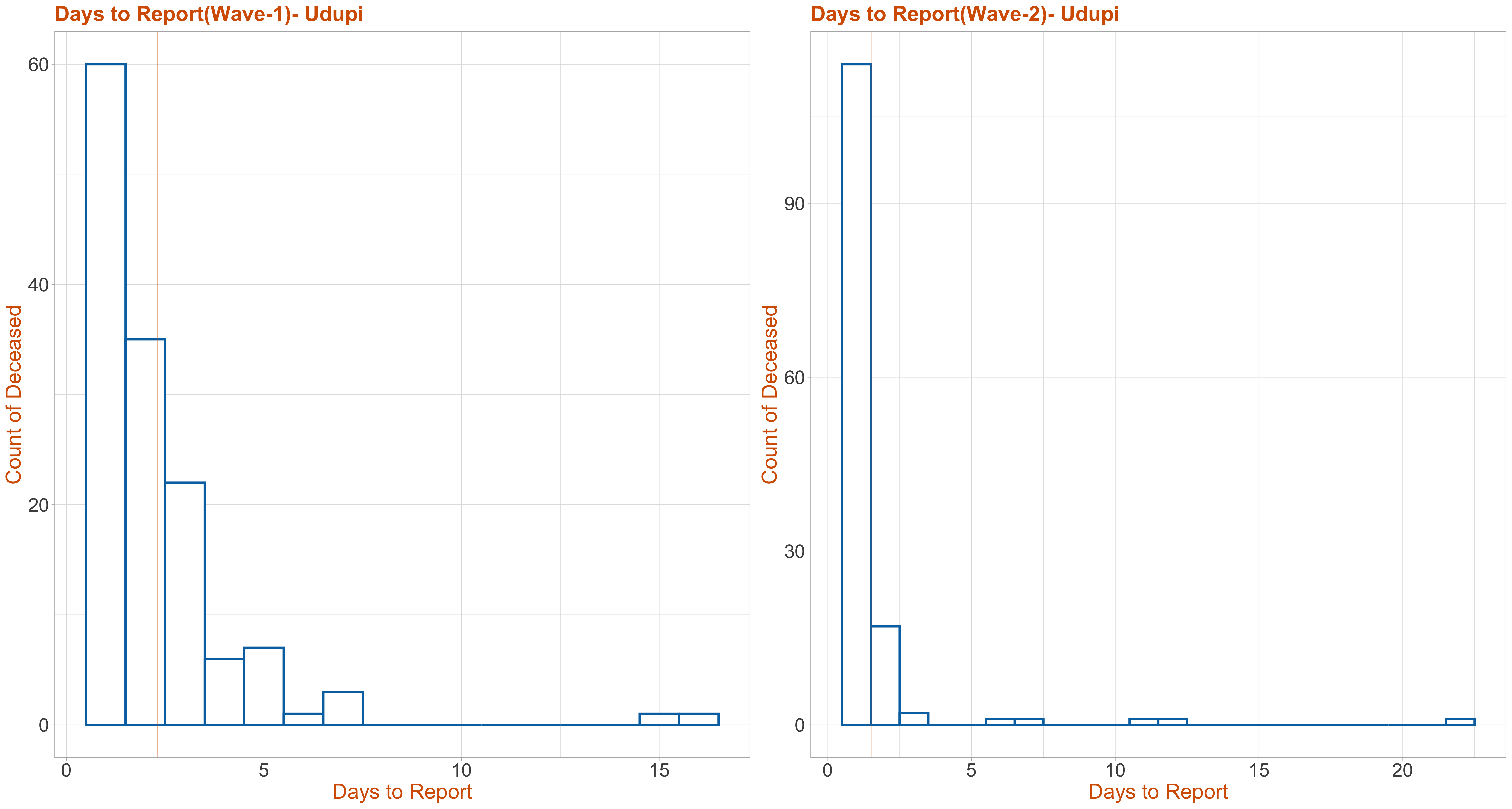
Days to Report
The Media Bulletin reports each reported patient as either admitted to hospital, or brought dead or died at residences. All these graphs provide the stacked age distribution of the reported COVID-19 patients in every district. The yellow bar is for male while the blue bar is for female. Since the number of transgender, neutral gender, unknown ages, district and gender were small, they have not been plotted. The data has a district called as others, whose count was also less and hence not plotted.
For all the graphs on this page, if you click on the image then it will display an interactive graph, where as you hover your mouse pointer over the graph annotations with details will be displayed.