Clusters of Symptoms of Deceased across districts
Scatter plot of District-wise Hospitalisation Rate.
The graph below represents the scatter plot of districts in Karnataka based on the data collected.Here we take the ratio of patients hospitalised(i.e,we take the counts of patients who were hospitalised and divide it by total number of death across districts) on one axis and plot a scatter plot with total deaths on the other.This gives us a understanding of how well hospitalisation is done in a particular district.

Most of the districts did well in hospitalising patients.Since most of the districts are above the .95 mark.
Scatter plot of Hospitalisation Rate(Wave 1 vs Wave 2).
The scatter plot of Hospitalisation Ratio of the deceased patients has been presented here across districts.The Media Bulletin reports each deceased patient as either admitted to hospital, or brought dead or died at residences, we call both the categories brought dead and died at residence as deceased patients who were not hospitalised.Then for each district, we count the total deceased patients and total hospitalised patients and take the ratio of hospitalised patients to total deceased patients to arrive at the hospitalisation ratio.We calculate the ratio for each district wave wise and then plot plot a scatter plot along with line y=x.

Scatter plot of District-wise Hospitalisation Rate(Subplots).
Now for a better analysis we clustered individual districts on the basis of total death counts and then we again perform the similar analysis as earlier.Here we took 3 categories.Firstly with total death count less than 500,secondly total death count ranging within 500 to 1500,and thirdly districts with death count higher than 1500.


Barplot of Place of Death(Wave-1 vs Wave-2)
The graph below represents the Barplot of Place of Death(wave-wise) in Karnataka based on the data collected.We first separated each individual deceased patient with respect to wave and then then took counts on the basis of place of death.

The counts in wave-2 are higher because of the higher number of fatalities.
Confidence Interval for Days to Decease Age-Gender-wise
From the media bulletin, we took the difference between the date of decease and admission date and call the difference as days to decease.We then separated the deceased on the basis of age and gender and calculated the mean, variance, and standard deviation for days to decease.We then plot the 95% t-confidence interval around the mean for all the age-gender category.

Confidence Interval for Days to Report Age-Gender-wise
From the media bulletin published by the state government, we took the difference between the date of decease and the media bulletin date and call the difference as the days to report.We then separated the deceased on the basis of age and gender and calculated the mean, variance, and standard deviation for days to report.We then plot the 95% t-confidence interval around the mean for all the age-gender category.

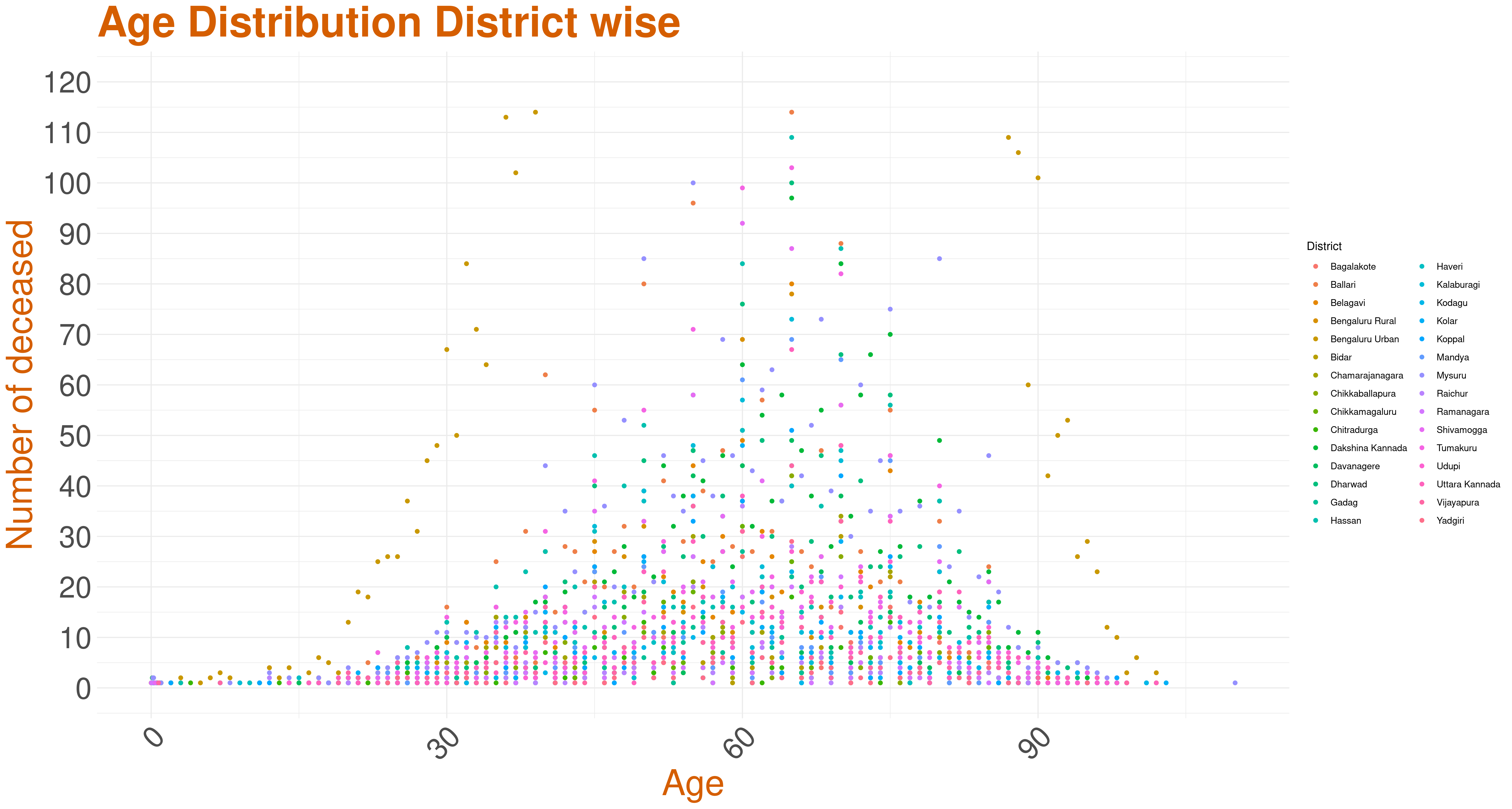
This graph is the scatter plot of the total age distribution across all districts. As we can see, Bengaluru Urban's trend seems to be different. Below are three scatter plots that give the age distributions of districts based on their total death counts.
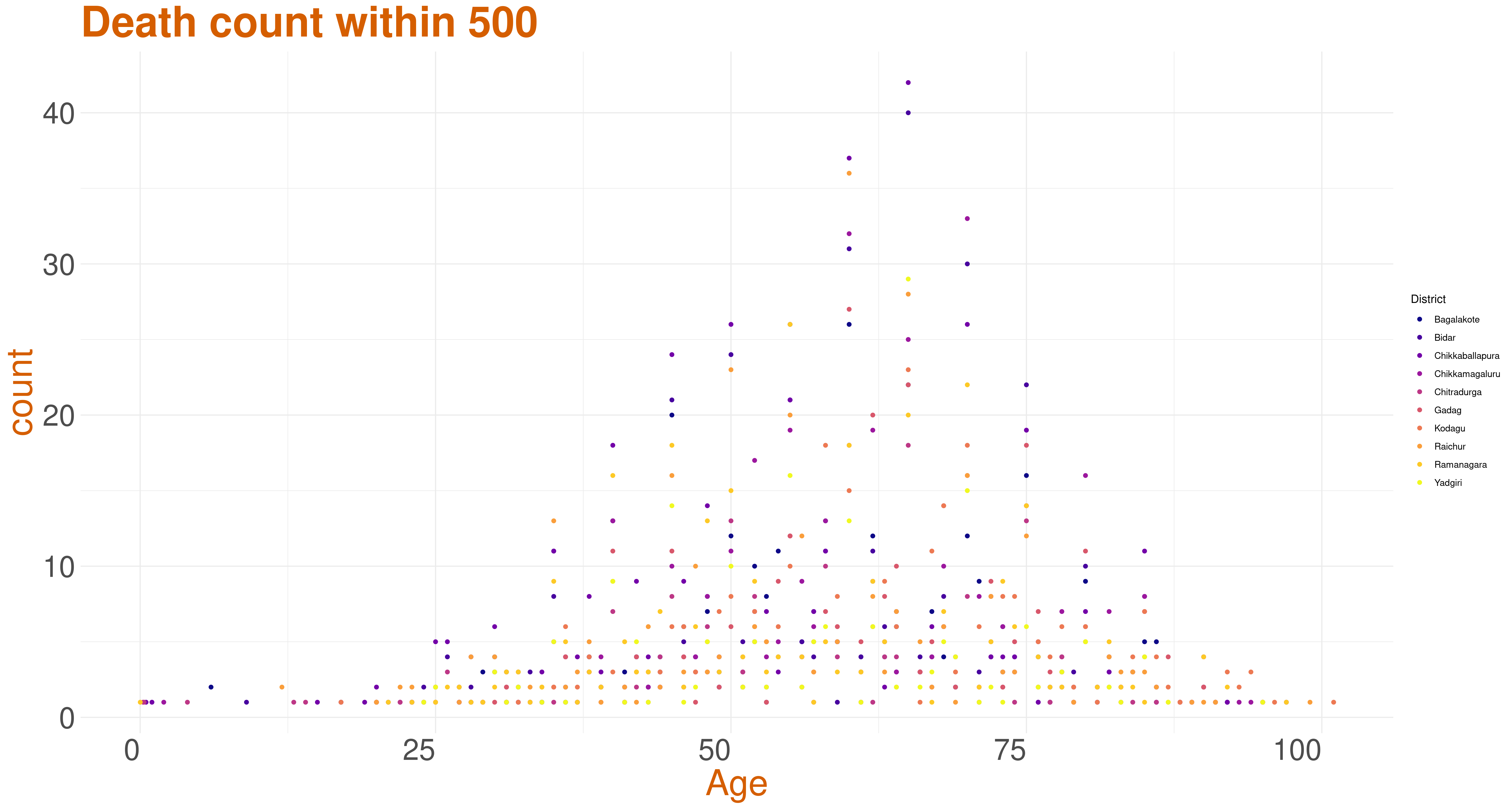
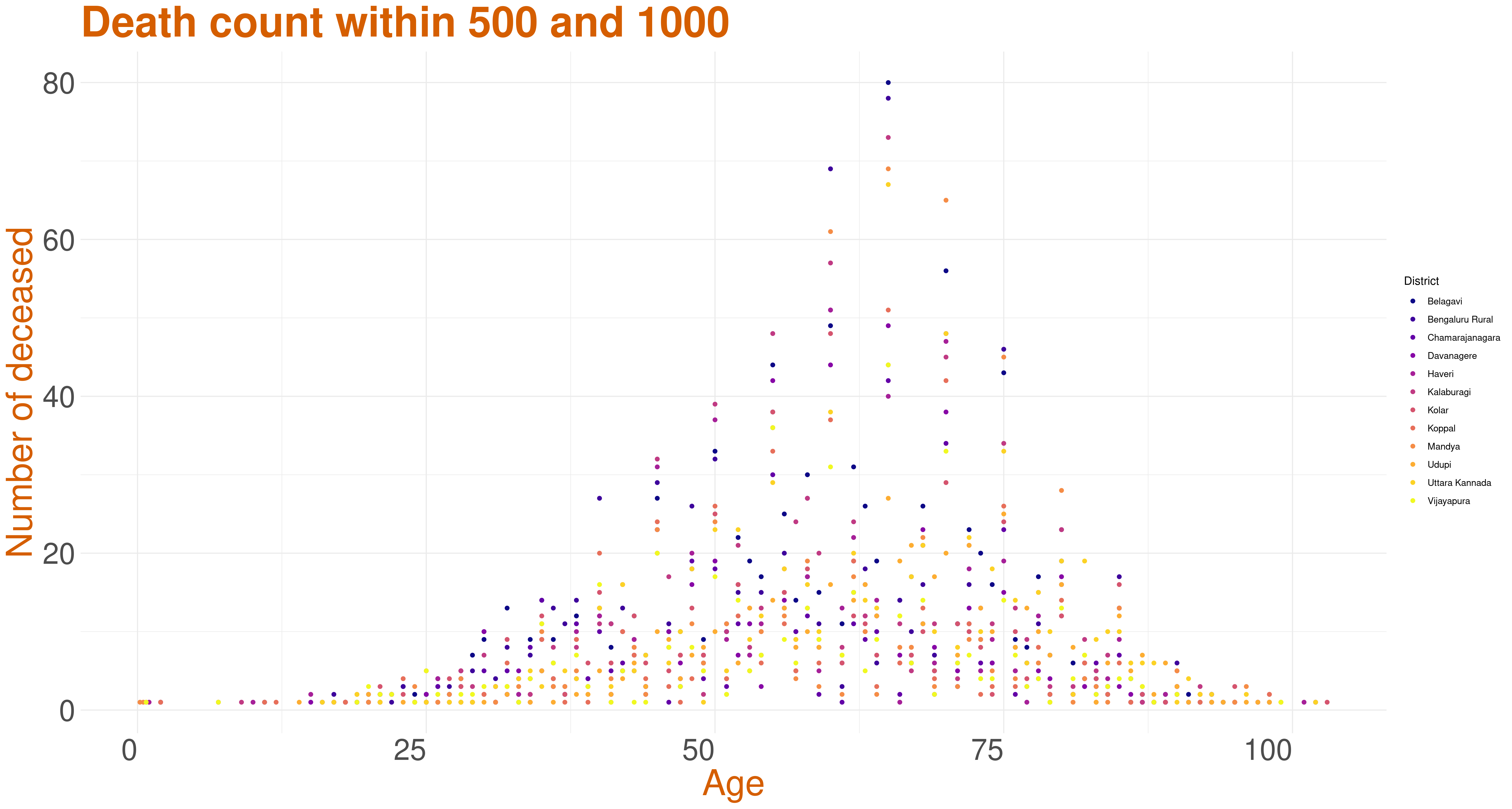
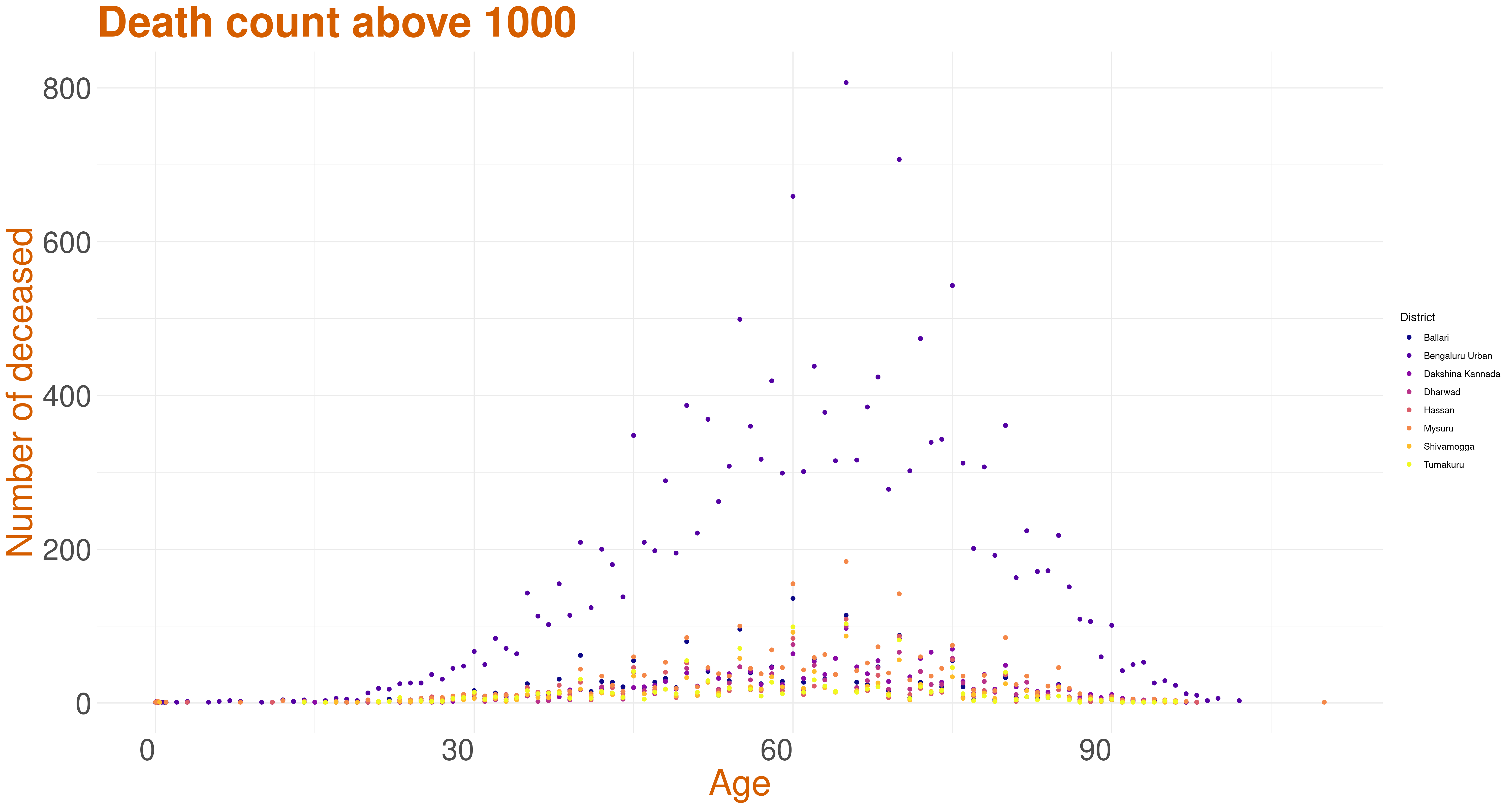
Analysis based on number of deceased across Districts
These three graphs are the age distribution across districts with the total death count in the district being less than 500, 500-1000, and more than 1000.