Age Distribution of Deceased
The detailed anaysis of the deceased based on age and gender distributions has been presented here. This throws light on the past trends of vulnerability of people which can be helpful to understand the patterns upto now.
Karnataka Age Distribution
The graph below provides the stacked age distribution of the deceased COVID-19 patients in Karnataka along with the census of the population of Karnataka for reference. Since the unknown entries of age, sex, districts were small in number, they were not plotted. The data has a district called as others, whose count was also less and hence not plotted.
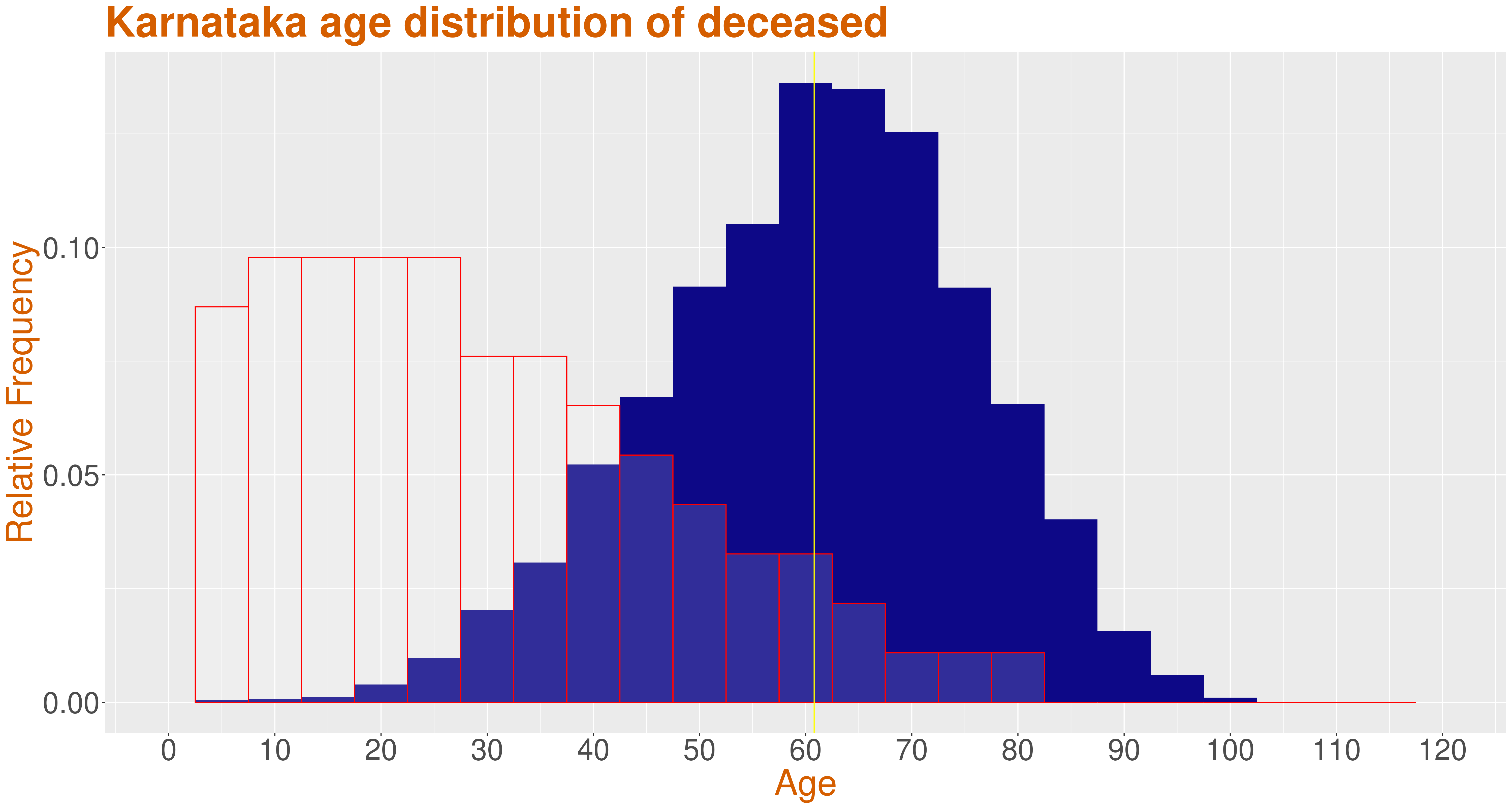
The filled in blue color indicates the distribution of the deceased coronavirus patients in Karnataka and the red outline represents the census of population. From the graph we see that mean age of the deceased is around 60 yrs. People of age 60-70 have the highest number of deceased patients, while people around the age of 0-30 have very less death count when compared to the demographic of Karnataka.
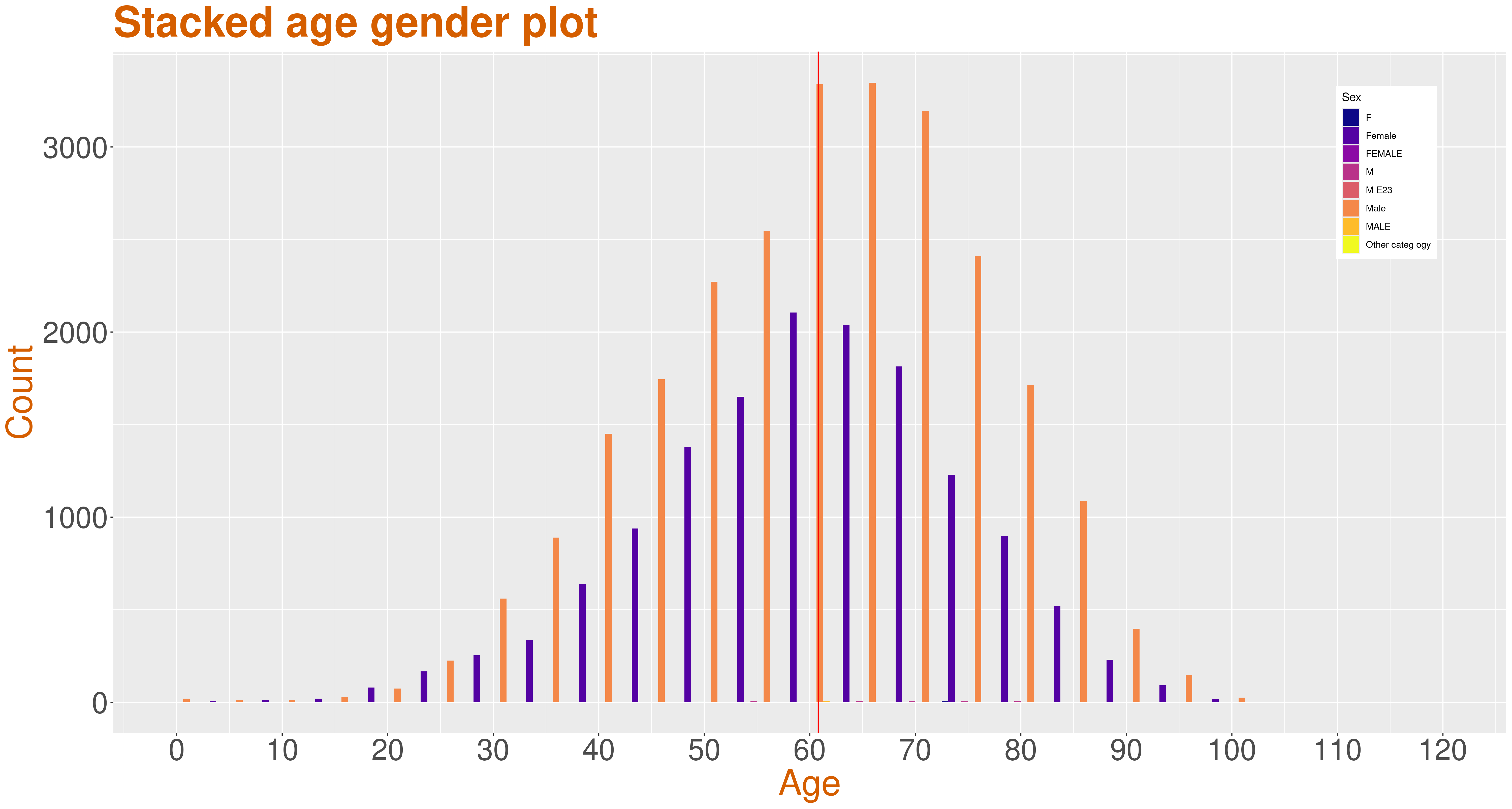
The graph is the stacked age gender distribution of the deceased in Karnataka.
Wave 1 and Wave 2 Age Distribution
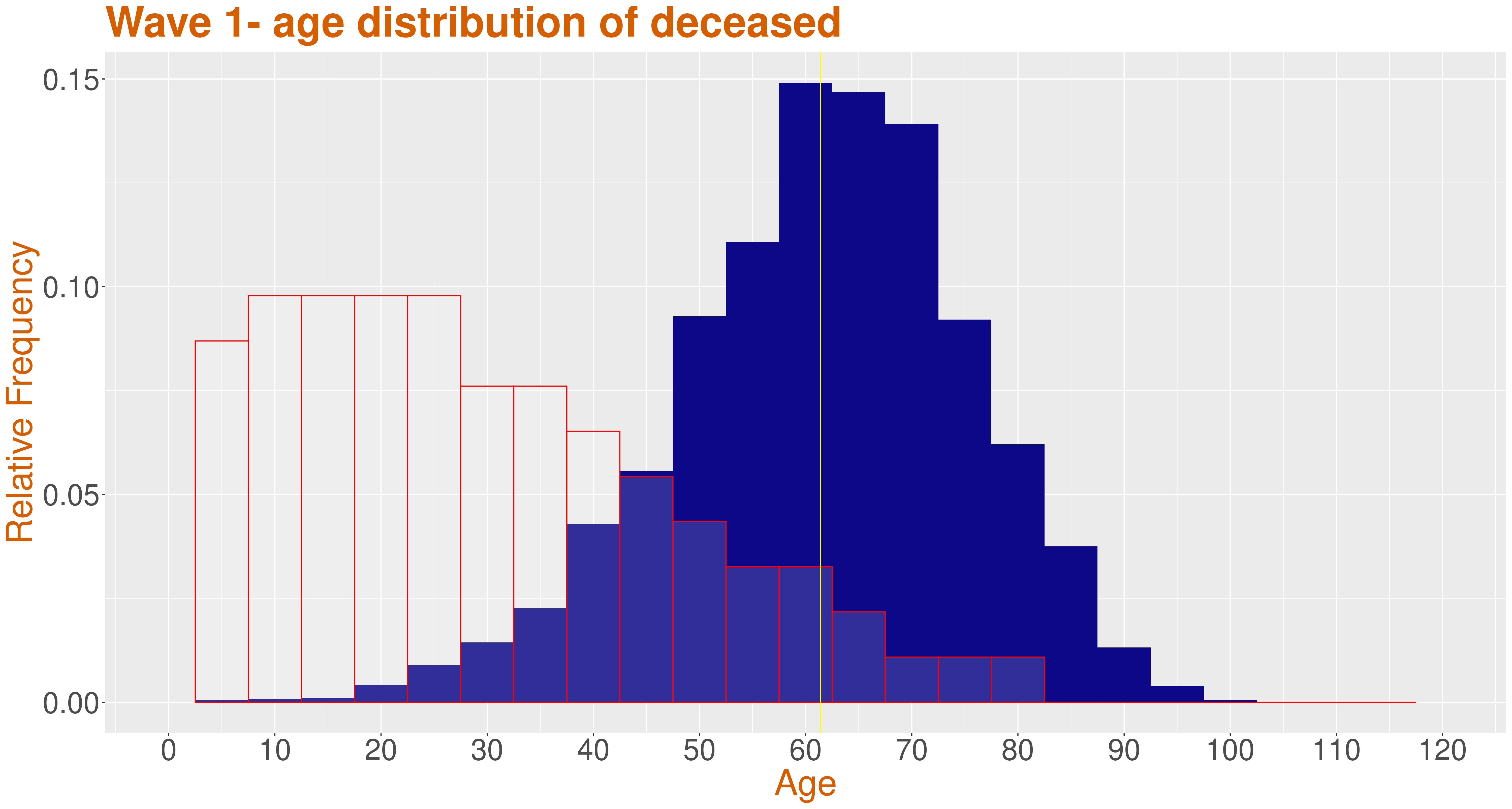
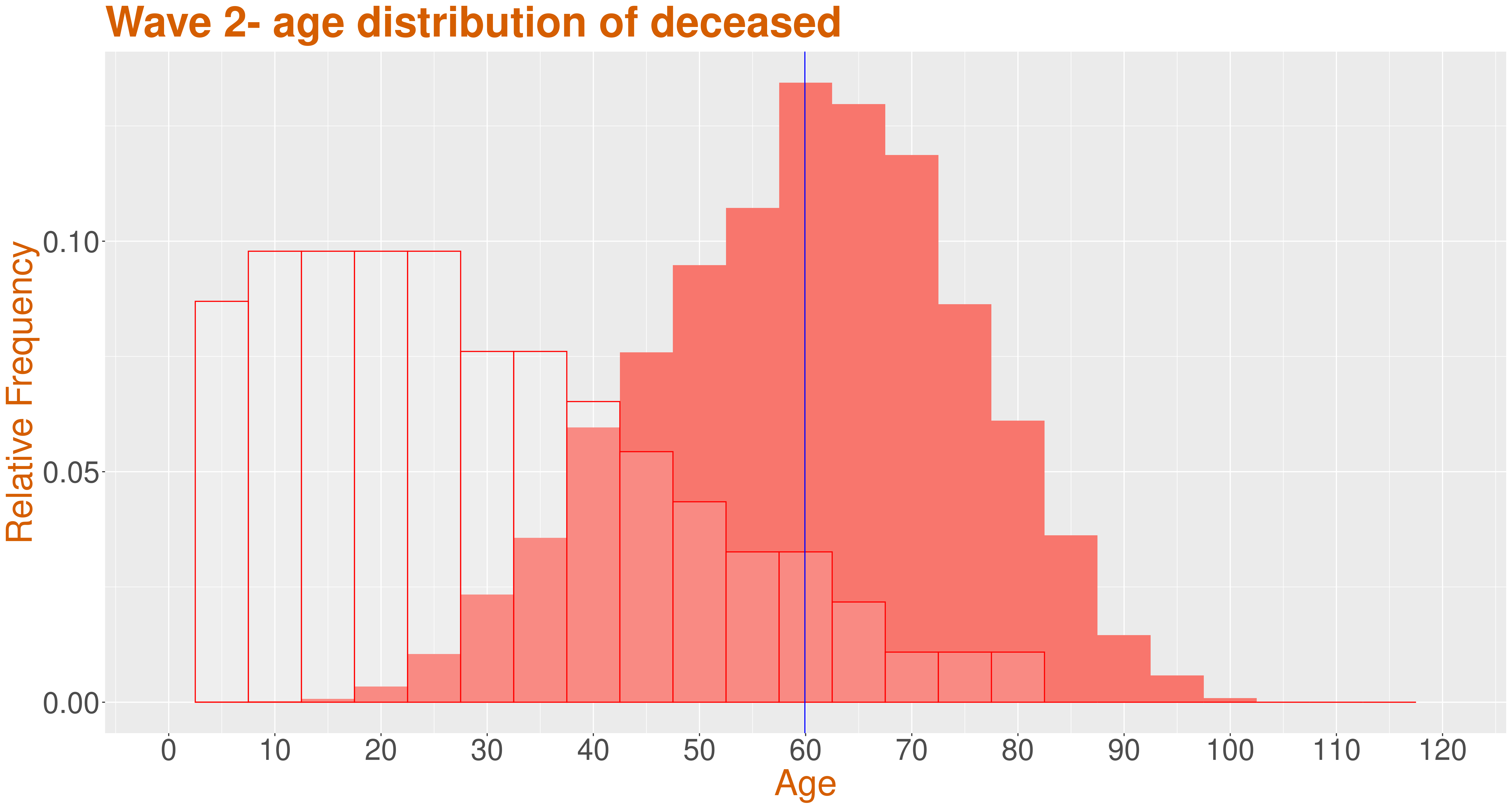
The graphs present wave 1 and wave 2 deceased COVID-19 patients age distribution along with the census of population of Karnataka for reference. Though the trends in wave 1 and wave 2 are almost similar, from the graph it can be seen that the mean age of deceased in wave 1 is around 61 and wave 2 is around 60. The deceased population between 0-40 has increased during wave 2 than wave 1, but still the highest deaths is observed in 60-70 age interval.
Age and Gender Distribution across waves
The data collected has been classified into three waves to get a better understanding of the impact of Covid-19. Below are the stacked age gender plots for each wave.
- Wave 1 - till the end of October 2020
- Middle wave - from November 2020 till the end of January 2021
- Wave 2 - from February 2021 till present
In all the below graphs, the yellow color indicates the males while the blue indicates the females.
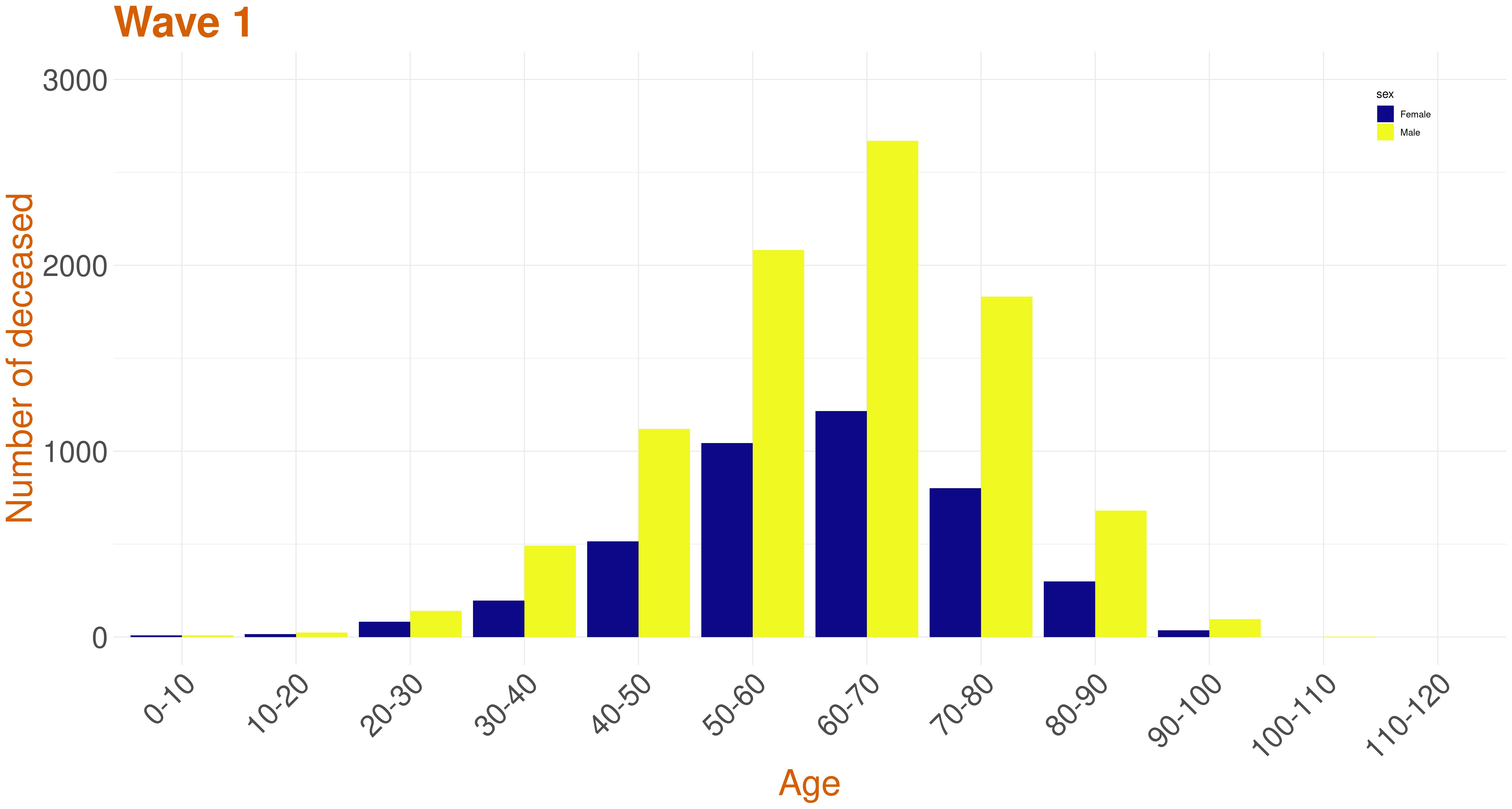
Wave 1 data
This is the stacked age gender plot of the deceased during wave 1. This shows the mean age of the deceased is 61 yrs. Across the entire distribution, we can observe that the males have been more affected than the females.
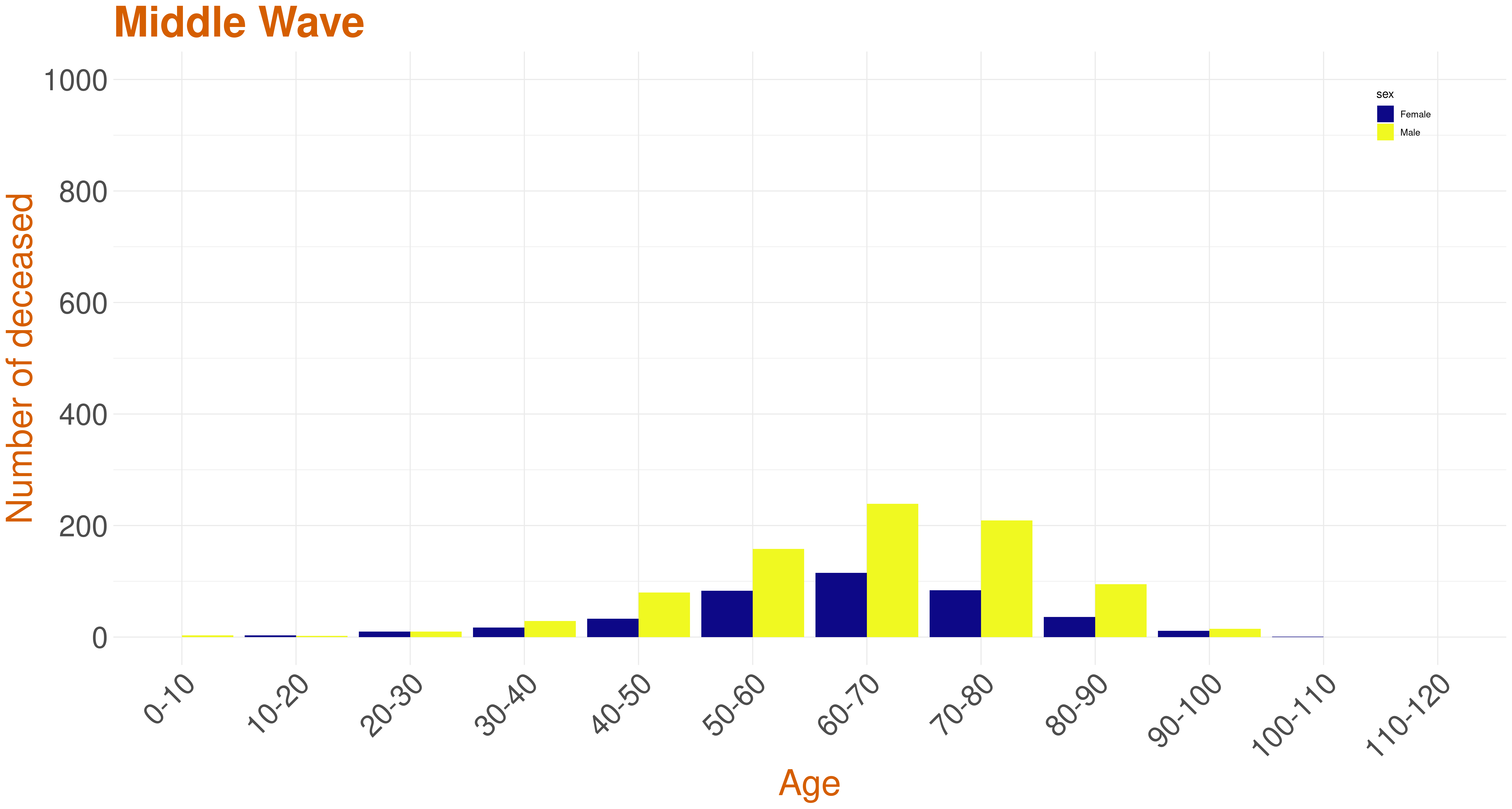
Middle Wave data
This is the stacked age gender plot of the deceased during the middle wave. From this graph, we can see that the gender trend of death count of males being higher than females still persists, though the total death count overall has reduced drastically compared to wave 1. The mean age of the deceased during this wave is around 64 yrs.
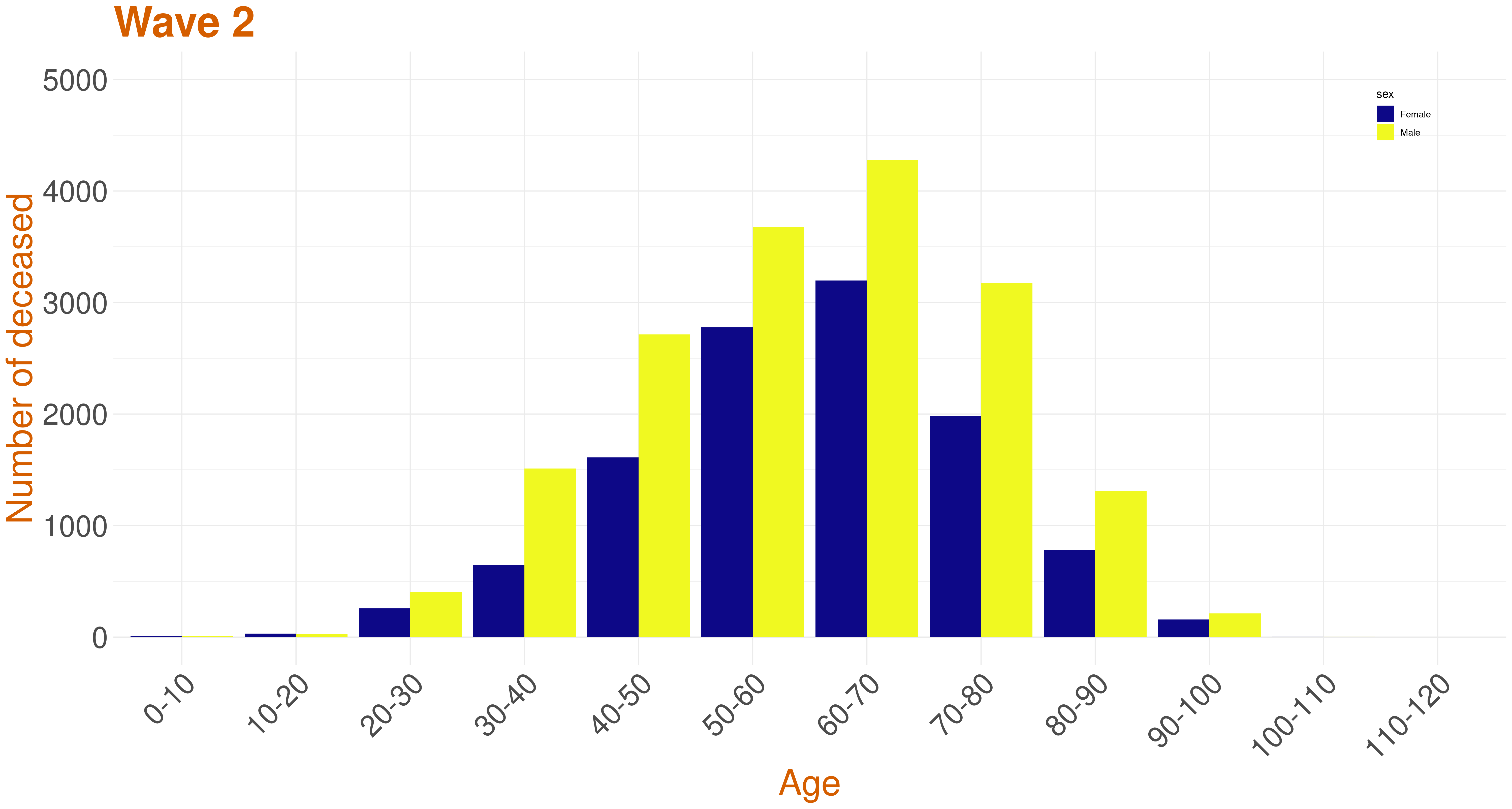
Wave 2 data
This is the stacked age gender plot of the deceased during this wave 2. It can be seen that the number of deceased has increased compared to the previous waves. Though the male death count does seem to high, the death count of female has increased compared to the previous waves. The mean age of the deceased during this wave is around 60 yrs. The peak age of deceased is still around 60-70, but the death count of people of age around 30-40 and 40-50 has increased compared to previous waves, thus extending the range of affected victims.
Wave based Age and Gender Distribution
Deceased data categorized by waves
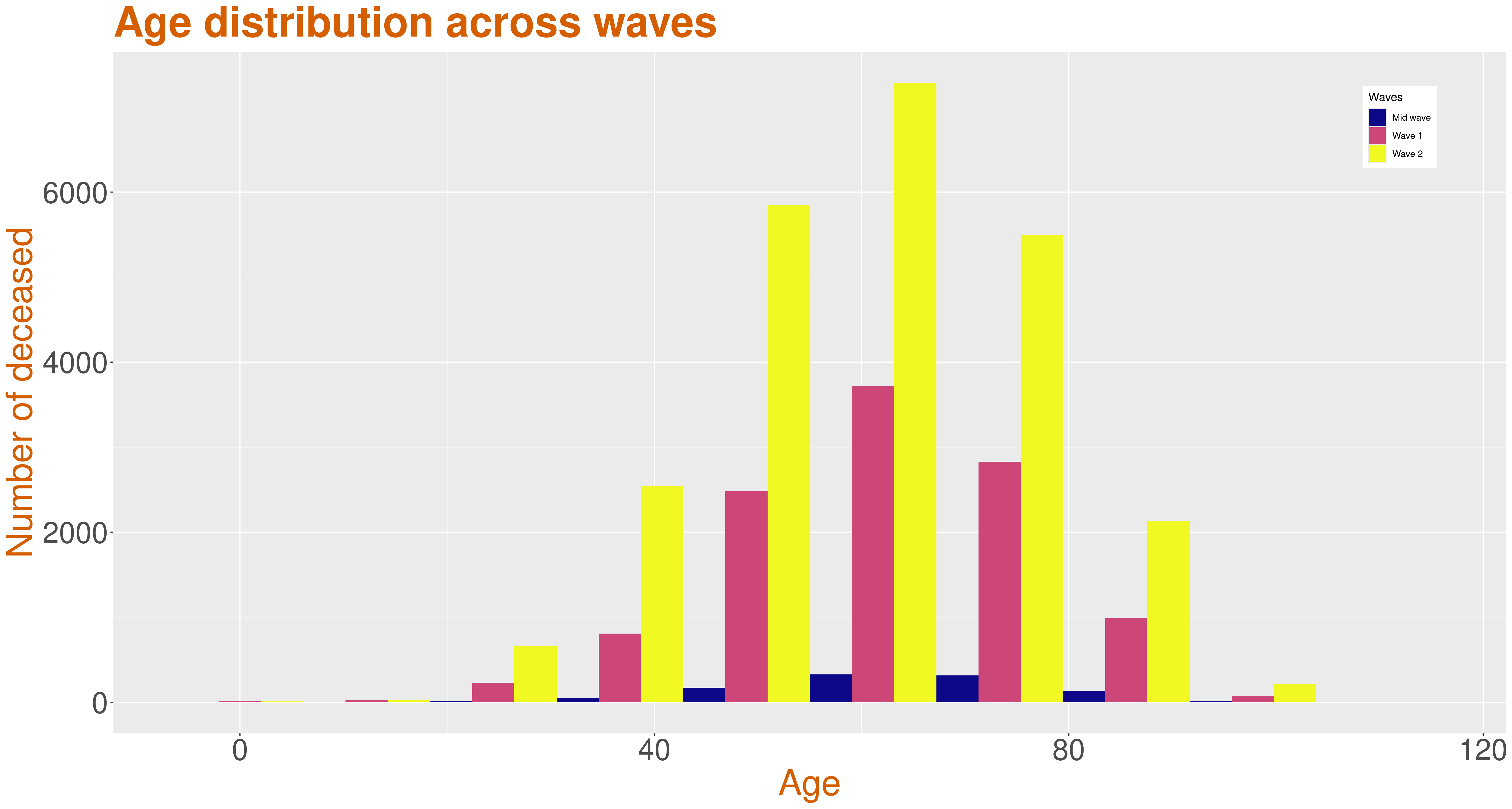
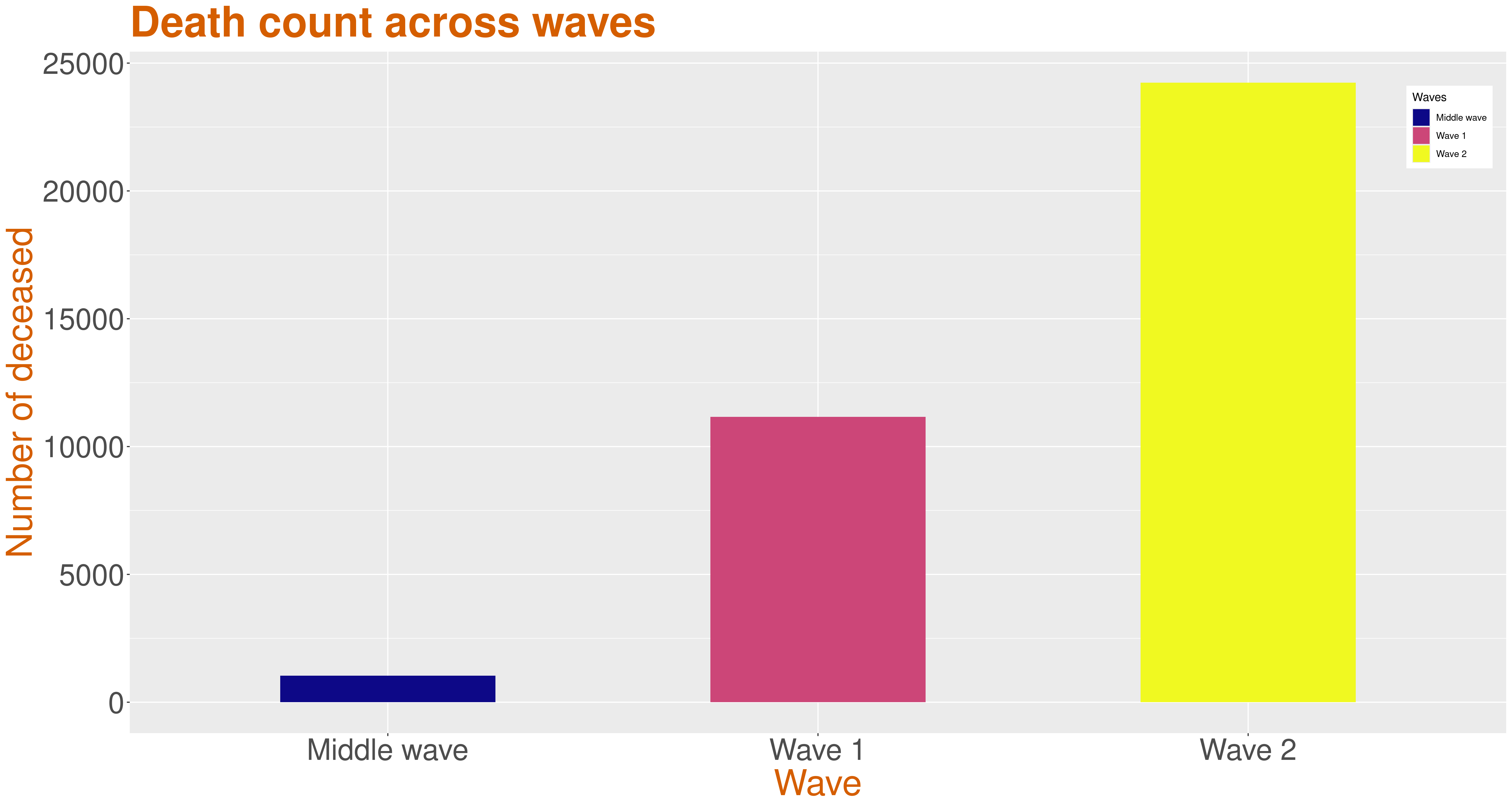
From these graphs, we can see that the number of deceased in the middle wave is very less. But the death count has increased a lot in the second wave across all ages compared to the first wave.
Confidence Interval
Wave wise all statistics across districts
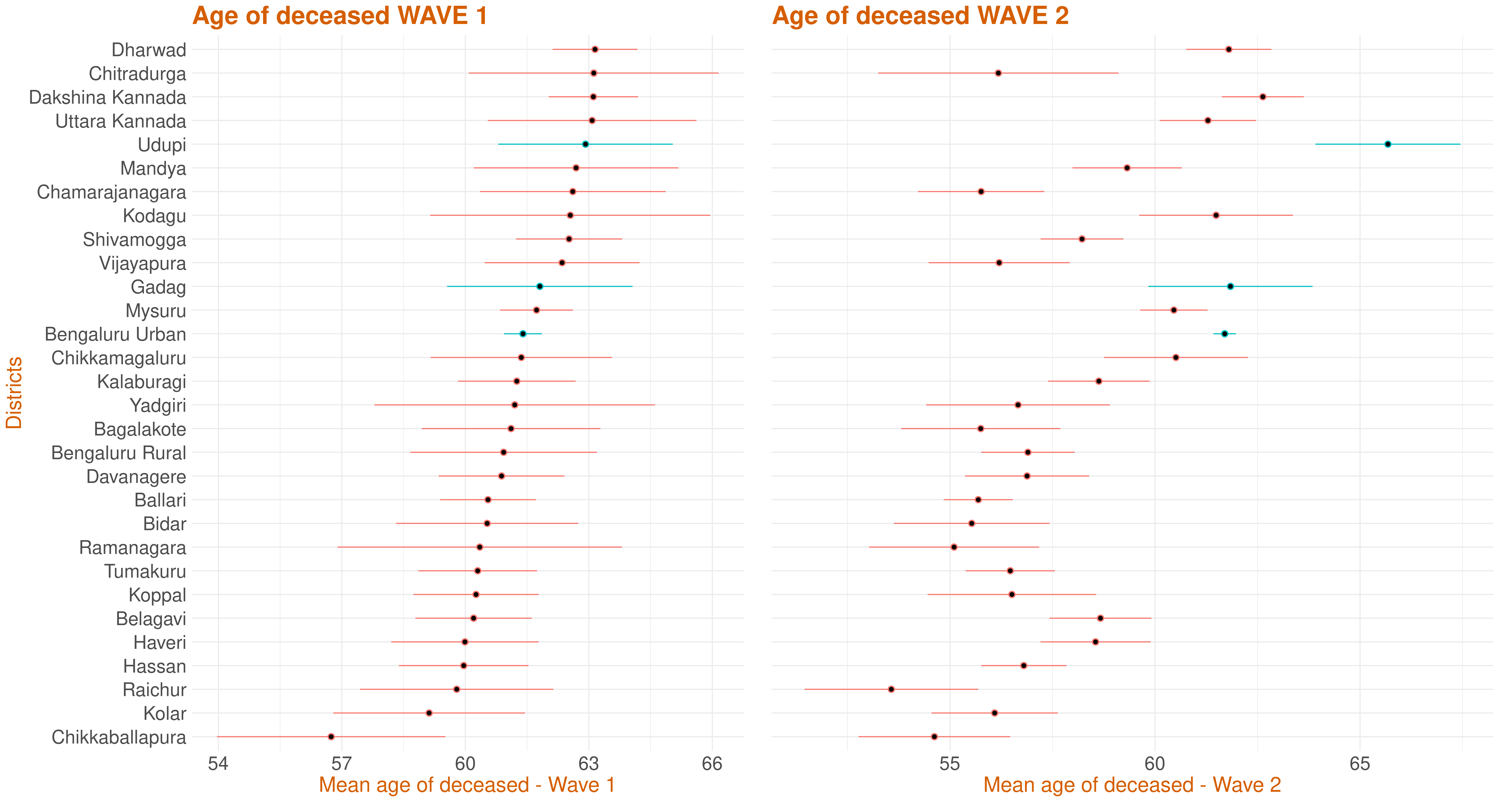
This plot represents the confidence interval for the age of the deceased by each district. It has been ordered in descending order of mean age of the deceased in wave 1. 95% t-interval around the mean age has been calculated and plotted. A wide variation about the districts can be observed.
Wave 1 and Wave 2 comparison
Number of deceased across districts and waves
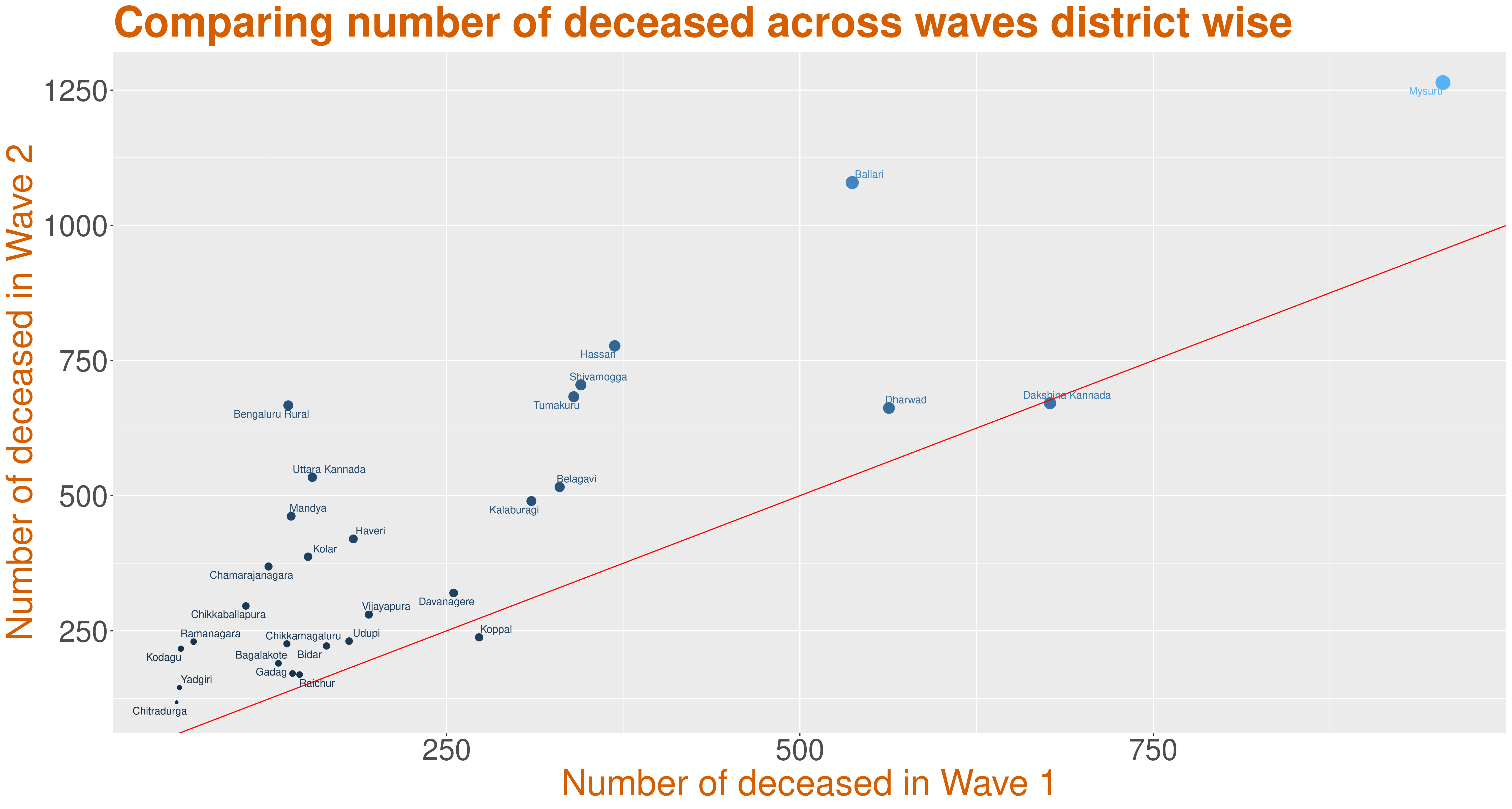
This is a plot of number of deceased in wave 1 versus the number of deceased in wave 2, with the point size indicating the sum of deaths during the two waves across districts. The line y=x has been plotted. This suggests that the districts above the line have wave 2 death count higher than wave 1 death count, while districts below the line have wave 1 death count higher than that of wave 2. The number of deceased in Bengaluru Urban during wave 1 is 3836, during middle wave is 488 and during wave 2 is 11235 as of 2nd July, 2021. Due to the large count, this district has not been plotted.
District based Age distribution
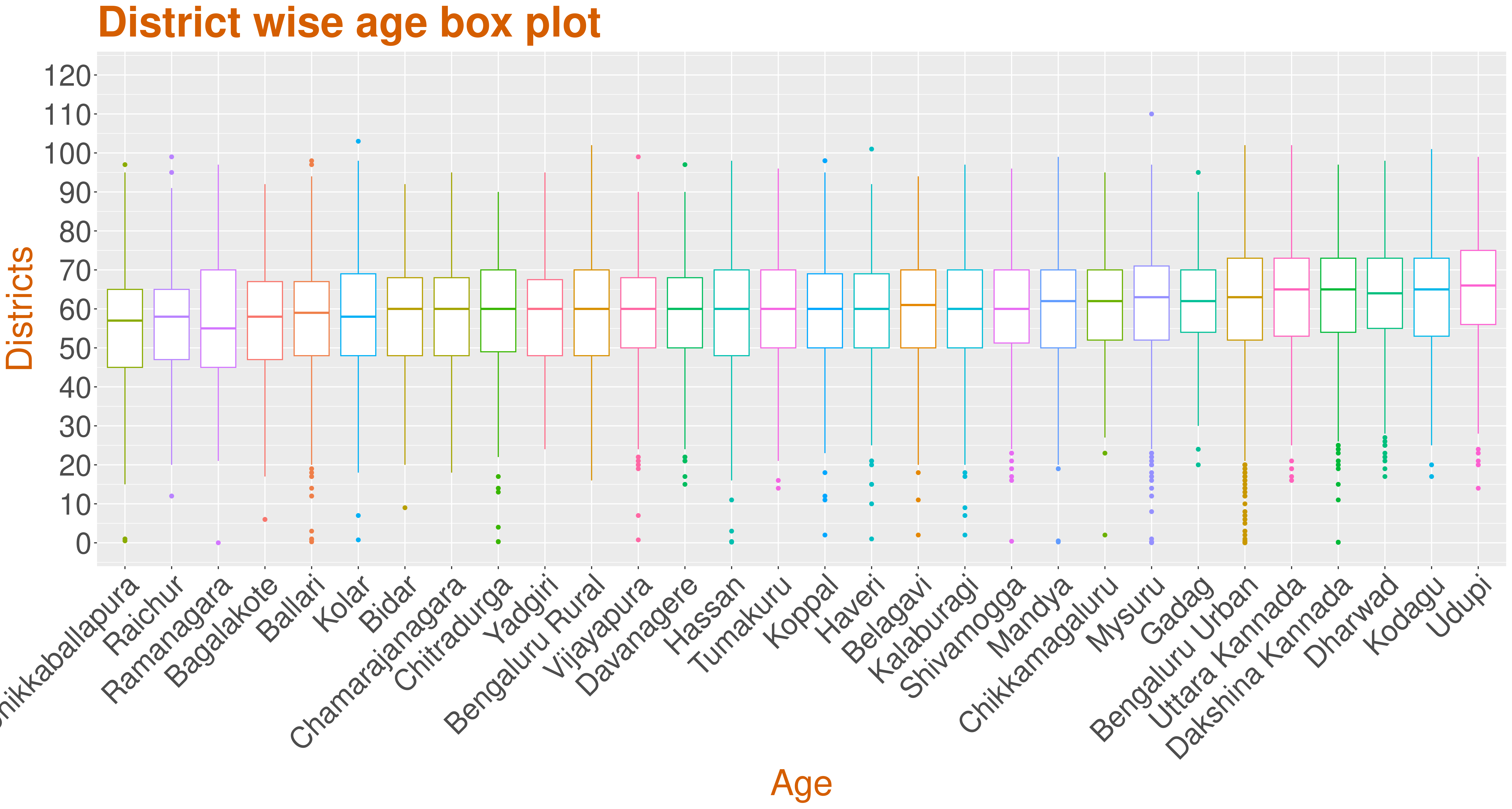
This plot, across districts, suggest that the median age of the deceased from every district is around 60 mostly, consistent with the general overall trends and across waves. We can see that the maximum number of outliers can be observed with Bengaluru Urban while Bidar has no outliers.
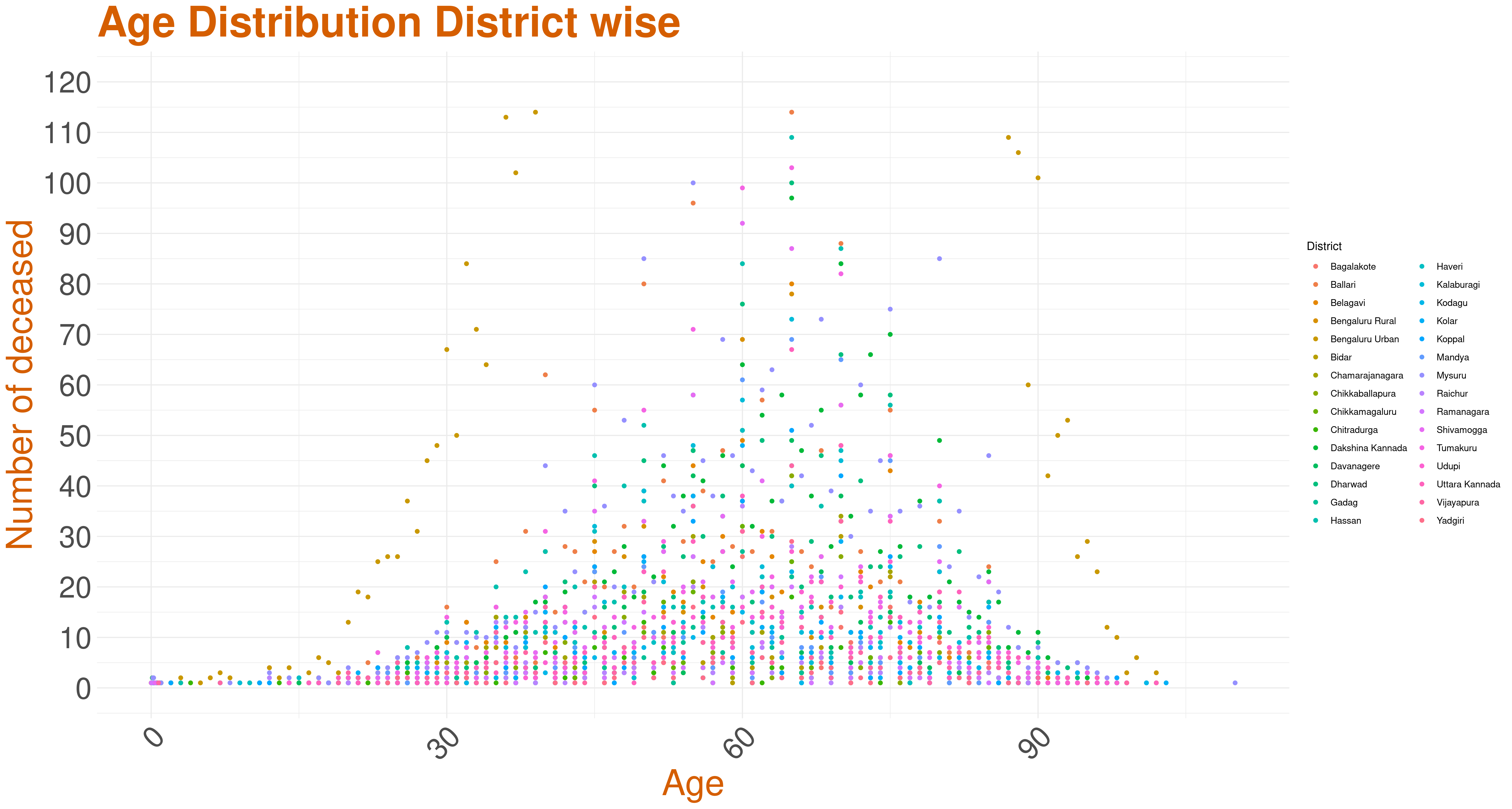
This graph is the scatter plot of the total age distribution across all districts. As we can see, Bengaluru Urban's trend seems to be different. Below are three scatter plots that give the age distributions of districts based on their total death counts.
Analysis based on number of deceased across Districts
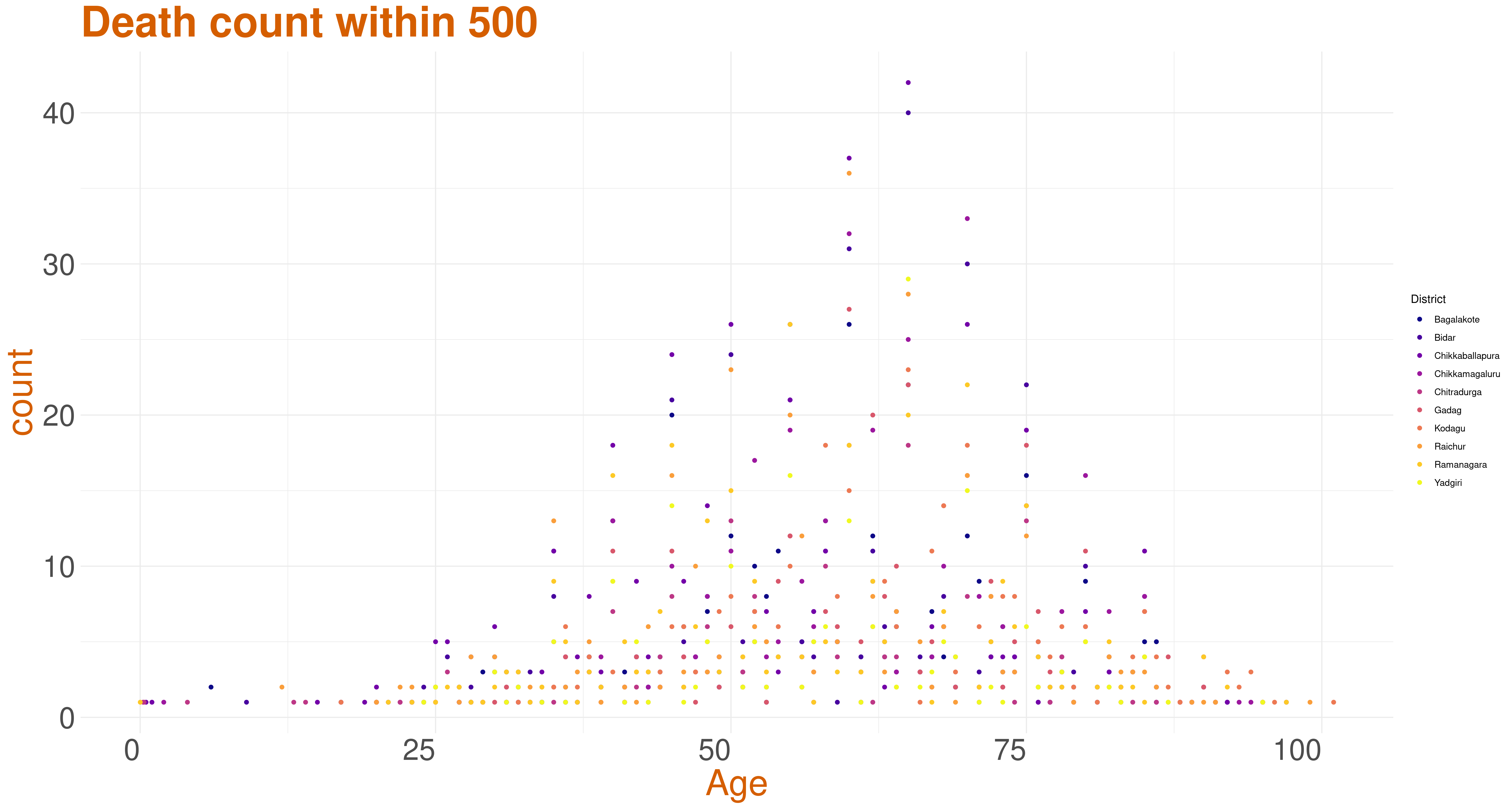
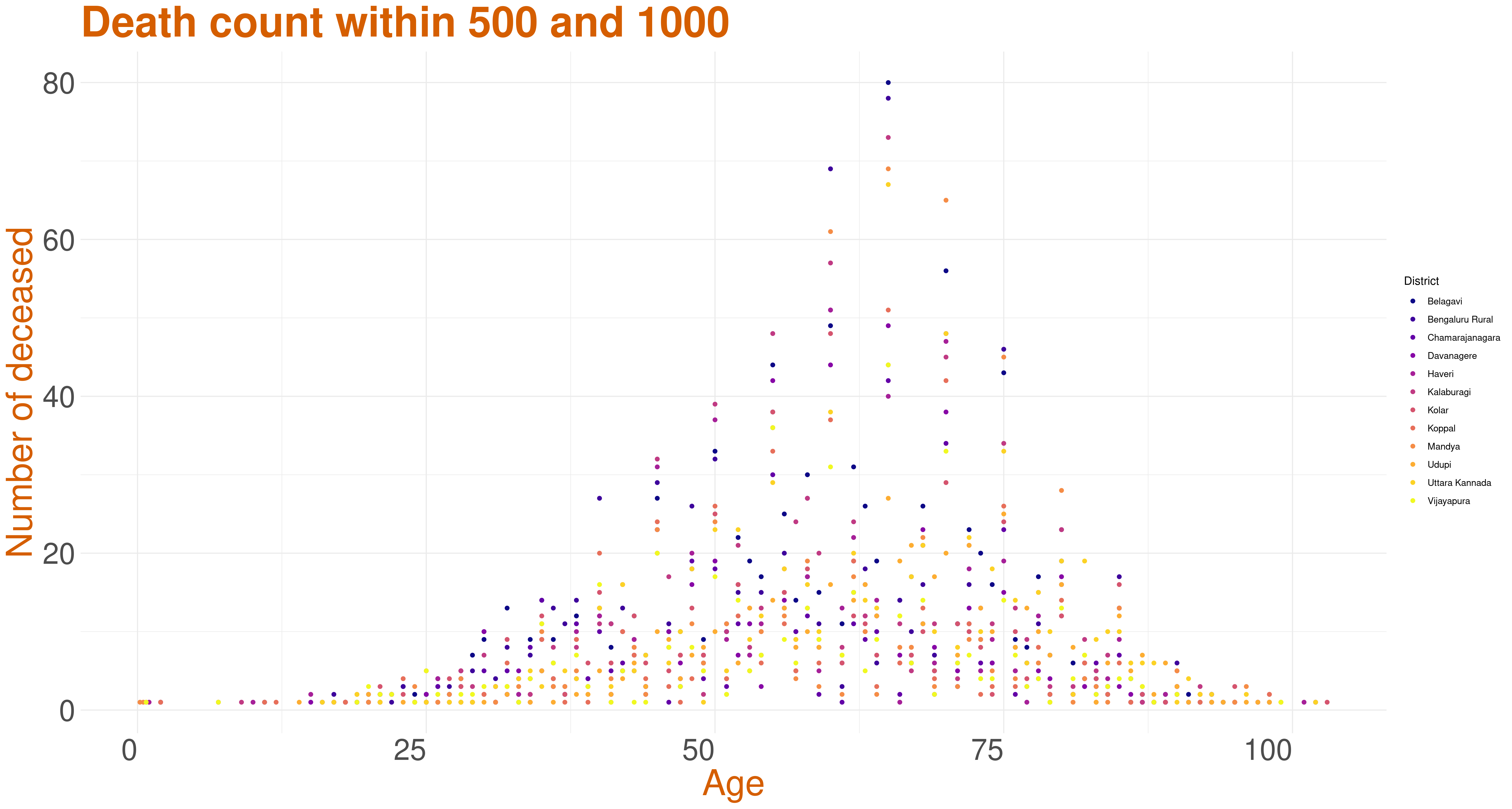
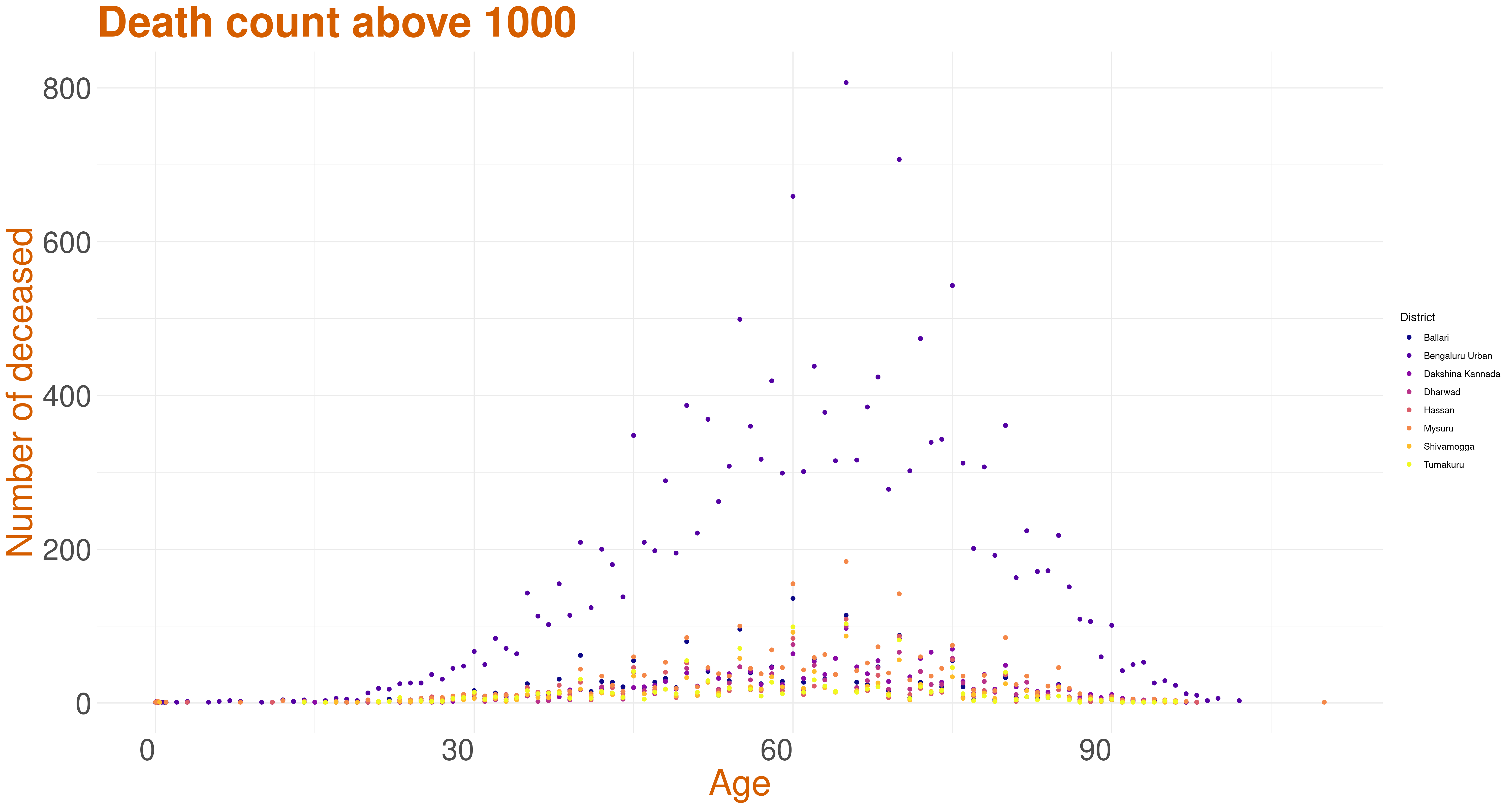
These three graphs are the age distribution across districts with the total death count in the district being less than 500, 500-1000, and more than 1000.
Monthwise distribution of number of deceased
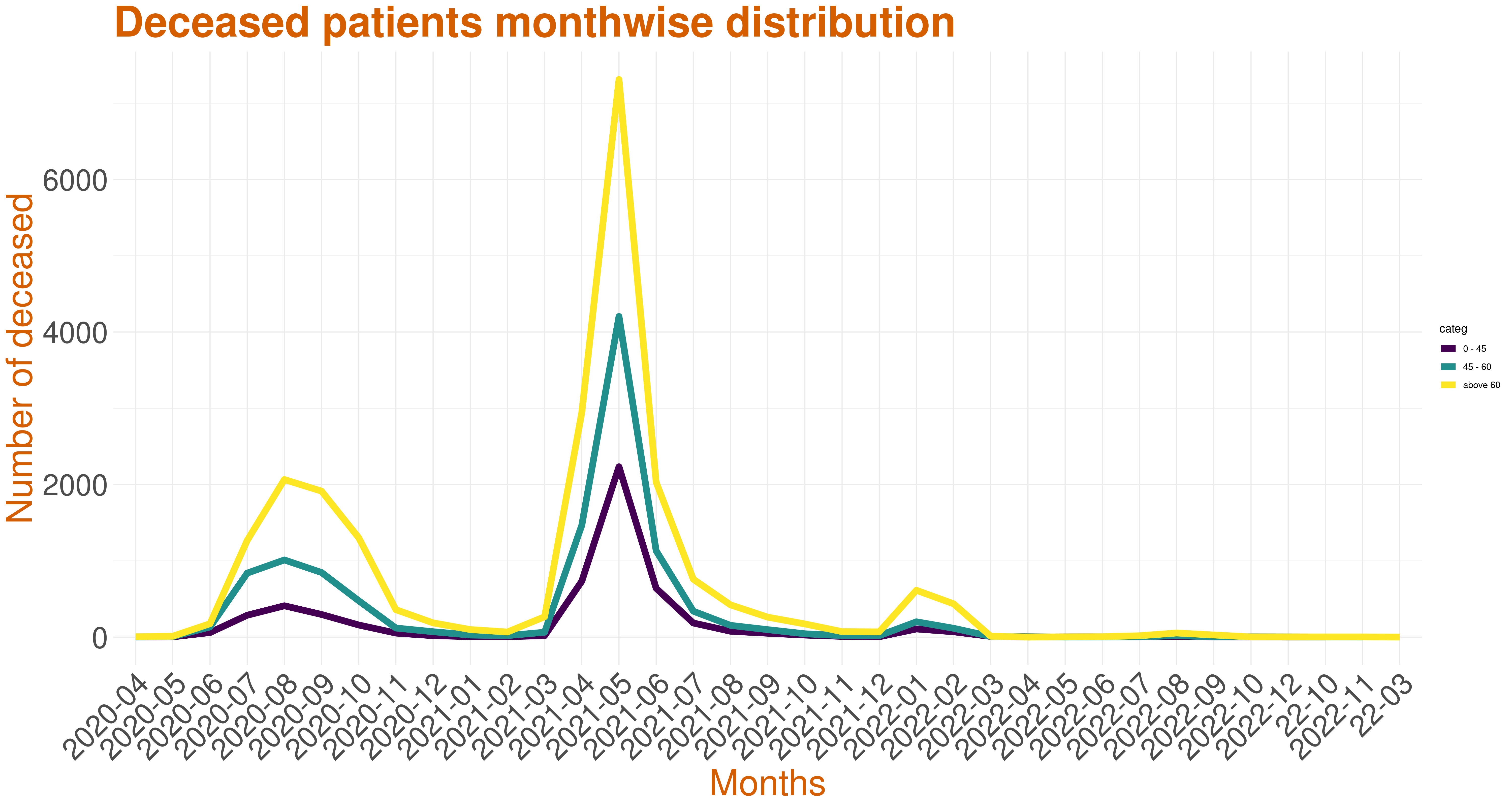
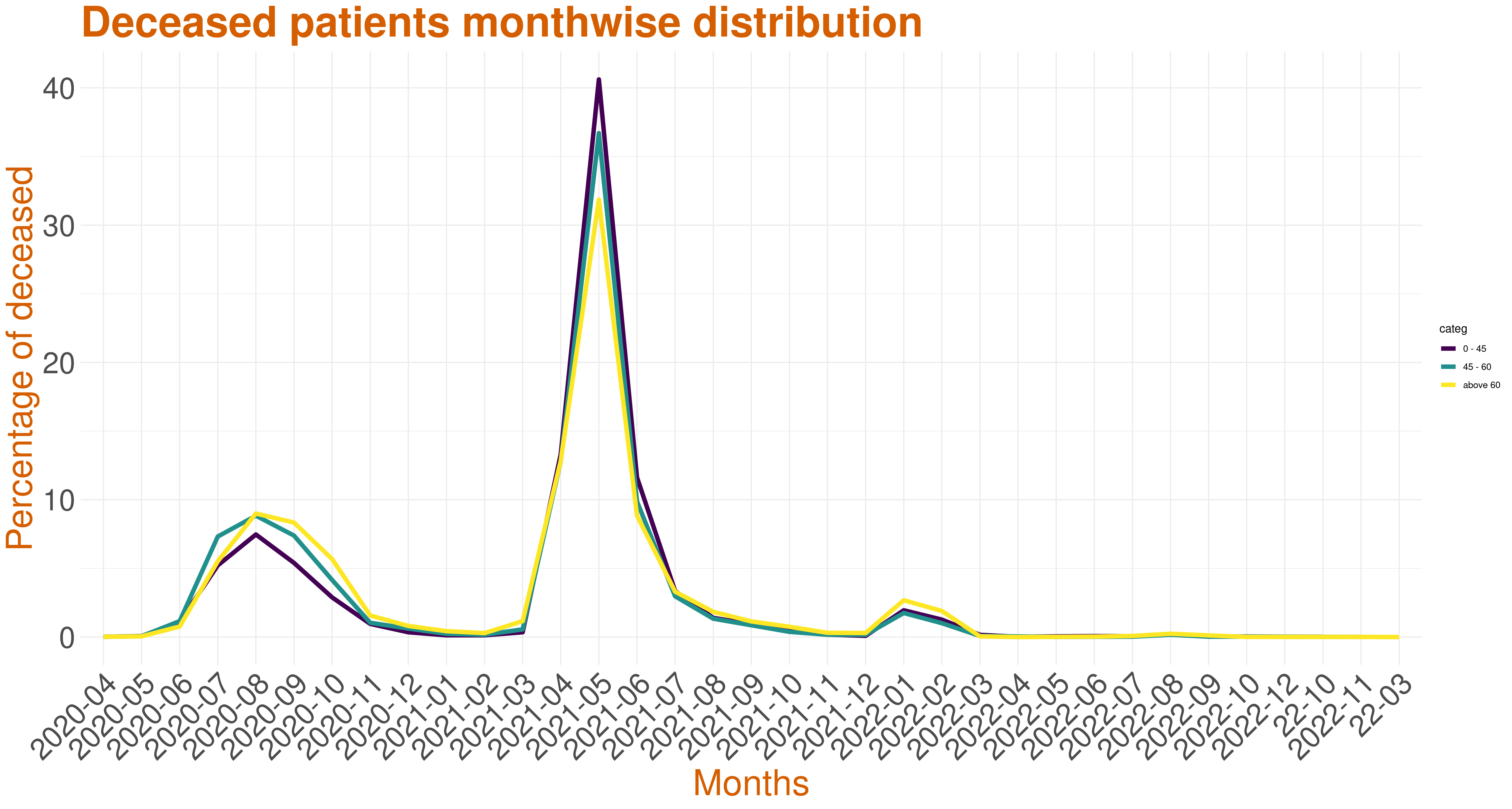
The two graphs represent monthwise death count and monthwise death percentage of people belonging to three different age categories, namely, 0-45, 45-60 and above 60. The sum of percentages across all the months, for all three age categories each, is 100 percent. Although there has been slight increase in deaths in August 2020, there is a visible spike of death cases in May 2021.
Deceased data categorized by the three age bins